
Apple Music billboard ad, Berlin
Contributed by Florian Hardwig on Aug 28th, 2015. Artwork published in
.
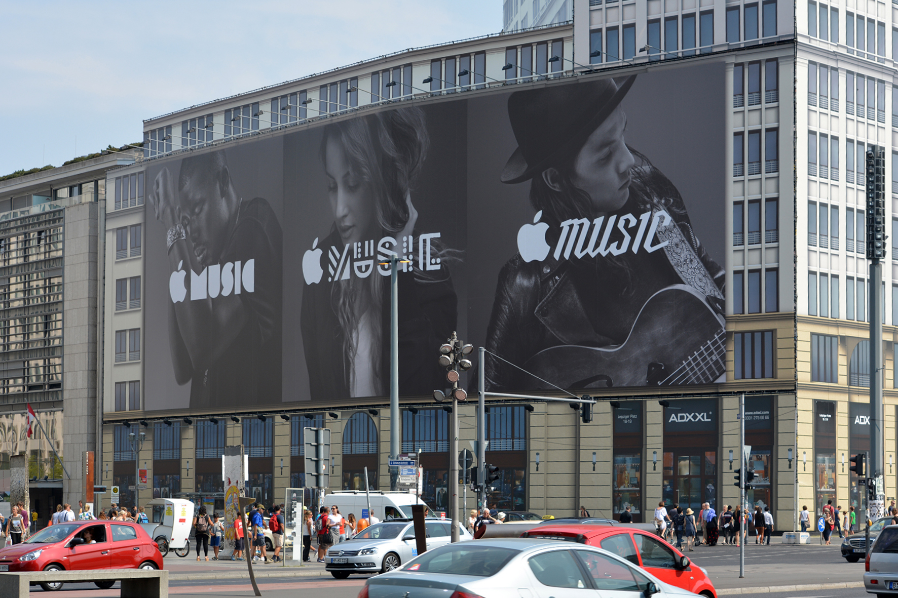
Photo: Florian Hardwig. License: CC BY-NC-SA.
Large-scale ad for Apple’s music streaming service at Potsdamer Platz, Berlin.
The geometric letterforms on the left are inspired by Milton Glaser’s Baby Teeth — without any counters, as seen in this Photostat version. Its Pac-Man C has been replaced by a semicircle, or rather a semistadium. I couldn’t ID the middle one. The angular script on the right is Kyle Wayne Benson’s Millie Bold in all-caps, with the alternate S and a few mods.
Photo: Florian Hardwig. License: CC BY-NC-SA.


</cite> Czechoslovak movie poster")


2 Comments on “Apple Music billboard ad, Berlin”
I’m not opposed to Apple breaking away from Myriad or San Francisco in their advertising, but this look could be too much of a departure from their brand. It feels like a forced attempt to be young and hip. They do this kind of stuff in the iTunes and App stores but not in advertising.
I actually kinda like how apple has created a “sub-advertising identity” (if that’s what you want to call it) for apple music.
Like Stephen, i was a bit thrown off when i first saw them since i was used to seen Myriad on all things apple but it’s pretty cool how these ads convey diversity which is exactly what apple music is.