
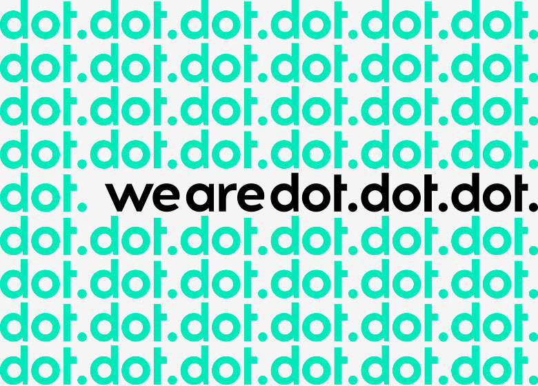
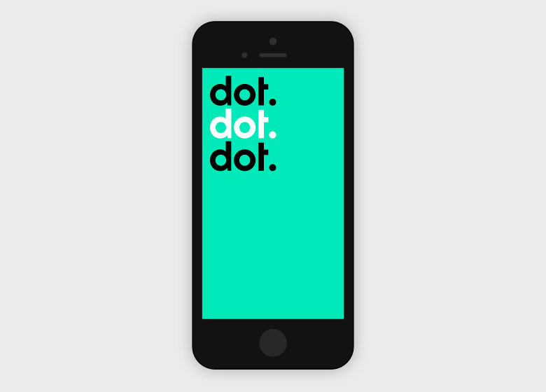
WeAreDotDotDot identity
Connecting Tech City is a collaborative initiative to bring East London’s young people closer to opportunities in the growing digital cluster. Rosie Lee were approached by Centre For London to create the visual identity for this new and exciting initiative — the basis of which would be used for the creation, and delivery of an online digital platform to connect young people to leaning opportunities in East London.
The identity brief to Rosie Lee was to create a logo that appeals to various demographics involved within the campaign, whilst still keeping in mind the core premise of the initiative. The final logo, WeAreDotDotDot, was a subtle reference to punctuation used in digital technology, and also gave the suggestion of ‘what happens next?’… Also seen as fun and irreverent, WeAreDotDotDot was accessible to all key demographics involved.


")


")


")


")


