
Lieder zur Weihnachtszeit (1940)

For your typographic holiday reading, here’s a find from a flea market in Berlin-Schöneberg.
Lieder zur Weihnachtszeit (“Songs for Christmastide”) was published by Georg Kallmeyer Verlag in 1940. Despite the poor condition, it looked like a charming booklet on first sight. The title on the cover is lettering by Hans Voigt. The typeface used throughout the book is a Fraktur that was first cut in 1933 in a single size by Paul Koch for his Werkstatt Haus Fürsteneck in Frankfurt, based on letterforms written by his father Rudolf Koch. In 1937, three years after Rudolf Koch’s death, the Gebrüder Klingspor type foundry made it commercially available in a range of sizes as Claudius. Here it is combined with a typeface for musical notation also cut by Koch Jr. Nicely printed in red and black, the song book is enriched with illustrations by Heinrich Pauser, another artist of the Haus zum Fürsteneck workshop and a student of Koch Sr.

Illustrations are credited to Heinrich Pauser, who also designed typefaces. His debut, Semper-Antiqua, was released the same year. The pen script Petra followed in 1954. The booklet was printed by August Osterrieth.
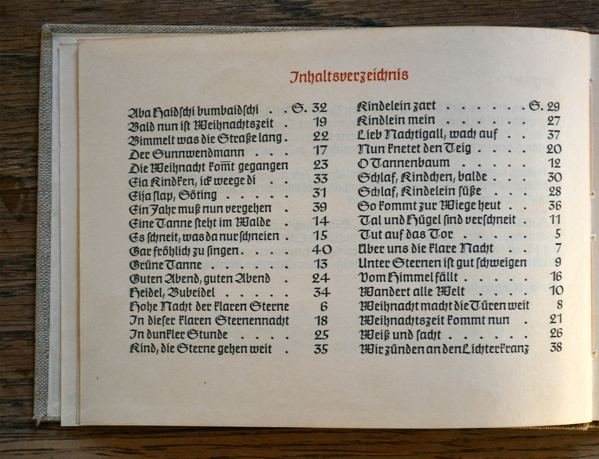
The table of contents reveals that the numerals in Claudius are not tabular.
As soon as one starts reading, one is painfully reminded that the heyday of this workshop in the tradition of the Arts and Crafts movement coincided with Nazism, and that its members allowed those in power to coopt their talents for propaganda purposes. As beautiful as Claudius and the two-colored musical notation might be, the joy is spoiled by the content which is drenched in the unholy zeitgeist.
Editor Ilse Lang’s foreword was written on Christmas 1939, only a few months after Nazi Germany had invaded Poland and started the Second World War. The introductory text vaguely hints at the war (“the moving events of our day”), and the cultural revolution of the first years of the Third Reich (“all the songs that have been created over the past few years in addition to the old familiar ones, songs that will gradually feel equally familiar to us”). For a compilation of Christmas songs, there are indeed exceptionally little references to the biblical nativity story, or Christian elements in general. “Gott” (God) and “Engel” (angel) appear only twice, and are outnumbered by terms like “Stern” (star), “Licht” (light), “Nacht” (night), “Feuer” (fire), “Wald” (woods), etc. Santa Claus is replaced by a pagan “Sunnwendmann” (Solstice man). Instead of Mary, there is “Frau Holle” (Mother Hulda). And there certainly is not a single mention of the Jewish baby named Jesus.
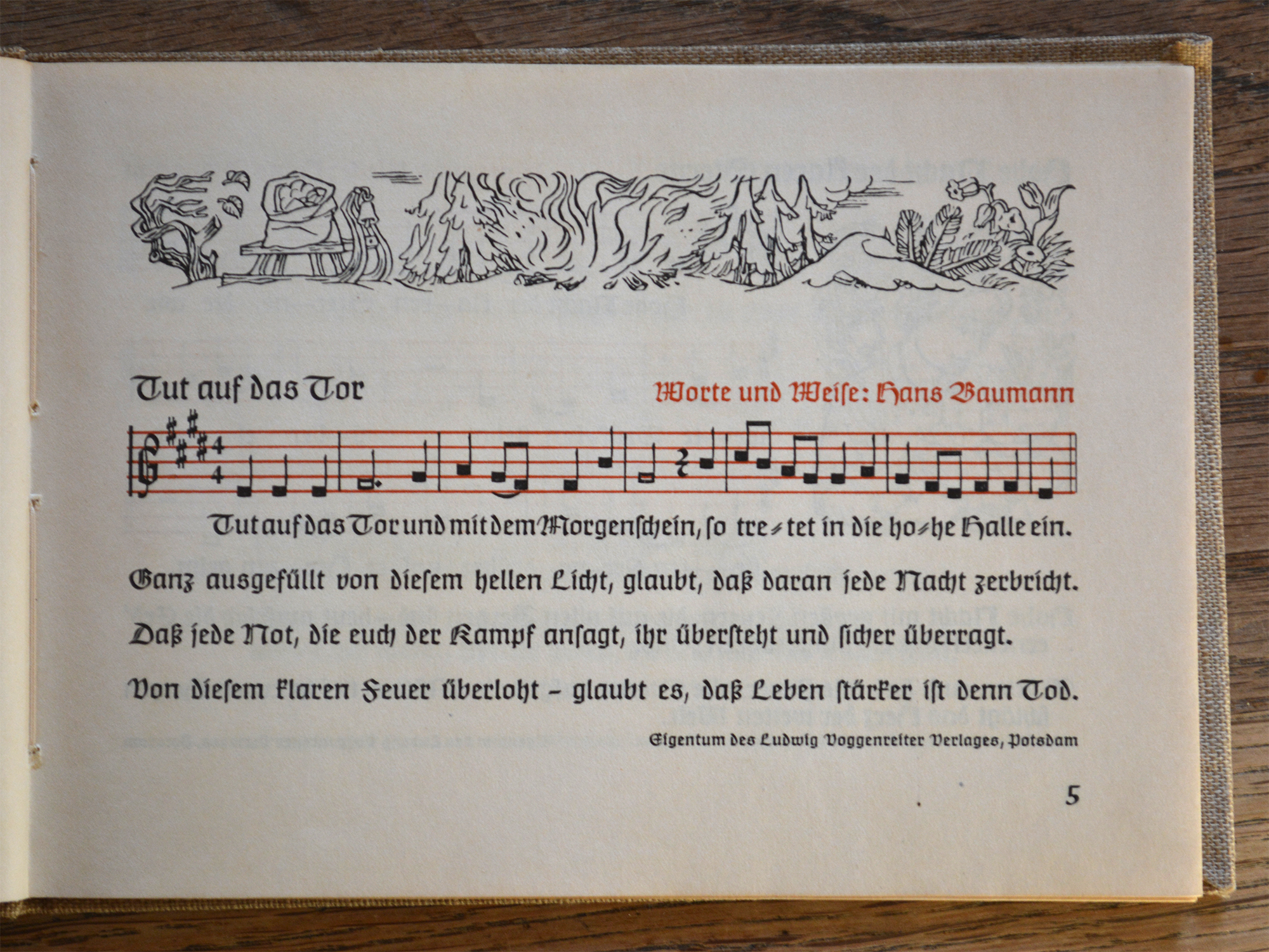
The notes with square heads are printed black on red staves. Hans Reichardt lists Paul Koch’s typeface for musical notation in his pdf for the Klingspor Museum simply as “Musiknoten”. Koch wrote about this topic in articles for Imprimatur (“Neugestaltung des Notenbildes in Handschrift und Druck”, 1933) and Klimschs Jahrbuch (“Die Musiknoten im Buchdruck”, 1940).
Several of the included carols are by Nazi songwriter Hans Baumann who also wrote “Es zittern die morschen Knochen” (“The frail bones tremble”), the official marching song of the Reichsarbeitsdienst. In “Kind, die Sterne gehen weit” he prepares the German youth for the deprivations of the war years to come and calls for soldierly obedience: “Once you grow up you will need strong hands to master the hardships. A cold home and hard bread — stop asking questions.” His “Hohe Nacht der klaren Sterne” is a prime example for the new carols of the 1930s that should replace Christian songs like “Stille Nacht, heilige Nacht” (“Silent Night”). Its success was based on the fact that it brought together key concepts of Nazi ideology such as “nature mysticism, mother cult and new birth” (Esther Gajek, see Michael Fischer’s entry in liederlexikon.de) without being clumsily obtrusive. In fact, the song continued to be popular after the collapse of Nazi Germany and is still sometimes performed in the modern day. The booklet ends on a belligerent note. “Gar fröhlich zu singen” (“To be sung gleefully”) predicts what to expect from the new year: “Viel Kampf, Heil und Segen und Arbeit fürwahr” (“Much fighting, salvation, blessings, and labor for sure.”) If you want to read more about Christmas in the Nazi regime, I recommend Faith Thomas’ feature for DW Online.
![It used to be common to mark omitted double letters with an overbar, especially for ‘mm’ and ‘nn’. These abbreviations come in handy when lyrics have to match the musical notes, see “da kom[m]t er her”.](https://fiu-original.b-cdn.net/fontsinuse.com/use-images/35/35214/35214.jpeg?filename=Lieder%20zur%20Weihnachtszeit%205.jpg)
It used to be common to mark omitted double letters with an overbar, especially for ‘mm’ and ‘nn’. These abbreviations come in handy when lyrics have to match the musical notes, see “da kom[m]t er her”.
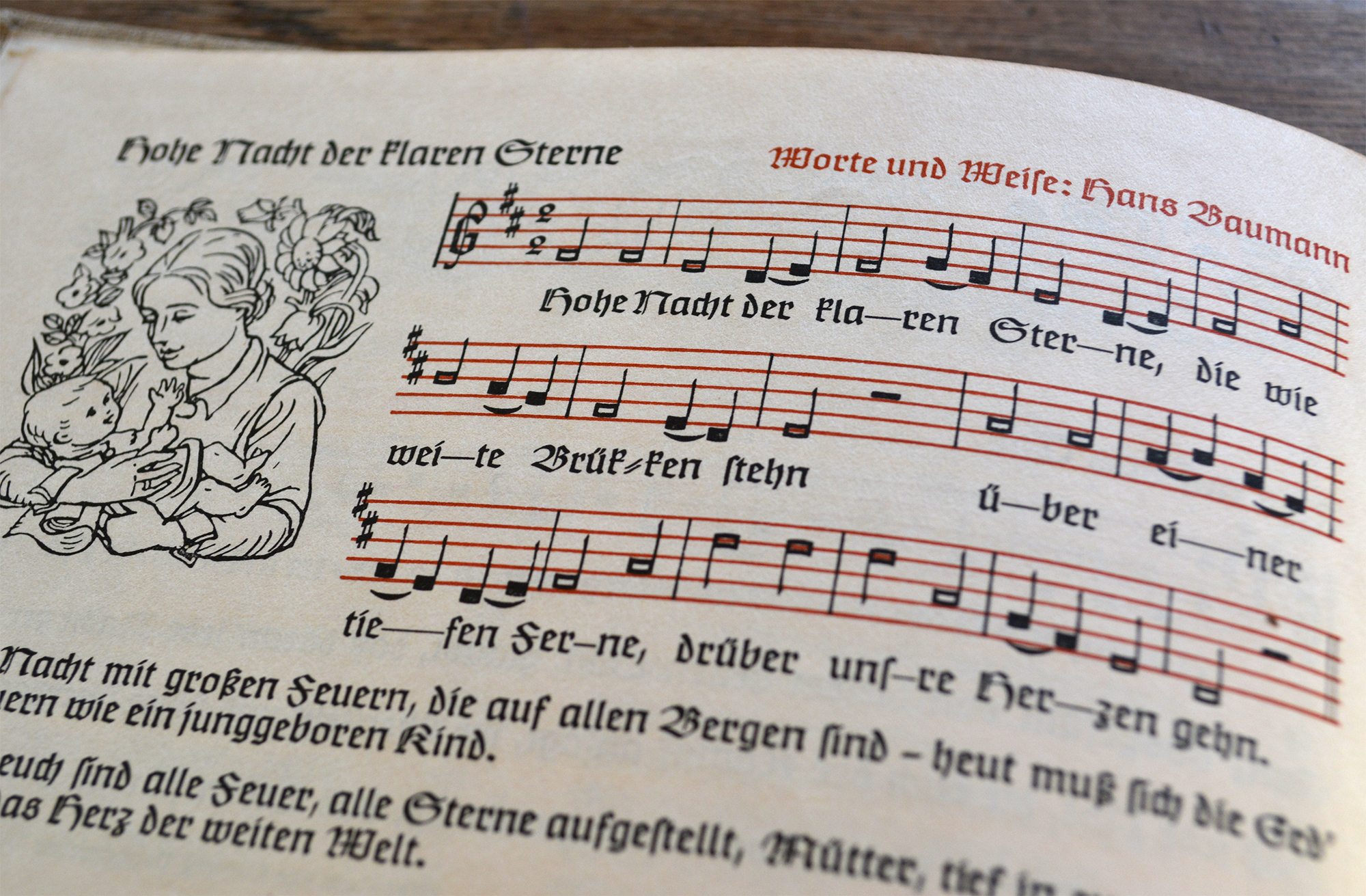
The second line features an oddity of German orthography as used until the reform of 1996. When words are hyphenated at the ‘ck’ digraph, the spelling changes to ‘k-k’ (Brücken → Brük-ken).

Like most metal typefaces, Claudius has compact umlauts with integrated dots (or strokes), see “Äpfel”. It comes with a number of ligatures, some of which can be observed here (ch ck ſi ſſ ſt). See the full glyph set on Gerald Lange’s Flickr page.

")


")

")


")


1 Comment on “Lieder zur Weihnachtszeit (1940)”
A striking piece–thanks for writing this.
The feature you link to on Heinrich Pauser is even stranger: an anodyne, advertisement-filled magazine of art and commercial design printed bilingually in English and German in April 1943.
Reading it I felt that I was examining a magazine from an alternate universe in which Hitler won the war in Europe, not one published two months after the final surrender at Stalingrad. Most striking is the bland, studied writing about propaganda shop displays with 'a distinctly political character’.