
Concrete Quarterly, No. 2
Concrete Quarterly has been an attractive and informative mouthpiece for the British concrete industry for nearly 70 years, from 1947 to the present. The Concrete Centre generously scanned and hosts an archive of every issue on their website.
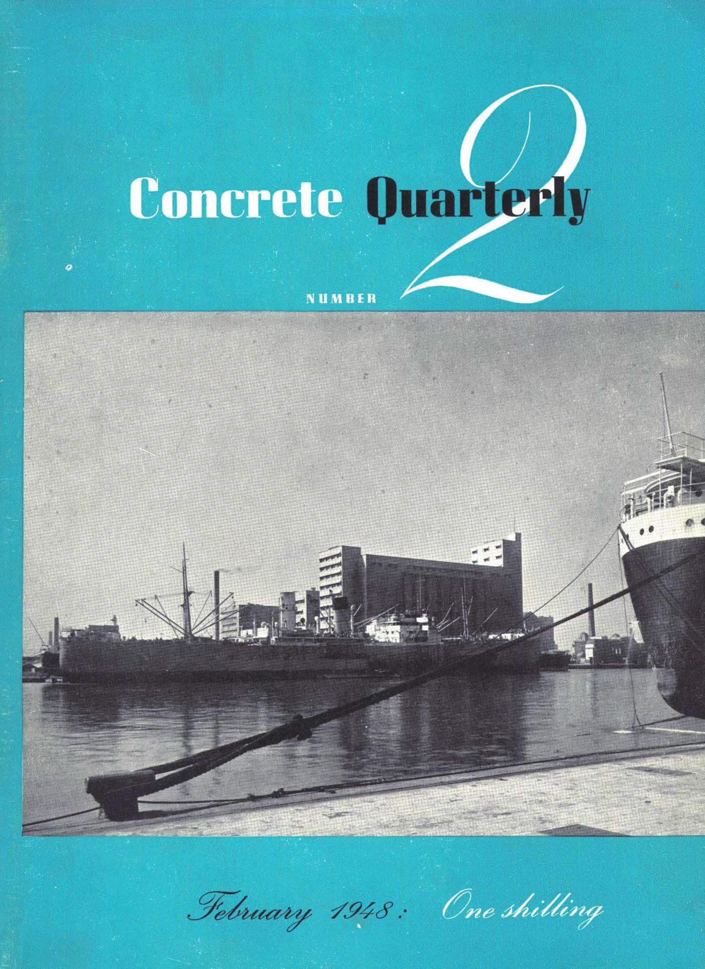
The design and typography varies widely over the magazine’s run. Issue No. 2 uses Corvinus and Bodoni throughout, and on the cover, Marina Script, a face which Stephenson & Blake proclaimed shortly after its release as “undoubtedly the finest script type now available in this country, preserving in a most elegant manner all the subtleties of the true copperplate alphabet.” The font’s interlocking bodies ease proper setting and alignment, but something happened to the connections on “One shilling”.
See also The Ministry of Type on CQ. Clare Skeats also talked about CQ at this week’s Letterform Live in London.

“A Notable Swiss Bridge”. Now known as the Lorraineviadukt, it was the longest four-track railway viaduct in Europe at the time of construction.

“Glasgow Remembers its Solitary Women”, a building for single women only.

“Improvements at the world’s biggest gas-works: The Beckton Plant”


")


