
Tržnica, Bratislava
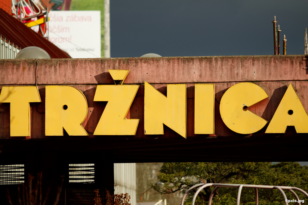
Tržnica, or actually Nová tržnica (“New Market”) is a market hall in the new city of Bratislava, the capital of Slovakia. The mounted yellow caps are not custom made, but were derived from a typeface named Black Body. Peter Steiner designed it for Berthold Fototypes in 1973. In some regards, it’s like Kabel Black on steroids.
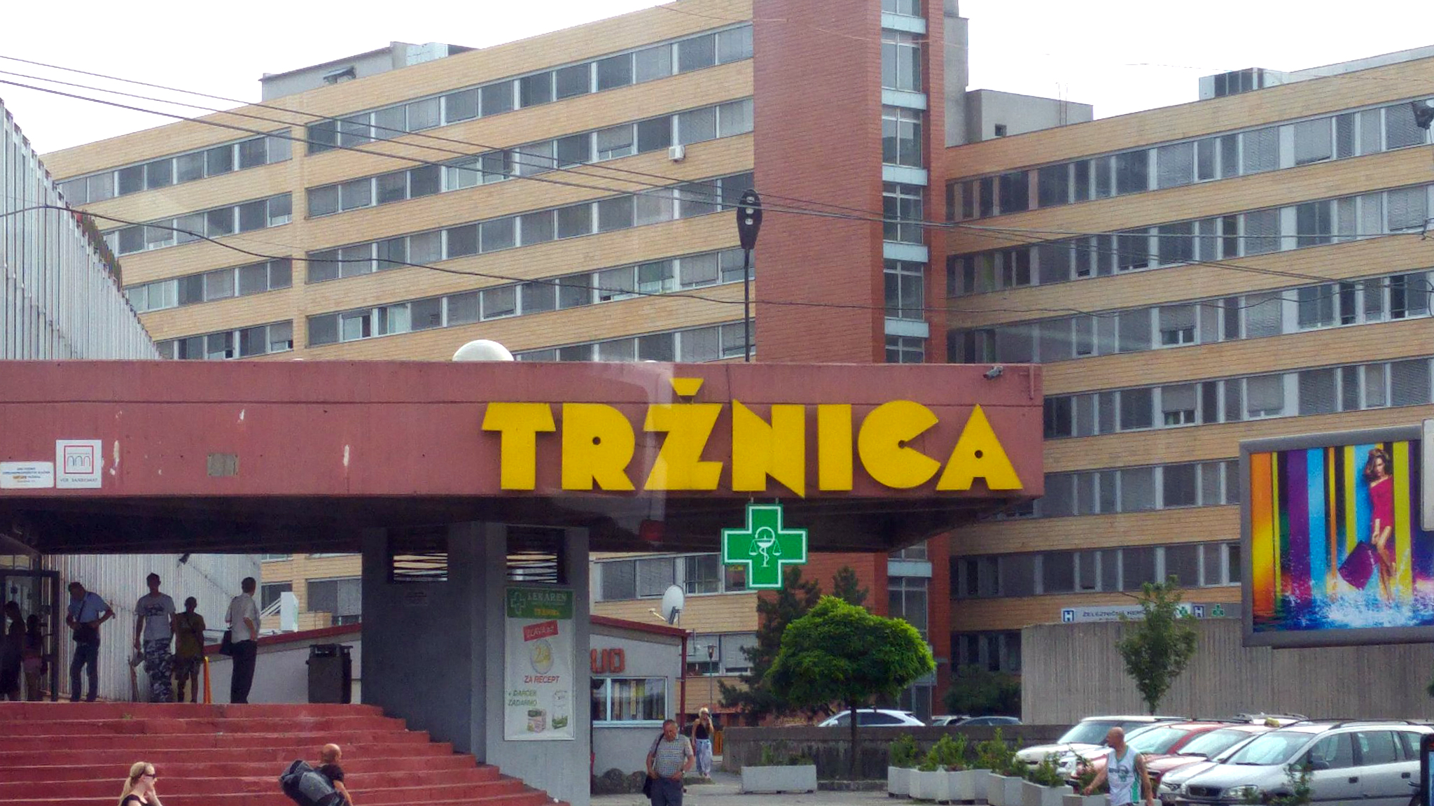
With mounted architectural letters, it’s often the case that the overshoots are ignored, and all letters indifferently aligned to the baseline. This seems to be the case here, too – in the image above, the round C sits a tad too high. In the images shown below, the C gets totally out of line. Maybe the letter was remounted at some point, or maybe it’s a different sign at the other side of the porch.
From Matúš Teplický’s review for Triptease:
In the early ’80s, Tržnica was a top-notch marketplace. Built in the then popular high-tech style in one of the busiest city squares, it was the place to be. A lot has changed since and modern shopping centres have mushroomed all over the city, but Tržnica has stayed the same. A kaleidoscope of workers, housewives, pensioners and winos, it’s stuck somewhere near the end of the 20th century.
Jonathan Hill made a digital interpretation and expansion of Black Body as Mekon (The Northern Block Ltd, 2010), but sadly doesn’t credit the original source.


")


")


")


 TV series")


