
Square Circle Triangle by Bruno Munari

Cover and band of Square Circle Triangle.

Cover and band of Square Circle Triangle.
Bruno Munari’s three books on the circle, the square, and the triangle have a complicated publishing history. The first two, La Scoperta del Quadrato and La Scoperta del Cerchio, appeared in 1960 and 1964 respectively, published by Vanni Scheiwiller & Piero Draghi/All’Insegna del Pesce d’Oro in Milan, Wittenborn & Co. in New York, and Eric Diefenbronner in Stockholm (and by the Tschudy-Verlag in St. Gallen as well, for the first volume). The format of these two volumes was 15.5×15.5cm square, and the title and author’s name appeared on a band about 1/3 the height of the book. The third volume, however, La Scoperta del Triangolo, did not appear until 1976. It was published by Nicola Zanichelli Editore in Bologna as part of their “Quaderni di design” series, in a much different (and to my eye less-well-designed) format. That series also included a reprint of Munari’s volume on the square (1978), but curiously never included the one on the circle.
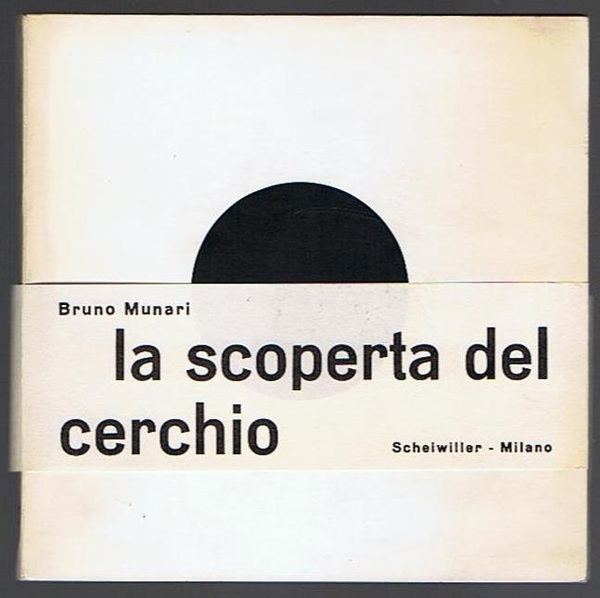
The cover of the original (1964) edition of Munari’s La Scoperta del Cerchio.
In 2015, Edizioni Corraini, working with Princeton Architectural Press, released a 3-in-1 edition of Munari’s books which restores the size, square format, and cover band of the original two volumes. PAP’s designer, Paul Wagner, chose for the band Dada Grotesk, a very close match for the Aurora-Grotesk on the original band (images of Aurora specimens posted to Flickr by Indra Kupferschmid confirm this identification). For the spine and interior of the book Wagner chose Excelsior, again, he says, to match the type in the 1960/1964 editions.
Aurora-Grotesk, designed by Johannes Wagner from Leipzig, Germany, was distributed by the C.E. Weber foundry in Stuttgart. It was one of a number of similar fonts distributed by various foundries in Germany and around Europe during the first decades of the twentieth century, according to Claudio Piccinini and Uli Stiehl writing on Typophile in 2009. In the same Typophile thread where Piccinini and Stiehl shared their research, Paul Barnes noted its similarity to Venus-Grotesk, the typeface Jan Tschichold chose to set die neue typographie (1928).* Piccinini wrote that the earliest records he had found suggest that Weber released Aurora-Grotesk in 1912. Linotype didn’t acquire any of Weber’s catalog until 1971 (according to the foundry’s page on Wagner), and they don’t appear to have ever released anything but the two condensed Aurora faces still in their digital catalog today, so I suppose the bands for the first two Munari books could have been printed letterpress with the original cold-metal type from Weber.
Dada Grotesk was released by Optimo Type Foundry in 2009. The designers were the Paris studio deValence, who designed the font for use in their design magazine Back Cover (published by Éditions B42, of which six issues have appeared since 2008). The firm based their design for Dada on the typeface used to print at least the 1918 issue of the art magazine Dada Paris (perhaps they meant Mouvement Dada Paris?). Dada has a slightly less geometric look to it than Aurora has, as Piccinini notes. But I disagree with his verdict about how it compares to Aurora in use: it very much has the same feel. I use Dada frequently, so I’m pretty familiar with it, and it was a bit of a shock to run across what at first looked like Dada in the images of the original 1960s Munari covers in Giorgio Maffei’s edited compendium of Munari’s book designs (Munari’s Books, Princeton Architectural Press, 2015). It’s really a great match for the original.

Spine of Square Circle Triangle.
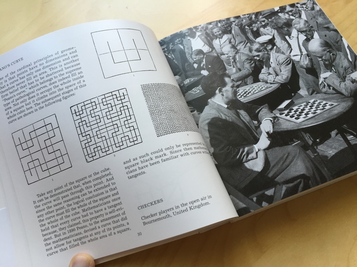
Interior of Square Circle Triangle.
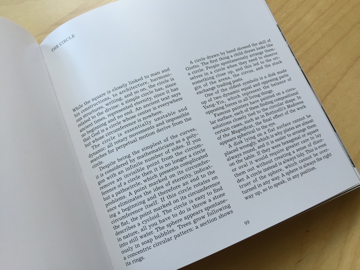
Interior of Square Circle Triangle.
Excelsior was originally designed by the American Chauncey H. Griffith, and released by Mergenthaler Linotype in 1931. (Griffith eventually became VP of the company in 1936.) Griffith’s specialty was newspaper typefaces, and Excelsior was one of the most popular such faces of its day. I have not seen the interiors of the original editions, but given its lineage, I would not be surprised to find Excelsior’s for-real metal ancestor in the first two volumes of Munari’s trilogy.
(Additionally to the sources linked above, thanks to Paul Wagner for help with background information on his design.)
*Author’s correction, 2 August 2016: Indra Kupferschmid informs me that the text of die neue typographie was set in something closer to Aurora. A quick check of the University of California’s 1995 English translation/'facsimile’ edition and its colophon confirms that its designers would agree.

Spine of Square Circle Triangle.

Interior of Square Circle Triangle.

Interior of Square Circle Triangle.

The cover of the original (1964) edition of Munari's La Scoperta del Cerchio.


")


")

")


")


5 Comments on “Square Circle Triangle by Bruno Munari”
This is great, thanks. Since the original book was printed in Italy, I guess they used Cairoli by Nebiolo (and perhaps their Egizio), not Aurora, but which has its roots in the same source, Wagner & Schmidt in Leipzig. This sans serif pops up under various names from 1909 on. Likewise, Die neue Typografie was not set in Venus but also one of these Wagner faces as I found out in Barcelona the other year.
(Neue moderne Grotesk – as I usually call the design – is similar to Venus but foremost in the bold extended cut which appears to be identical or of the same roots.)
There are several new typefaces inspired by this design now – luckily, as there is still no good digital version of Aurora. The article linked to above mentiones Stephan Müller’s design I hope will see the light of Font Releases soon.
I found this while picking up my old research on Cairoli/Aurora. I have also read all your entries on Flickr, Indra. Thanks much for deepening the subject.
If you happen to see this, I wished to ask: do you have particular proof to attribute the first casting to Wagner & Schmidt? Their “Neue moderne Grotesk” samples you posted here on Flickr are not dated, if only tentatively. Thanks much!
P.S. Maurice, that is undoubtedly Cairoli, 100% sure as Munari surely printed where they used Nebiolo faces, and since they had their version it’s quite a safe bet to say that almost one in Italy used one of the German versions.
Technically, Wagner & Schmidt did no casting. They were a company that produced matrices to sell to other foundries. But to make it all more complicated, the Wagner family (Ludwig Wagner and two sons) was involved in several type foundries. Neue moderne Grotesk was the name at the Ludwig Wagner foundry of Leipzig and is dated to 1909 in the Seemann (light/regular style, I’m sure I mention that date on Flickr, too). Edel-Grotesk, for instance, was the name at the Johannes Wagner foundry (son of Ludwig) which later had a close collaboration with Weber, who cast the design as Aurora. The info in the post above is not totally correct as we do not know who designed the typeface. Likely not Johannes Wagner though.
I wrote a longer article about the typeface for the release of Forgotten Shapes’ version of it. It should be published in the near future.
Hi Indra, Don’t worry: thanks much. We can talk a bit via email, if you want.
Yes, I realize Wagner & Schmidt was not casting type, but they designed them in order to produce the matrices to sell to the foundries, right?
Anyway, I see you did a presentation about the complicated story of the company. Is there a transcription? I’d like to know where you gathered the 1909 date. Makes sense, as the earliest (dated) example of Neue Moderne/Aurora that I have, as Cairoli, is from 1910.
I have just followed you on Twitter; in case my email address is outdated (possible) I will give you my current one.
I also registered to “Fonts in Use”: I meant to do it for quite some time… :)