
New York magazine, Culture Pages, Fall Preview 2016
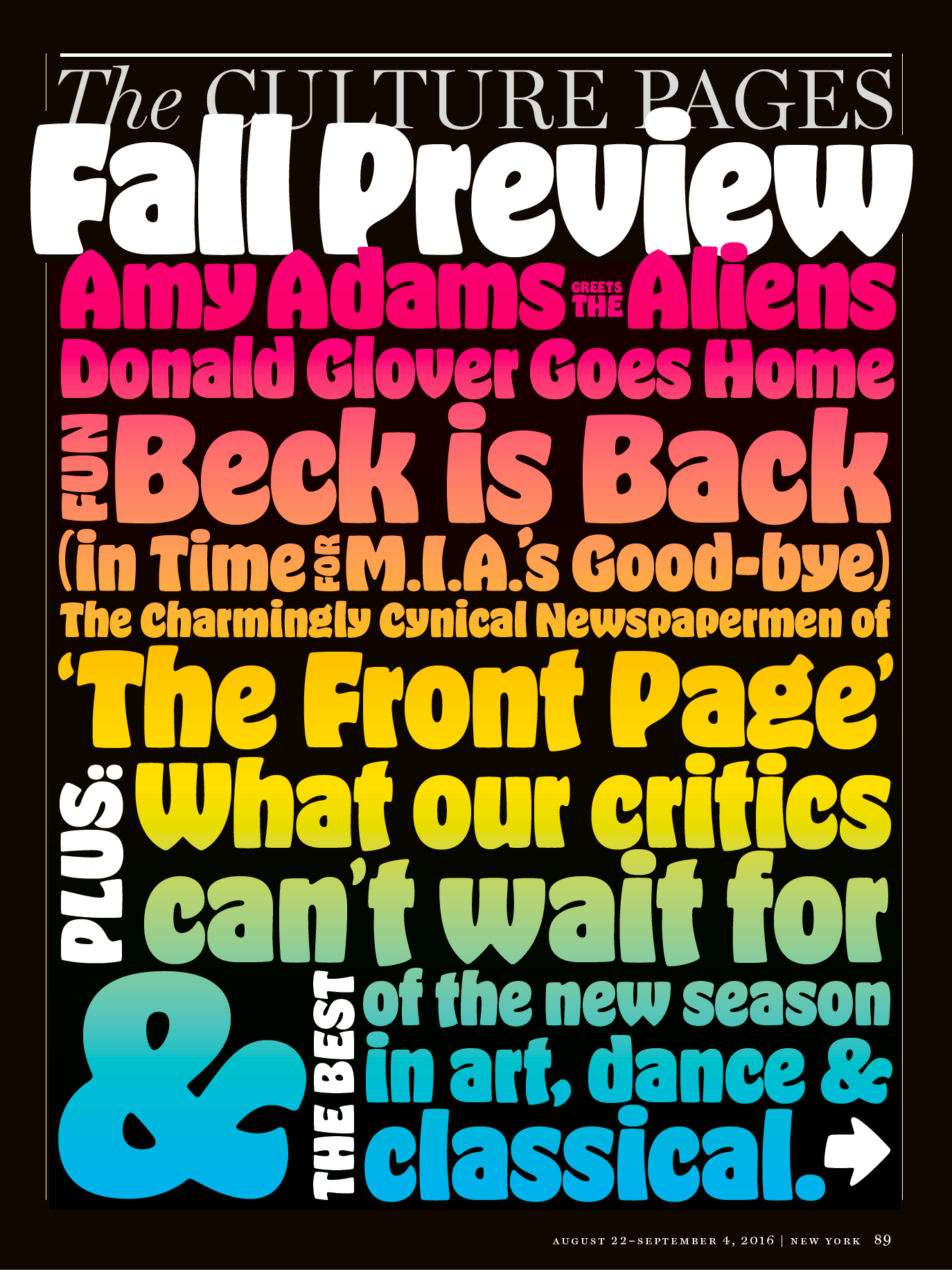
The opener page is almost exclusively set in Hobeaux Black, stacked and justified, with a rainbow gradient. Parentheses and quotes/apostrophes are taken from lighter weights of the 5-style family.
Just in time for OH no Type Co.’s first anniversary, founder James T. Edmondson’s “dreams are coming true, thanks to the brave designers at @NYMag.” The Culture Pages of New York’s Fall Preview issue 2016 are a celebration of his Hobeaux.
Credits: Thomas Alberty (Design Director), Randy Minor (Art Director), Chris Cristiano (Deputy Art Director), Miranda Dempster (Strategist Art Director), Stevie Remsberg (Art Production Manager), Aaron Garza (Designer).
The section titles are in gigantic Hobeaux Black, cropped and partly superimposed, sometimes rotated. The colored numbers and the authors’ names feature the Bold weight.

The pilcrow (¶) is a space-efficient means to mark paragraph breaks.


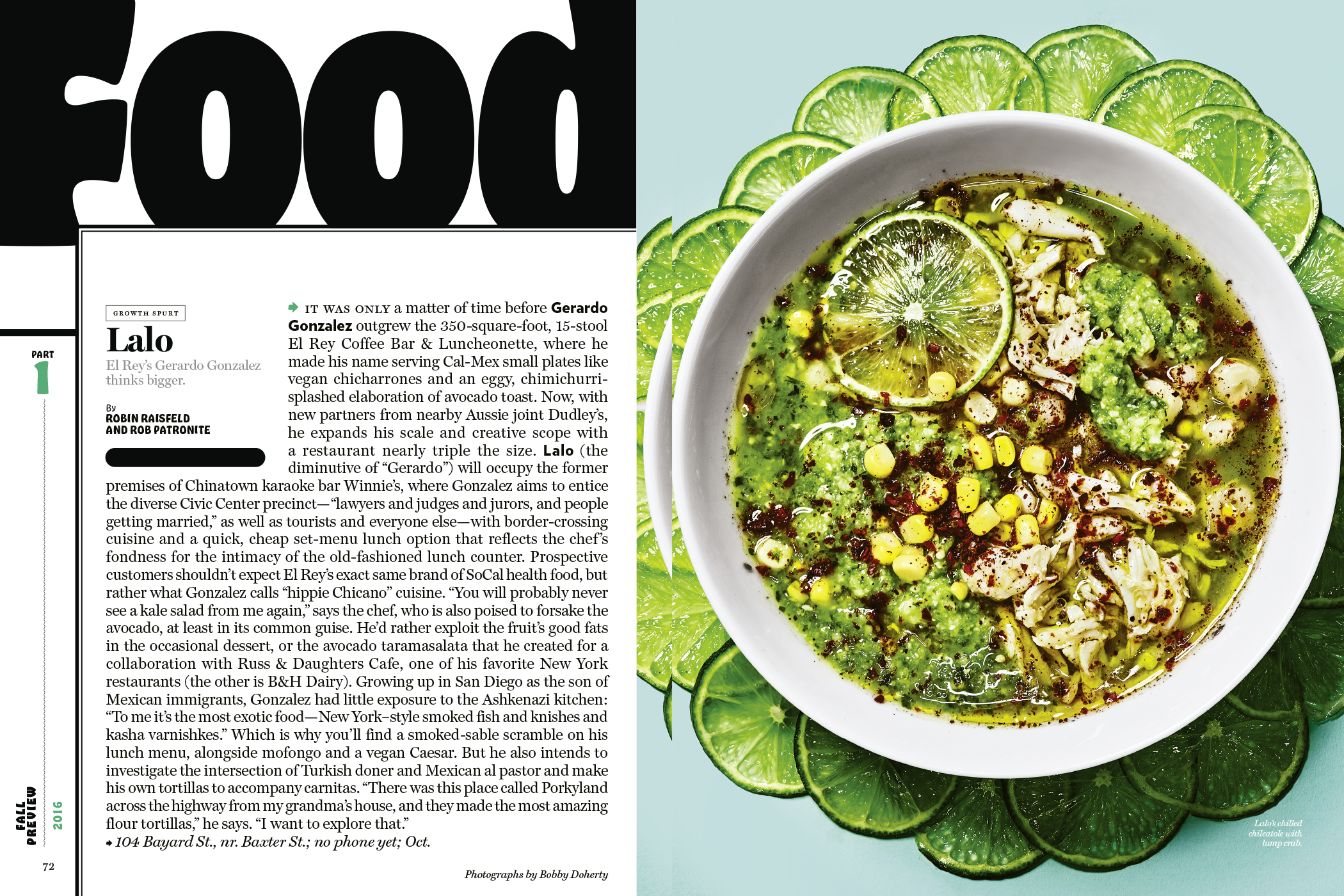
Hobeaux drop cap! Fun fact: “Loser” was released in 1993, just like Whale’s “Hobo Humpin Slobo Babe”.


Detail from a column in the Pop section


")


3 Comments on “New York magazine, Culture Pages, Fall Preview 2016”
Hobo type sucks, even if used ironically.
^^^ Ahh, yes, but Hobeaux, now that’s a sweet looking typeface.