
H. Niehaus invoice, 1944

The first vintage invoice I’ve posted here featured a combination of sans serif and blackletter — “German” letterforms for the company’s name, “Latin” ones for everything else. In this one, it is the opposite way around. This formula — Fraktur as default, with proper names of persons or locations distinguished by the use of Antiqua (i.e. roman, incl. sans serif*) — was in fact the convention for German texts for centuries.
*) The term for sans serifs as defined in the German DIN classification is actually Serifenlose Linear-Antiqua (“serifless linear roman”), clearly labeling them as a subgroup of romans.
“H. NIEHAUS, HASSEL” is set in a typeface that today is best known under its export name, Phosphor. In Germany, it was generically named Lichte fette Grotesk (“Open bold sans serif”). Designed by Jakob Erbar and released in 1923, it is the harbinger of the Erbar-Grotesk series (1926–30). With its “instant logo” qualities, the all-caps inline face enjoyed great popularity — Lichte fette Grotesk can be found on many invoices from this era. This commercial success caused Ludwig & Mayer to add several related styles (Lucina, Lumina, Lux), and other foundries to follow up with similar releases, see e.g. Helios (1928), Elegant-Grotesk licht (1929), Friedrich-Bauer-Grotesk licht (1933), or Kristall-Grotesk lichtfett (1938). Lichte fette Grotesk came with a few alternates. Both forms of ‘S’ have been used here.
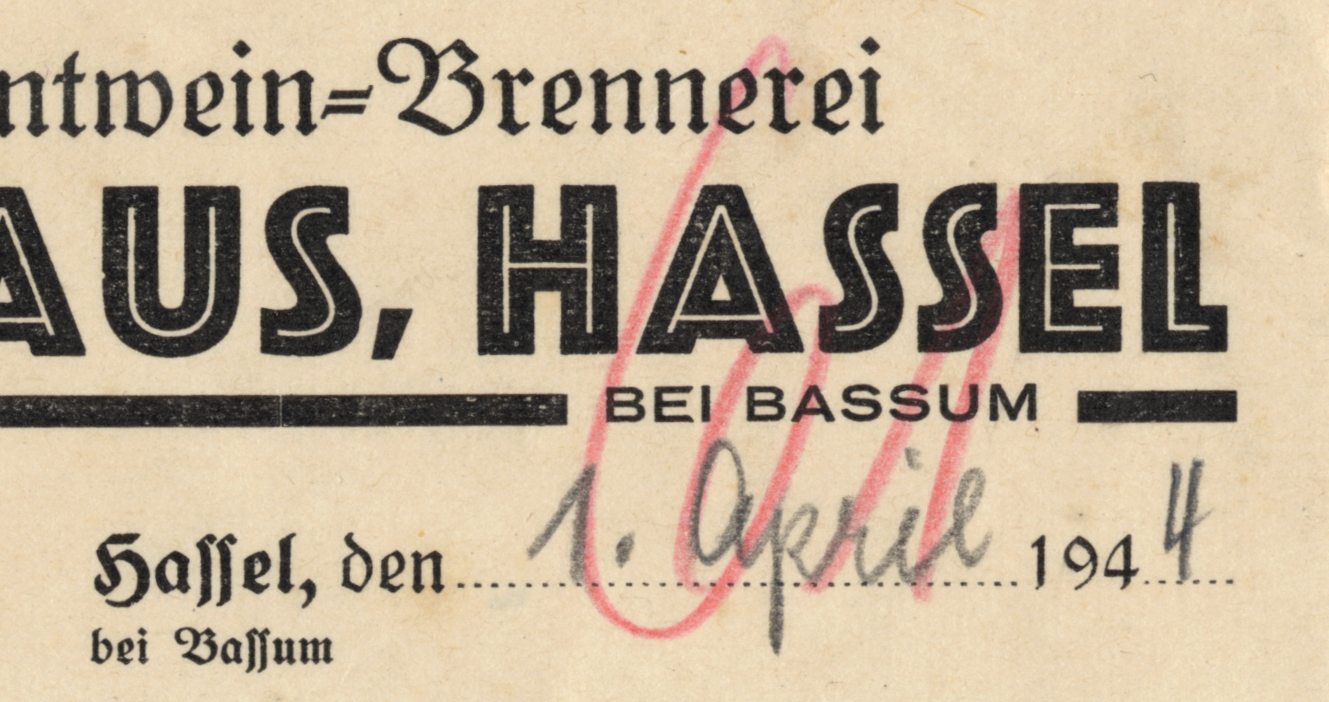
The other faces constitute a random mix with too many uncoordinated ingredients, likely determined primarily by what the local printshop had in their type drawers. There’s Rudolf Koch’s Deutsche Schrift, in fett (“Rechnung”, “Eigenes Erzeugnis …”) and schmal (items). Potsdam schmalhalbfett makes an appearance, too (“für Herrn Gastwirt”). The rest is set in two weights and various sizes of Kleukens-Fraktur, with the smallest sizes added from one of the countless standard frakturs, see Normal-Fraktur. The initials (“H.N.”) might be in Kabel fett, but that’s hard to tell from two caps only. The way the arms of the ‘E’ are sheared suggests that “BEI BASSUM” is in Venus Extended.
Metal fonts typically didn’t include special characters like the percent sign (%) or currency symbols (ℛℳ) in a matching design. These were inserted from a separate case that held miscellaneous catch-all sorts.

Typography aside, the date — just a few weeks before Operation Overlord began, yet still a full year before this area south of Bremen was captured by Allied troops — and the manually added item “Kriegszuschlag” (war surcharge) remind us of the circumstances this distillery invoice was issued, and make me wonder what kind of sorrows were drowned with these 120 bottles of corn brandy. The buyer, Erich Eschenhorst from Nordholz, didn’t live to see the end of the war.


")


