
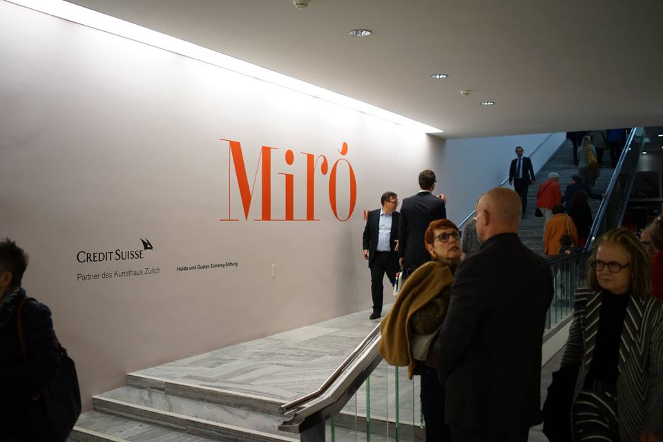
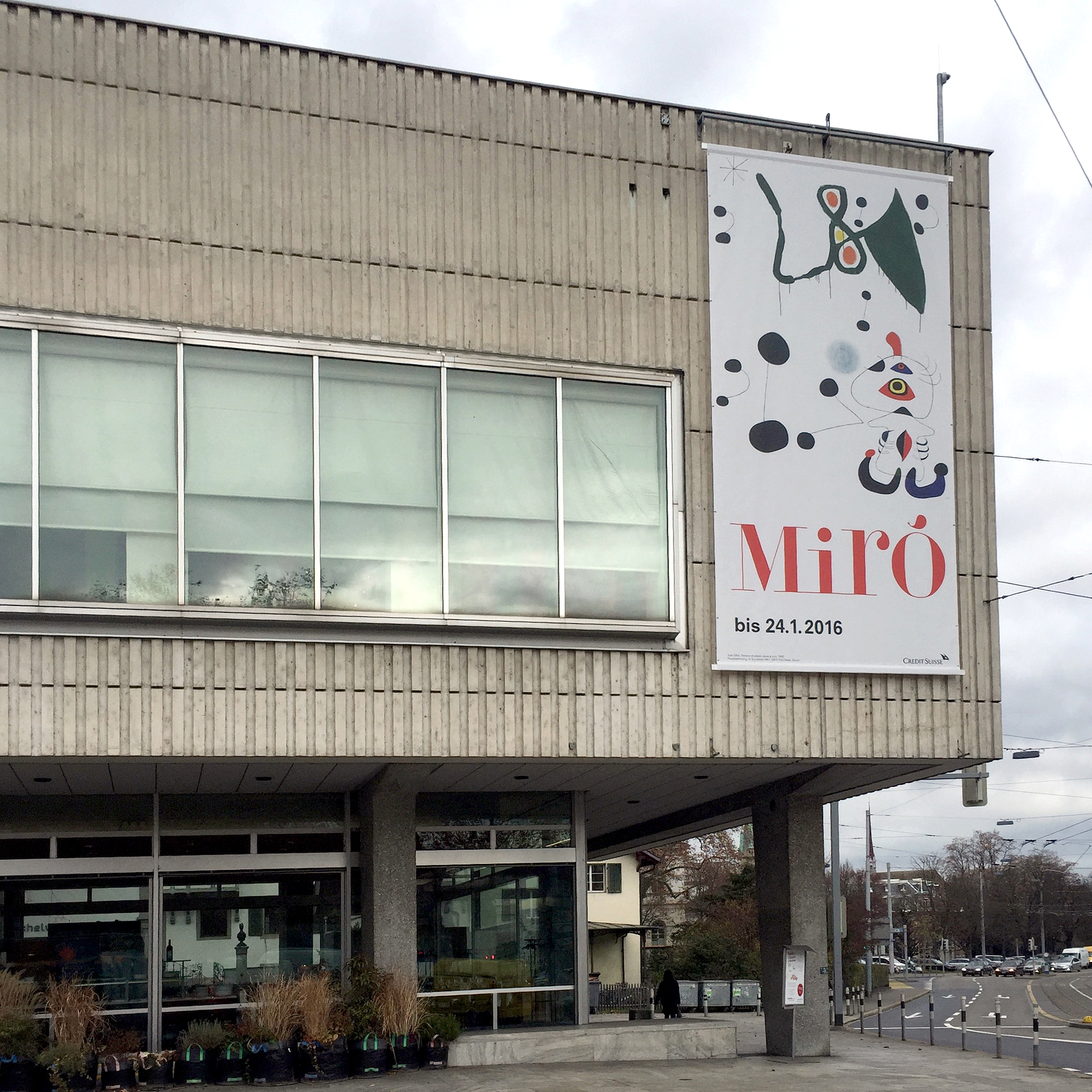
Joan Miró. Wall, Frieze, Mural, Kunsthaus Zürich
Contributed by Gareth Hague on Nov 28th, 2016. Artwork published in
.

Perla is a thoughtful choice for the branding of the Joan Miró exhibition Mauer, Fries, Wandbild / Wall, Frieze, Mural in Kunsthaus Zürich. Its circular, ball terminal motif and mix of upper and lower case characters reference Miró’s own lettering. The Didone style letterforms are a formal counterbalance to the gestural artwork, and were often used in Miró’s poster designs.


")


")


")


")
