
Muscle
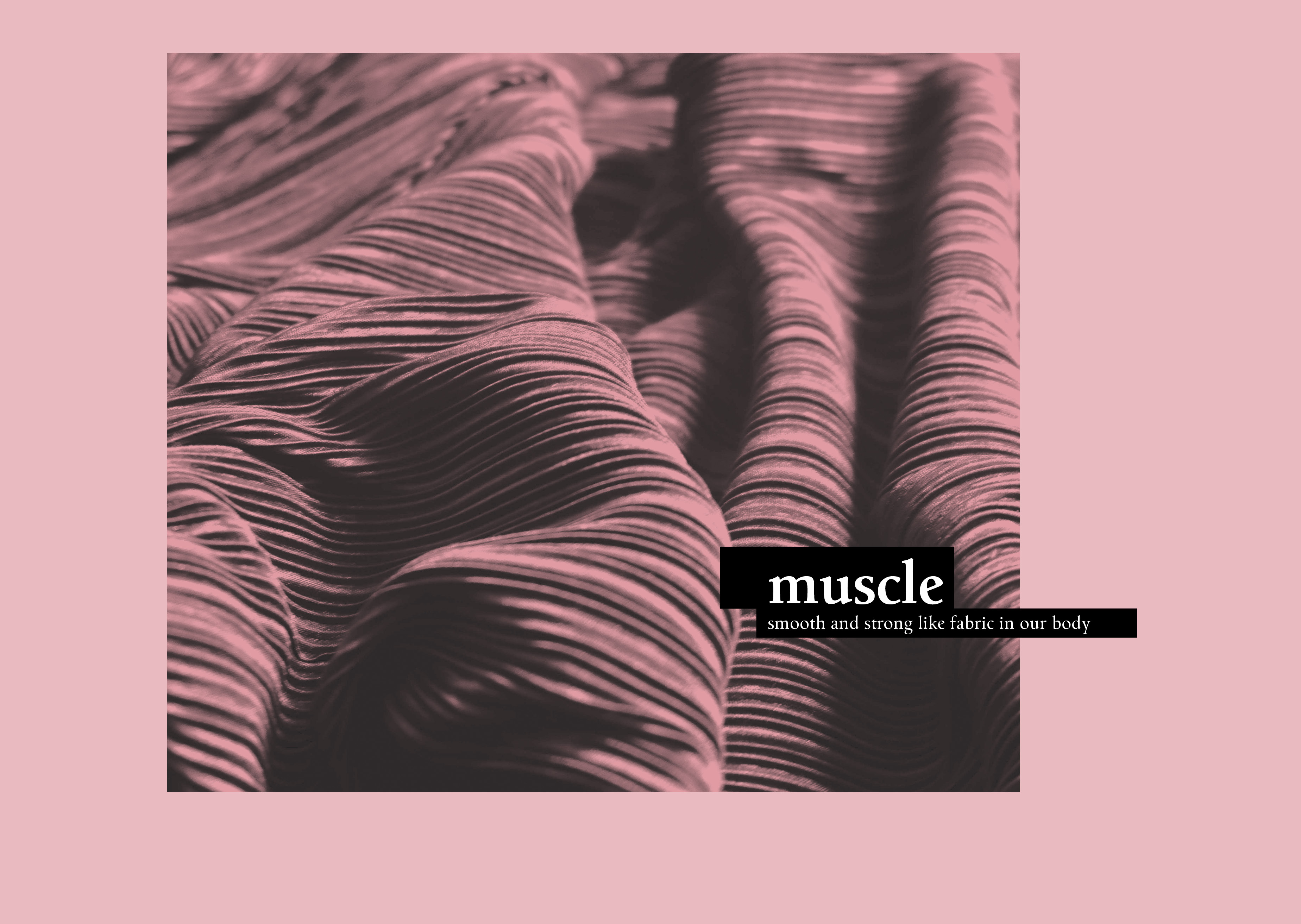
This is a graphic design school project made at the Academy of Art University, San Francisco. The assignment was to focus on a natural phenomenon, i.e. a non-artificial event in the physical sense, and therefore not produced by humans, although it may affect humans. Also eligible as a concept was any human sense or property like vision or taste or skin. I chose muscles because they are smooth and strong like fabric in our body.
Mengelt Basel Antiqua is the main typeface I used in this project. With its strokes that look calligraphic, it gives people a warm and humanist feeling. I think it is really suitable to use with this topic. Univers is perfect to combine with Mengelt Basel Antiqua, because of its clean and modern characteristics.
Most skeletal muscles are attached to bones by bundles of collagen fibers known as tendons. In the world of typography, the solid strokes of typefaces work just like the skeletons in our body. The tiny muscle graphics cover the skeletons of the typeface.


")

")


