
Weatherland by Alexandra Harris

Hardback cover
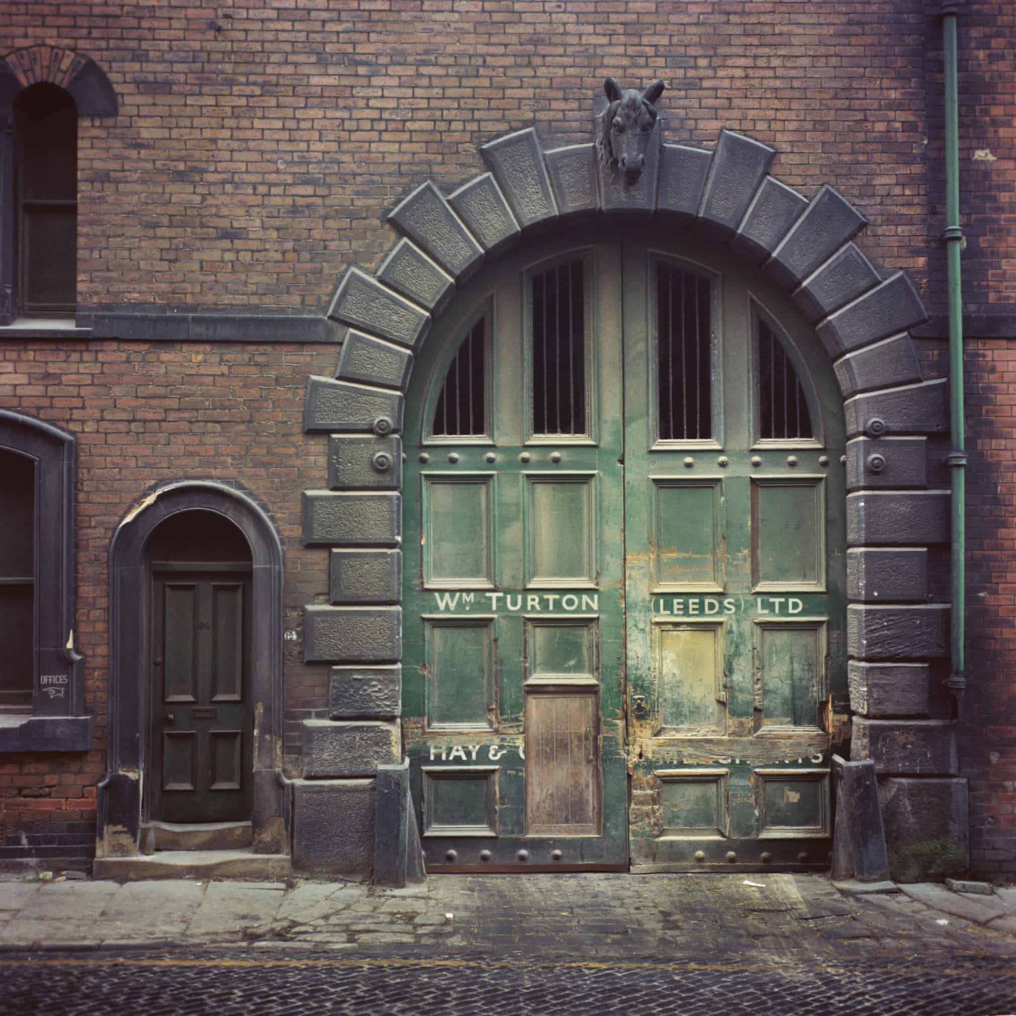
Alexandra Harris’ collection of British nature-writing was published in an interesting mixture of fonts that refers to the past without quite reusing it.
The hardback edition (September 2015) uses P22 Cézanne Pro for the title, and the rest of the cover in caps and small capitals of English Grotesque, an industrial-style sans based on the many pieces of sans-serif lettering around the UK similar to (or preceding?) Johnston and Gill but not a direct copy (here’s a good example – sign painters in this style seem to have had a lot of fun with ampersands). The body text and a quote on the cover is in Carat, an Ungerish sharpened old-style from Dieter Hofrichter.
The same fonts are used throughout the book – rather neatly the numbers referring to endnotes are also English Grotesque, making them noticeably more solid than the text and easy to spot. It’s a well laid-out book, although perhaps Carat gets a little fragile when used for the blockquotes in a smaller size. Cézanne also recurs in the text – it’s the font used for ornaments. The paperback (July 2016) uses a title in Perpetua (quite appropriately, as both Harris and Gill are from Sussex) and small text in Brandon Grotesque. The cover of the Australian edition uses English Grotesque and Carat.
I think the logo of publisher Thames & Hudson is based on Bliss but with the capitals and ascenders cropped a little.

Paperback cover

Detail from the interior, in Carat

Cover of the Australian edition


")


I once asked Dieter which of his fonts he considered the most successful and he replied that it would be Candide, which surprised me. I use Candide but personally find Carat to be the best; even if Oliver Linke and Kai Büschel are of the opinion that it would be Carrara and Cala.
But I also have to admit that the Carat is a personal preference because of its shapes. Carrara and Cala are, as I have argued elsewhere on this blog, underused.
For example, if you compare the Adobe Garamond with the Carrara and the Milo, it soon becomes clear that with the same x-height the Milo runs a little narrower, but the ascenders and descenders of the Carrara are between the other two. The Garamond requires a little more space, which the Carrara stands out overall, also because it is not used as often. The deeper cuts towards the stems are clearer on the Carrara than on its competitors, which makes it easier to read.