
Through a Glass Darkly, UIC Public Seminar Series
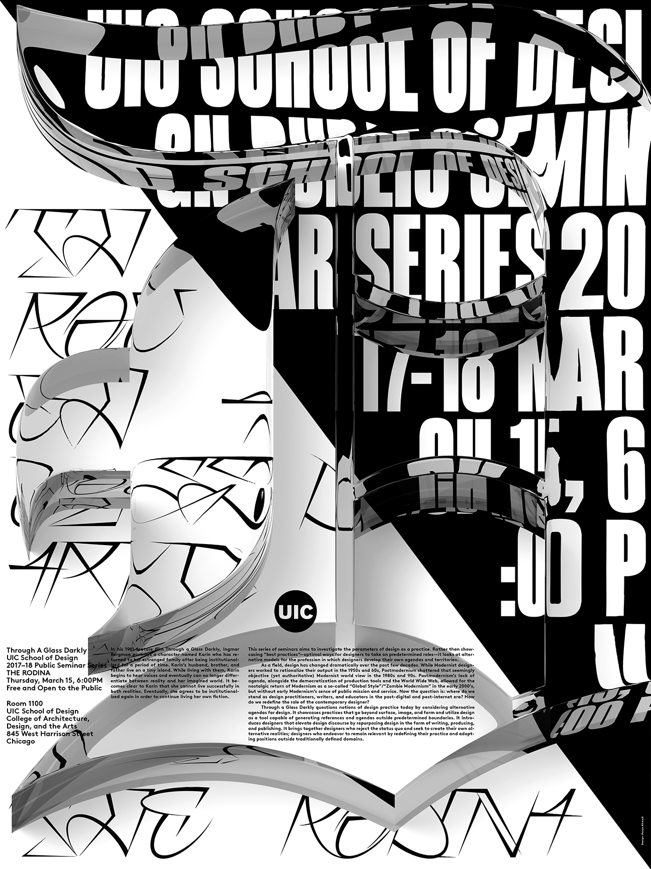
D — The Rodina, March 15, 2018, featuring Arges (Blaze Type) and Shakotan (Benoît Brun).
Through a Glass Darkly was a series of four public seminars at UIC School of Design in 2017/2018:
This series of seminars aims to investigate the parameters of design as a practice. Rather than showcasing “best practices”—optimal ways for designers to take on predetermined roles—it looks at alternative models for the profession in which designers develop their own agendas and territories.
As a field, design has changed dramatically over the past few decades. While Modernist designers worked to rationalize their output in the 1950s and 60s, Postmodernism shattered that seemingly objective (yet authoritative) Modernist world view in the 1980s and 90s. Postmodernism’s lack of agenda, alongside the democratization of production tools and the World Wide Web, allowed for the nostalgic return of Modernism as a so-called “Global Style”/”Zombie Modernism” in the early 2000s, but without early Modernism’s sense of public mission and service. Now the question is: where do we stand as design practitioners, writers, and educators in the post-digital and post-internet era? How do we redefine the role of the contemporary designer?
Through a Glass Darkly questions notions of design practice today by considering alternative agendas for design. It showcases practices that go beyond surface, image, and form and utilize design as a tool capable of generating references and agendas outside predetermined boundaries. It introduces designers that elevate design discourse by repurposing design in the form of writing, producing, and publishing. It brings together designers who reject the status quo and seek to create their own alternative realities; designers who endeavor to remain relevant by redefining their practice and adopting positions outside traditionally defined domains.
The poster series was designed by Pouya Ahmadi.
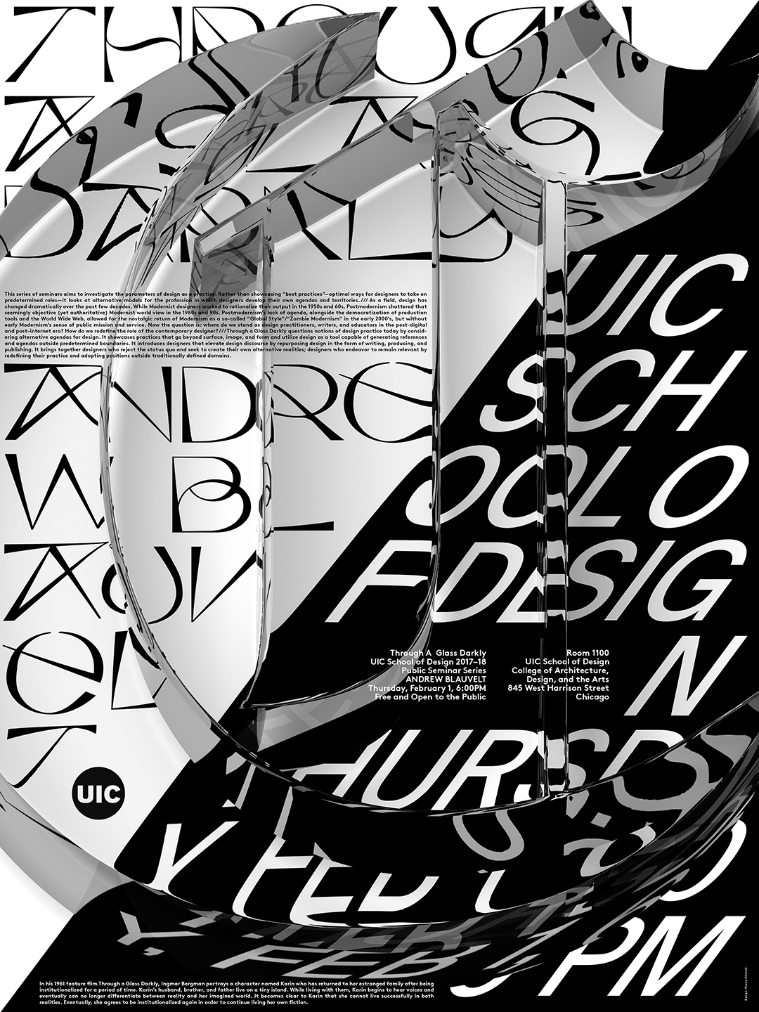
C – Andrew Blauvelt, February 1, 2018, featuring Kraft (Jacob Wise) and Suisse Int’l (Swiss Typefaces).
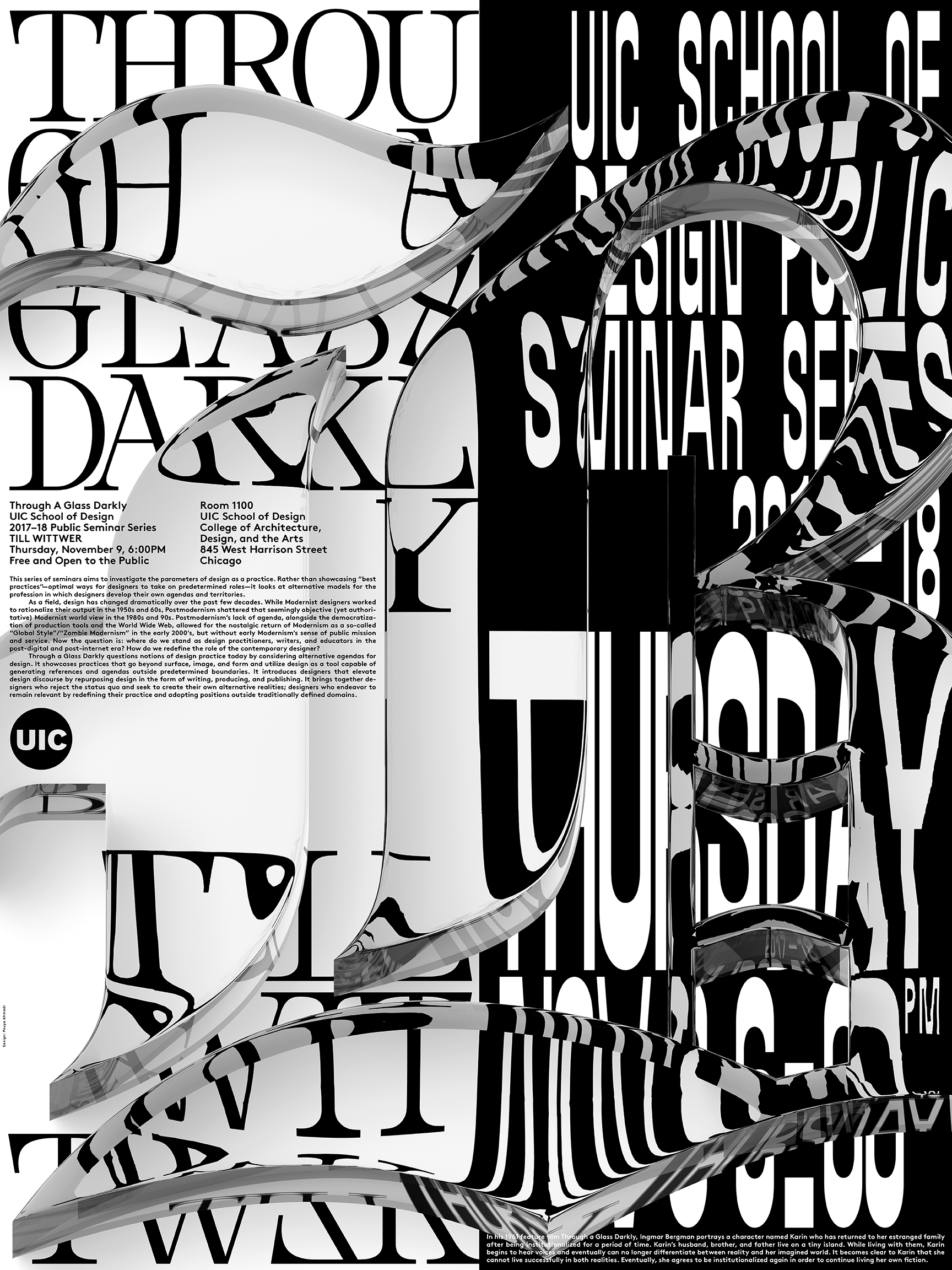
B – Till Wittwer, November 9, 2017, featuring Nemesis (Baptiste Bernazeau) and Asfalt (Dinamo).

A – Mark Owens, October 27, 2017, featuring Knif mono (A is for …) and Pano (Heavyweight).

The three-dimensional glass letters are based on a version of Engravers Old English. The text typeface used on all posters is LL Brown (Lineto).


")

")


")


")


