
New Musical Express logos

“The world’s largest selling musical newspaper. Every Friday”. Magazine ad from 1959, featuring the New Musical Express logo as it was used from c. 1953 to 1966.
Today marks the final print copy of the New Musical Express. After 66 years as one of the UK’s predominant music publications, NME ceases its weekly print edition, and will from now on exist only online.
When The New Musical Express launched in 1952, its name was displayed in enlongated Bodoni-like caps with inline, boasting enlarged initial and final letters. At least by early 1953, this logo had already made way for two lines in bold expressive and slightly top-heavy caps, shown reversed in a black field. Although handdrawn, the letterforms clearly are based on a typeface. It is Fanfare by Louis Oppenheim. The qualifier “new” is added in lowercase connected script. With some minor changes, this version was in use until October 1966 (No. 1031).

This resetting in Louis, a faithful digital interpretation of Fanfare’s regular width, shows where the designer of the NME logo took liberties with the template. Most notably, ‘M’ got spikier, ‘S’ was freed from the vertical limitations of type, and the weirdly condensed (German) ‘C’ was widened up.

No. 996, February 11, 1966, featuring Billy Fury and a redrawn version of the logo. Unlike before, ‘P’ and ‘R’ here aren’t clipped at the top.

No. 1032, October 21, 1966, with The Monkees (in Kalligraphia). This cover was the first to feature the new logo in Playbill.
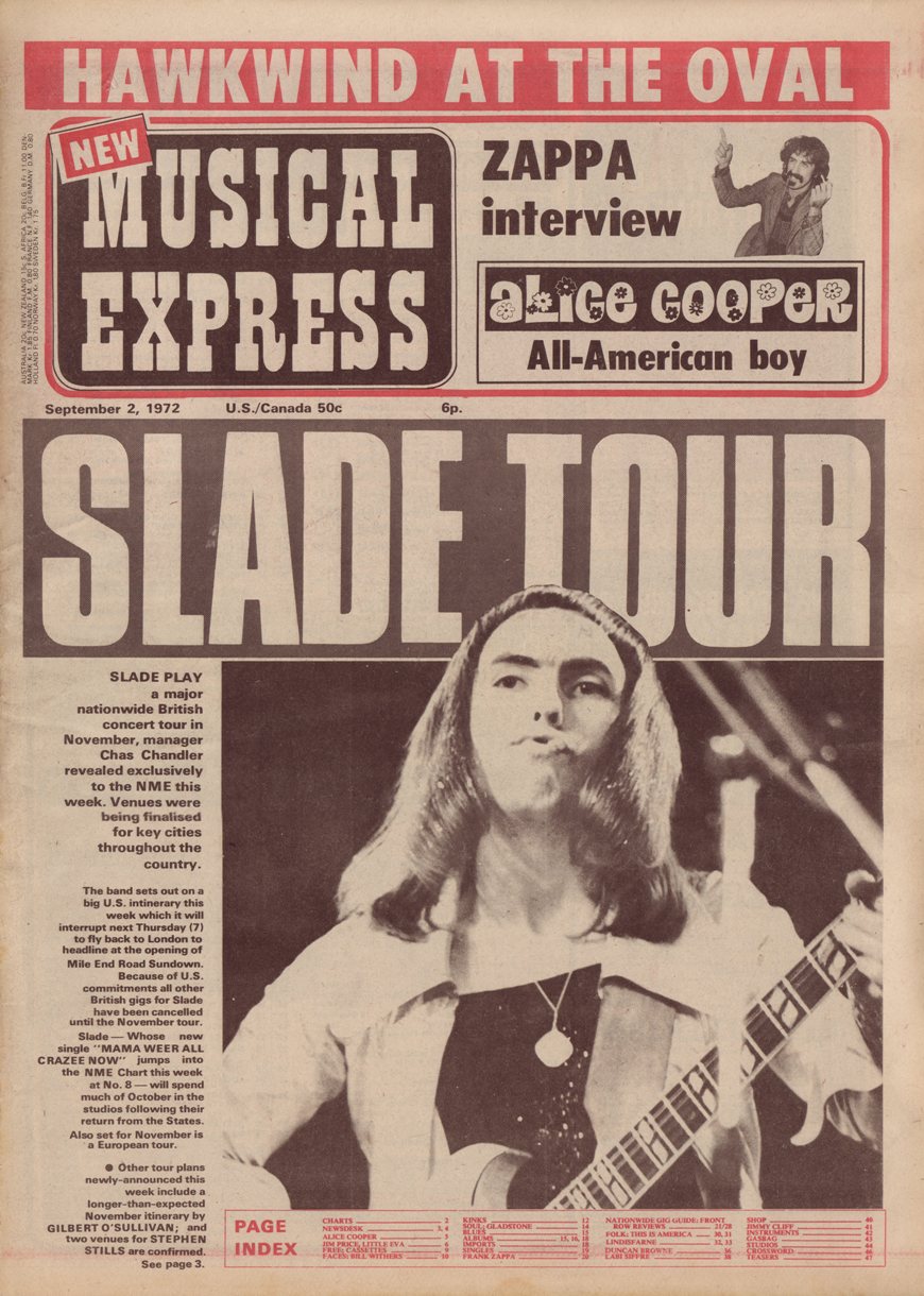
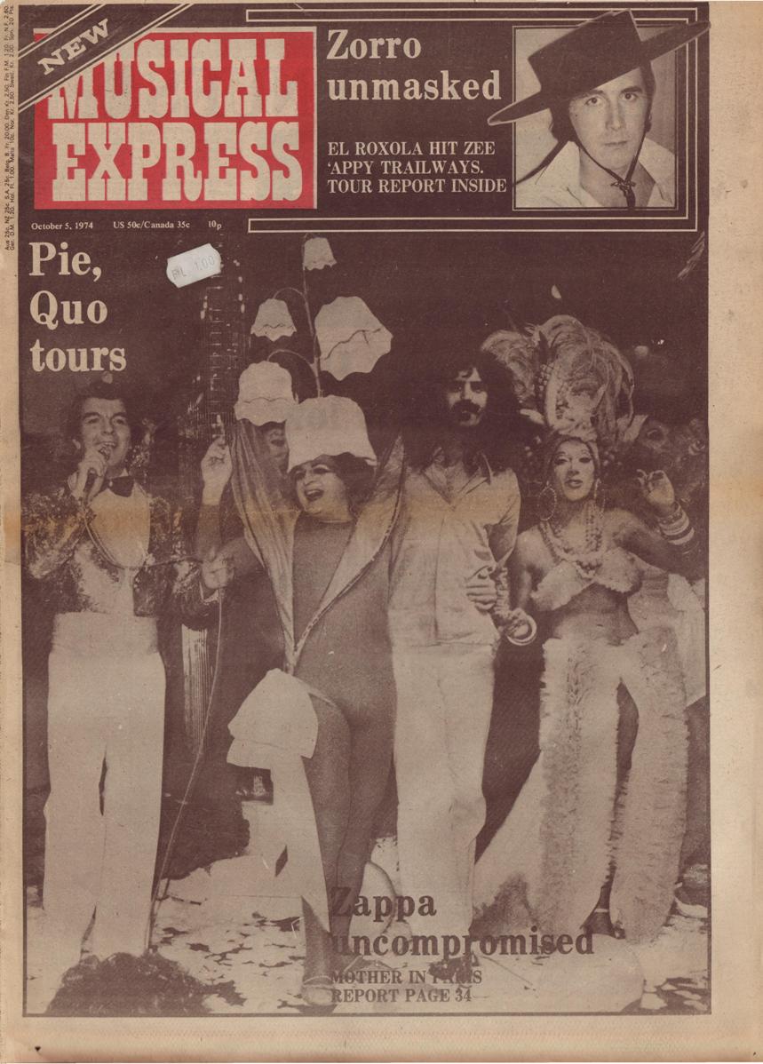
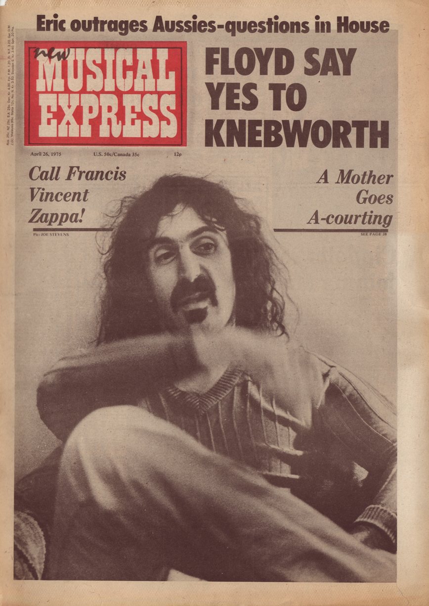
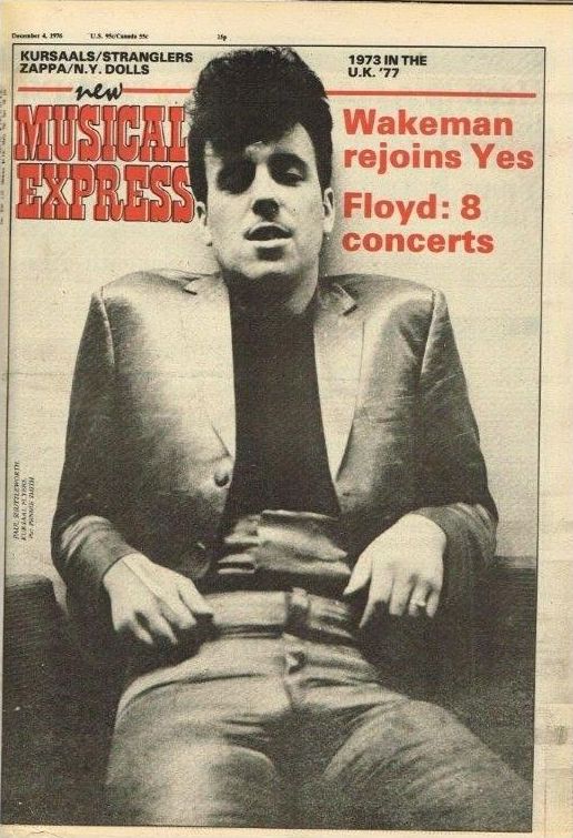
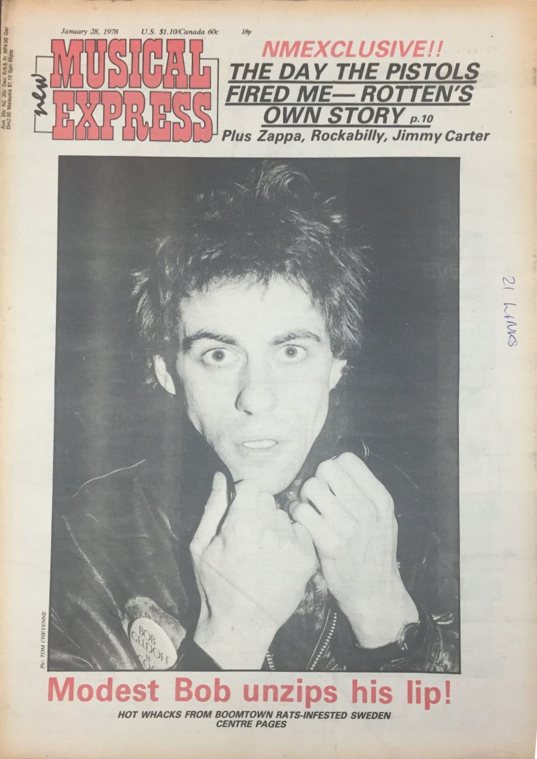
It was superseded by a logo in Playbill, Robert Harling’s reinterpretation of the 19th-century “French Antique”, initially set in three lines of mixed-case characters, and still enclosed in a black field — which later became red when the paper changed to two-color printing. The issue from February 5, 1972 introduced a revised version. “MUSICAL EXPRESS” is again in Playbill, but now appears in all caps. “NEW” is set in condensed sans serif caps enclosed in an angled black box. By 1974, the lines were spaced tighter together. The prefix is shown in a wide Clarendon and later in informal script caps. Around 1975, “new” appears in lowercase Mistral. In the course of 1976, the field was dropped, and Playbill’s caps are shown in red with a black outline. Two years later, the word “new” in Mistral was relegated to the left side, rotated.

The copy from January 3, 1976 shows Playbill in all caps, with tight linespacing; “new” is in Mistral.

The issue from December 2, 1978 with The Clash on the cover was the first to feature the new NME logo designed by Barney Bubbles. Univers Bold is used for the full name within the initials and also for other copy.
On December 2, 1978, New Musical Express introduced a redesign devised by Barney Bubbles. The new logo shows the initials NME in bold sans serif letters. They appear to be custom drawn, with an ‘M’ that references both the 1950s logo based on Fanfare as well as the local tradition of typefaces like Johnston or Gill Sans. In the first incarnation, the letterforms were outlined and contained the full name rotated inside the left stems, in caps from Univers Bold. The enclosed words later disappeared and the outlines went and came back, but the basic logo remained in use until today.
See also Avo Raup’s visual overview of selected covers from 1970–2015 and “Farewell to NME: a rock’n’roll riot that petered into silence” by Alexis Petridis (The Guardian).


")

")


")


")


 website")


