
Het Toneelhuis posters

La Bourla Lounge (June 2001)
Gert Dooreman of Ghent is probably the most talented and surely the most prolific book cover designer in Flanders, the Dutch-speaking part of Belgium. He is also a versatile poster designer. For some years, I was occasionally called in to brainstorm about typefaces — and to suggest striking new fonts for his typographic palette. One such conversation led to his tumultuous embrace of the complete type collection (or almost) by Czech virtuoso František Štorm — more about that in a different post. Another session led to Dooreman’s adoption of Rhode, the robust Figgins-inspired grotesque by David Berlow.
Dooreman (his family name is his brand) used Rhode for a wide range of paperback covers. Some of the most spectacular designs he used the family for was a series of theatre posters and programme brochures done for theatre company Het Toneelhuis around 2000. Rock the Vote was a night of indie rock, and La Bourla Lounge a day of outdoor concerts, both at Antwerp’s lovely Bourla theatre.
Asked about his motivation for using Rhode in the posters, Dooreman wrote: “My point of departure was to communicate the event’s intention with typographic posters that accentuate the text itself rather than formal qualities. ‘Back to basics’, inspired on one hand by the power of 19th-century letterpress posters as well as my growing aversion against the customary eagerness to please; on the other by the pressure to produce, amid the over-supply of communication in which everybody is shouting for attention, something that shouts a bit louder after all.” The subtle distortion of the Bourla poster’s rectangle is a subversive touch typical of Dooreman.
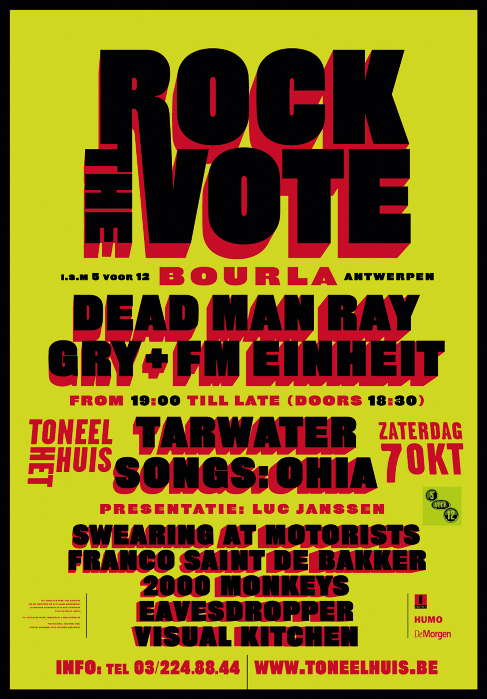
Rock the Vote (October 2000)


")


