
New Cool Collective – Electric Monkey Sessions (2014) and Electric Monkey Sessions 2 (2017) album art
![Front cover of New Cool Collective’s Electric Monkey Sessions, 2014. [More info on Discogs]](https://fiu-original.b-cdn.net/fontsinuse.com/use-images/67/67831/67831.jpeg?filename=0bc36b0d5cd9bdd5a0e1cd14_rw_1920.jpg)
Front cover of New Cool Collective’s Electric Monkey Sessions, 2014. [More info on Discogs]
Amsterdam-based illustrator Emanuel Wiemans designed the cover art for the two Electric Monkey Sessions records by Dutch jazz group New Cool Collective.
For the first volume released in 2014, Wiemans made an illustration of three mandrills in suits, apparently about to the enter the stage, exchanging impish looks. The typography is composed with Ed Interlock. A masterpiece of design and technology, this font was designed by Ken Barber with Ed Benguiat. It is based on Benguiat’s Newlock, originally drawn for Photo-Lettering in the 1960s. Tal Leming accounted for the technical implementation which enables the automatic glyph substitution, with some letters extending over and under their neighbors. Wiemans combined the interlocking feature with a stacked-and-justified setting for a solid block of letter goodness. The track list on the back cover uses another typeface from the Ed Benguiat Font Collection by House Industries, Ed Brush.

Back cover with the track list in Ed Brush.
![Front cover of New Cool Collective’s Electric Monkey Sessions 2, 2017. [More info on Discogs]](https://fiu-original.b-cdn.net/fontsinuse.com/use-images/67/67828/67828.jpeg?filename=07eb56e4-ef9e-4057-b7b0-0e443837d3cd_rw_1200.jpg)
Front cover of New Cool Collective’s Electric Monkey Sessions 2, 2017. [More info on Discogs]
For the second volume, the three mandrills find themselves in the nocturnal jungle. This time, the title is set in SpinOut, a “wacky 50s psychedelica” face from Shamfonts. It was designed by lettering artist and sign painter Shamrock, who, like Wiemans, is at home in Amsterdam. The Tiki-style SpinOut has a matching inline sans companion named SpinOff. The font used for the band name and the back cover is Eubie Script by Dai Foldes.
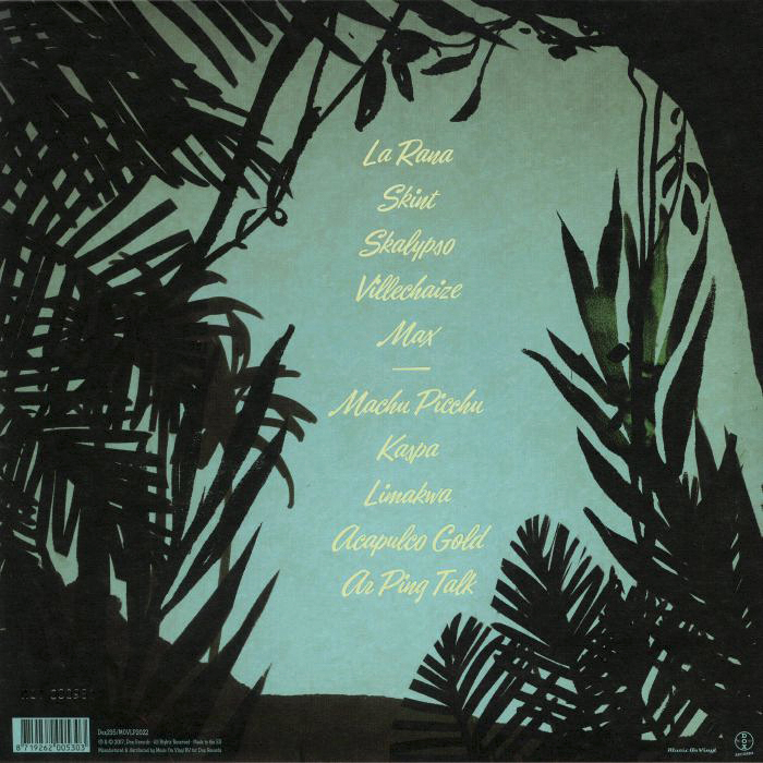
Back cover with the track list in Eubie Script.

Digipack with CD.

Release poster ft. Ed Brush for the tour dates.


")


")


2 Comments on “New Cool Collective – Electric Monkey Sessions (2014) and Electric Monkey Sessions 2 (2017) album art”
In a Twitter thread commemorating Ed Benguiat, Tal Leming recounts how he engineered the Ed Interlock font for Ken Barber and House Industries:
I got curious to see how the digital Ed Interlock compares to the analog Benguiat Newlock, and specifically its Condensed style (Newlock came in three widths).
The top line has Newlock as shown in Photo-Lettering’s 1965 specimen. The middle line is as close as I get to that sample with Ed Interlock. I inserted a couple of zero-width non-joining characters in order to suppress ligatures, and activated the alternate A with top left serif. Everything else falls into place automatically. The digital font has numerous triple-letter ligatures (see ITE), but just not for UCE and MEN. It has a little less bounce, which could be added manually by shifting the baseline here and there. The bottom line shows Ed Interlock out of the box: typed in all caps, with ligatures activated throughout.
Newlock Condensed has about 120 glyphs, with one (C G O Q X), two (D I K L T Y) or three (A E M N R S T) alternates for each Latin capital letter. There are numerals and a basic set of punctuation.
Ed Interlock has more than 1,700 glyphs, including a lowercase and characters to support most Latin-based European languages. There are just a handful of alternates. The interlocking magic in the uppercase (Basic Latin only) is accomplished via the many pairs and triples.
This font is a piece of art.