Biblioteca António Lobo Antunes logo and book covers





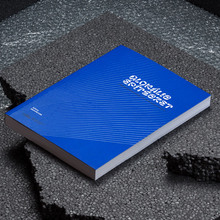
Luís Alvoeiro, of the MAGA studio in Lisbon, designed the Biblioteca António Lobo Antunes book series using “a minimalist approach with three elements – the original font (Alvoface 1), a high-contrast image, and a bright color that varies from cover to cover”. It’s a strong and instantly recognizable identity for the series, and I appreciate the way Alvoeiro integrated accents into letterforms (“ANTÓNIO”, “ÍTALO”, “HONORÉ”). The Deco-style ‘S’ also works well with the tightly-packed spacing of the titles.
Alvoface 1 appears to be directly inspired by Neville Brody’s FF Typeface Six (FontFont, 1991), with replacements for ‘ALSVZ’, some of which may be based on Brody’s related face, Bonn. There is also an alternate ‘E’ with an extended bar. I wouldn’t blame Alvoeiro for modifying Typeface Six – I’ve never been fond of its stiff-spined ‘S’ myself – but perhaps he should have acknowledged the source material when describing his custom typeface.
Formats
- Books (5421)
- Branding/Identity (6656)
Topics
- Literature (2505)
Designers/Agencies
- Luís Alvoeiro
- MAGA (1)
Tagged with
- Biblioteca António Lobo Antunes (1)
- book series (428)
- book covers (4793)
- logos (3868)
- tight letterspacing (732)
- tight linespacing (286)
- compact diacritics (100)
- custom typefaces (660)
- modified typeface (1465)
- Dom Quixote (publisher) (1)
- critique of use (83)



















2 Comments on “Biblioteca António Lobo Antunes logo and book covers”
The link is not easy to use, so here is the infamous S.
Thanks, Thiago! Yes, MyFonts seems to have broken the links to single glyphs. Another unique and helpful feature bites the dust … sigh. (It looks like you picked the slightly lighter FF Typeface Six Point Five, but the shape with the stiff spine is essentially the same.)