
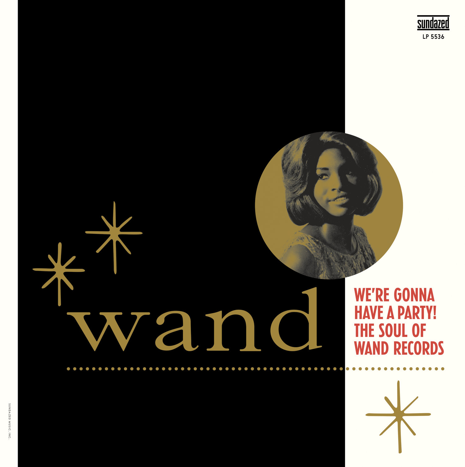
We’re Gonna Have A Party! The Soul of Wand Records album art
Contributed by John Sellards on Aug 15th, 2018. Artwork published in
.
License: All Rights Reserved.
2017 Sundazed LP. I have digitized much of the Vogue family over the past 7 or 8 years from a 1930s-era Intertype catalog (including the condensed varieties not included in the wonderful, recent Intervogue family) and used them often in my work as the face is a frequent component of vintage record jacket and label designs. The wide serif letters used for “Wand” were recreated from an original label. It appears in slightly different forms on the vintage labels and 45 sleeves, so I’d guess it’s hand drawn in the early ’60s.


")


 </span>")


")


 / Schumann (Humoreske Op. 20) </cite>album art")


4 Comments on “We’re Gonna Have A Party! The Soul of Wand Records album art”
Among digital fonts, ParaType’s Caslon comes close for the wide roman lowercase letters. This version “was designed at Polygraphmash type design bureau in 1992 by Isay Slutsker. Similar to Caslon designed by American Type Founders, 1902.”
Vogue?! That’s so cool.
The letterforms of this sample remind me of Gotham Condensed.
It’s a fascinating series, isn’t it? Vogue deserves more exploration. Its structure doesn’t follow a masterplan, to say the least. From Mac McGrew: “Through an unusual twist of names, Vogue Medium Condensed is bolder than Vogue Bold Condensed. Vogue Bold Extra Condensed (not to be confused with Vogue Extra Bold Condensed), is made only in a few large sizes and departs somewhat in design.” Here’s a snippet featuring the Extra Bold Condensed, from a Intertype specimen kindly shared by Urban Cottage Industries.
Very nice info, Florian!