
“Herzlichen Glückwunsch” wedding cards (1919)
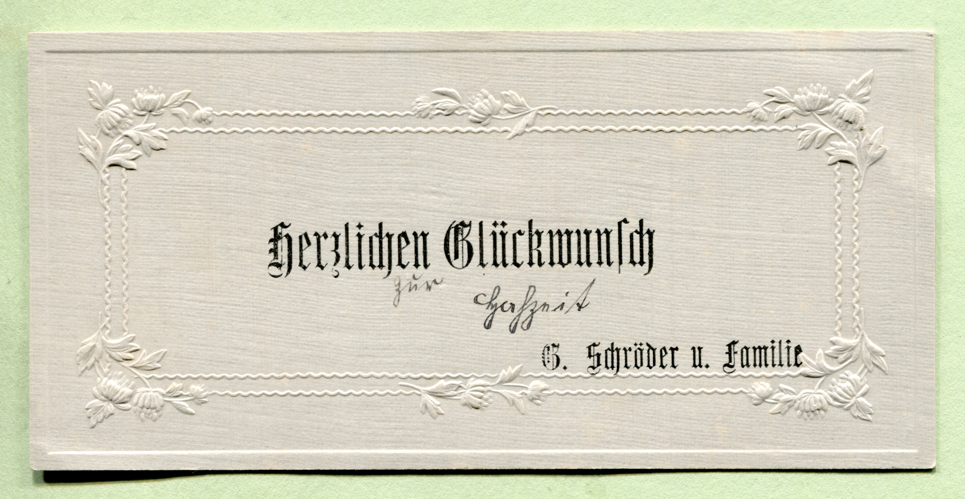
“Herzlichen Glückwunsch zur Hochzeit” from G. Schröder and family.
This series of wedding cards from 1919 was posted on Altpapiersammler’s Flickr stream, a treasure trove of (mostly) German ephemera. The generic greeting cards all have about the same format, they all show a single typeface in two or three sizes, they all say “Herzlichen Glückwunsch” (“Congratulations”), followed by the name of the sender. They are framed by some decorative embossing, and were all personalized with handwritten additions in Kurrentschrift, like “zur Hochzeit” (“on your wedding”).

Detail. For some reason, the typesetter used ligatures for the two ch pairs, but not for ck.
The typeface used on the first card is a narrow Textura cut by Friedrich Wilhelm Bauer in 1876, named Accidenz Gothisch schmal (later spelled Akzidenz-Gotisch schmal). Akzidenzen are, literally, “things that occur”. In the German printing trade, it’s the traditional term used for everything that’s not a book or some other text-heavy publication; for example invitations, birth announcements, business cards, ads, flyers, etc. Akzidenz-Schriften thus are typefaces suitable for these kind of jobs — “jobbing typefaces” is an English equivalent. In the days of metal type, they were sold in smaller quantities than Werkschriften (body types). Stylistically, Akzidenz-Schriften are often ornamented (outlined, open, shaded, floriated, etc.) or otherwise fancy in some way, but that’s not a requirement, as one can see in the famous Akzidenz-Grotesk. Size isn’t the defining criterion either: some were cast in sizes as small as 4pt. One could say that every display typeface is a jobbing typeface, but not every jobbing typeface is meant for display sizes.

Greeting card with finely embossed branches and ornaments, sent by Thea Wilkens and Rudolf Paulsen from Heide, Schleswig-Holstein.
The open sans on the second card is Sezessions-Grotesk licht, issued by the Julius Klinkhardt foundry in Leipzig around 1903. The Sezessions-Grotesk series comprises a number of styles and was also cast by other foundries, including Stephenson Blake in England (as Arabian). Just like similar releases by Berthold or Ludwig & Mayer from the turn of the century, this Jugendstil sans serif was named in reference to the Secession art movement in Munich, Vienna, and elsewhere.

Detail.
![“Herzlichen Glückwunsch zur Hochzeit u[nd] beste Grüße!” (“Congratulations on the wedding and best wishes!”) by August and Martha Burmeister from Marne, Schleswig-Holstein.](https://fiu-original.b-cdn.net/fontsinuse.com/use-images/72/72138/72138.jpeg?filename=43745229112_301e2338fd_k.jpeg)
“Herzlichen Glückwunsch zur Hochzeit u[nd] beste Grüße!” (“Congratulations on the wedding and best wishes!”) by August and Martha Burmeister from Marne, Schleswig-Holstein.
The third card uses an italic with swash caps. Designed by Heinrich Wieynck, it was first cast by the Bauer foundry in 1911, as Wieynck-Kursiv. In the 1970s, Letraset revived the design as Phyllis, which is the name that Bauer had used for markets abroad. Phyllis is used with ſ (long s) and ligatures for ch, ck, and ſt, as it was still common at the time.

Detail.
")


")


