
Berliner Jazztage 1972

Reproduced from: Welt aus Schrift: Das 20. Jahrhundert in Europa und den USA, edited by Anita Kühnel, Kunstbibliothek Staatliche Museen zu Berlin, 2010. The poster (offset, 118.7×82.6 cm) is part of the Kunstbibliothek collection, Inv. Nr. 14059394.
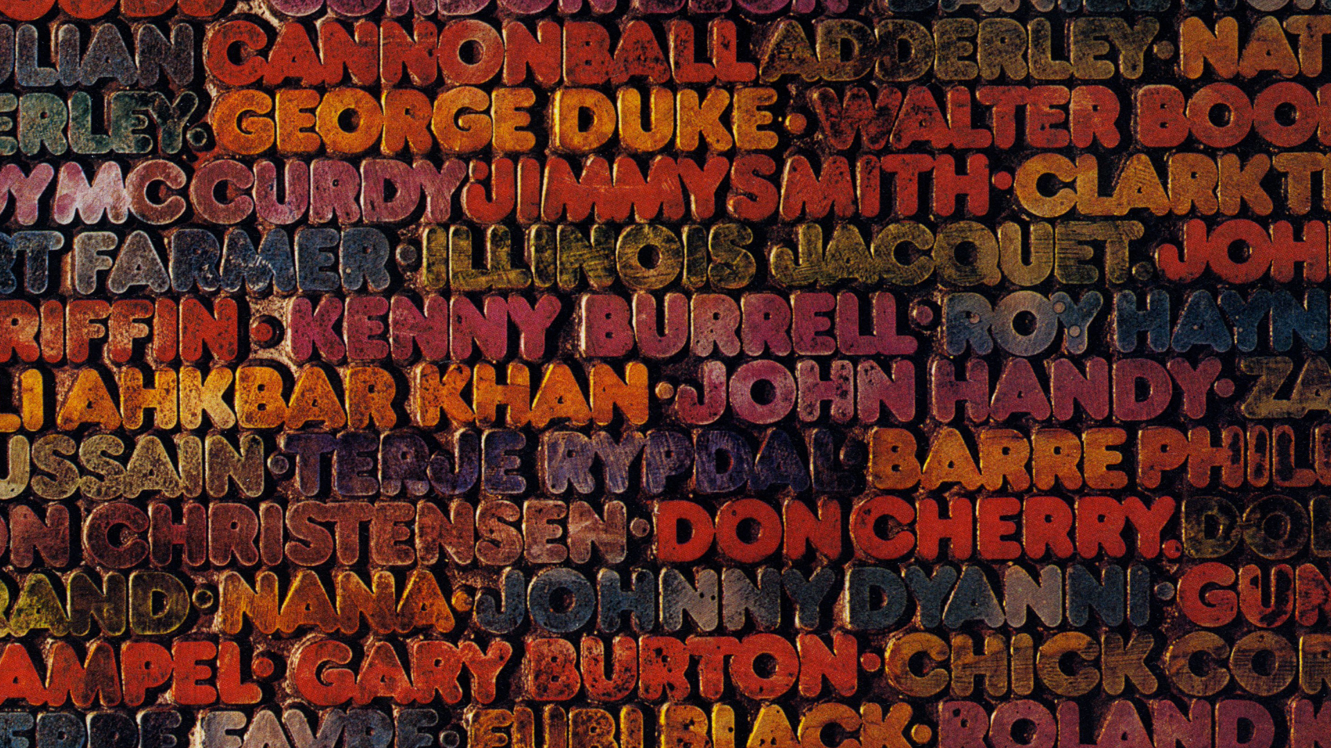
An almost dirty poster for the Berliner Jazztage in 1972, designed by Günther Kieser (1930–), who designed most of the festival posters since the festival started in 1964 until 2000.
The font in use is Frankfurter which was released by Letraset two years earlier. The typography consists of a photography of a block of text, with artists names inked in different colours, ready to make print, or just after having made a print (which would show mirrored type). The space between the letters is dirty, as if this block has been used many times before — which of course is not the case.
But… how did Mr. Kieser set the type? On a closer look, it seems like the type has been cut from a polymer- or rubber-like material. In many names, letters overlap one another (e.g. DY in Curdy, MM in Jimmy Smith).
If anyone can shine a light on how to proceed from a layout with dry transfer lettering to a machine-cut (?) block of text, I would love to hear/read it.
Detail


</cite> album art")


")


2 Comments on “Berliner Jazztage 1972”
On Twitter, Erik Spiekermann and Carolina de Bartolo suggest the following process and tools were used:
Günther Kieser probably had the type photoset on a Staromat (Berthold’s headline-setting equipment). The lines of type were pasted up (for example with wax adhesive) to form a black/white artwork which was then reproduced in a stat camera to make a negative.
After that, he must have used polymer plates, available as “Nyloprint” in Germany in the 1970s. The design was exposed through a photo negative back then, after which the unexposed parts were washed away. After that he hand-painted and photographed the plate – instead of using it to make a print. A similar process is used for rubber stamps. Today, the non-image parts of the plate are cut away using laser .
More about the handwork of graphic design and printing processes can be found, watched and followed via Graphic Means.
The laser we built ourselves at p98a.berlin does not cut away, but hardens the printing elements. See here:
We print books using that method, post-digital printing. Hacking Gutenberg!