
The War of the Worlds and The Invisible Man by H.G. Wells (Vintage)
From Lit Hub’s “The 75 Best Book Covers Of 2018 According To Book Cover Designers”:
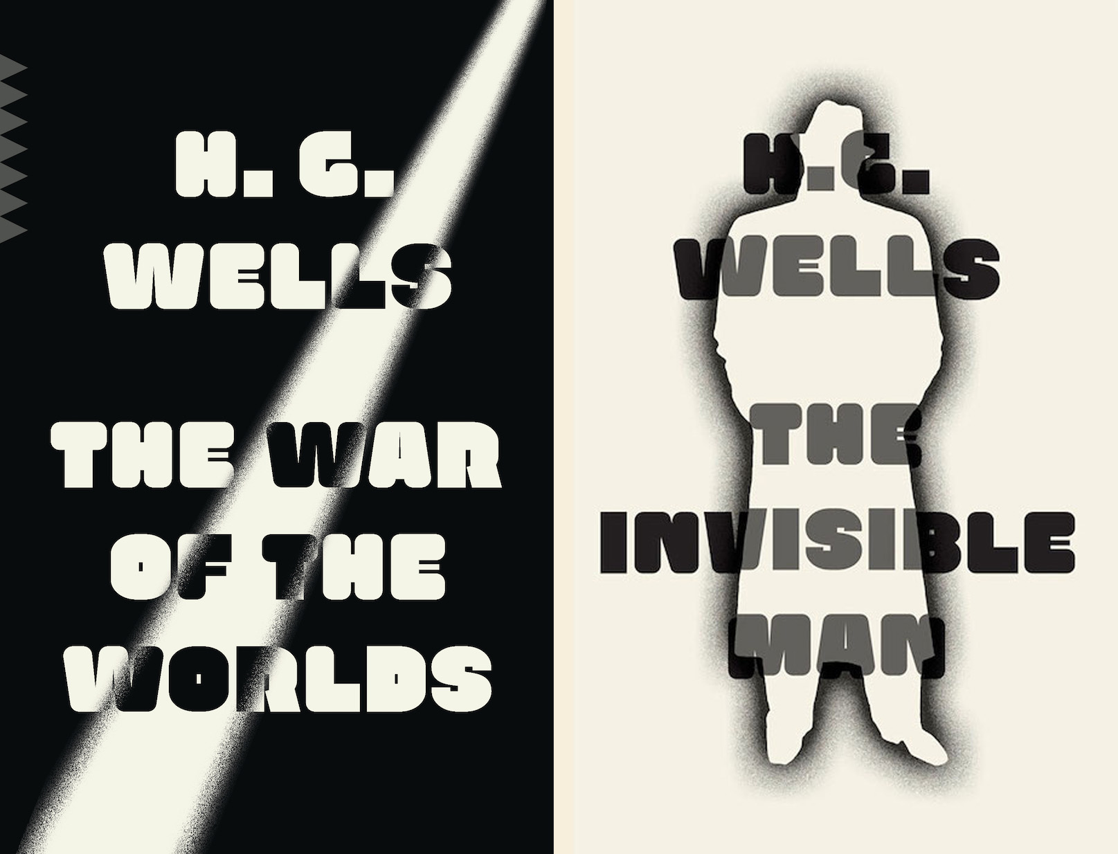
Linda Huang’s repackaging for The War of the Worlds (as well as The Invisible Man) is so fresh, yet it feels nostalgic. The use of just black and white, and the retro font, keeps the design strong and bold. —Emily Mahon
The font in question is Persiflage, one of the 52 typefaces released in 2016 by The Pyte Foundry. In his review for Typographica, Frank Grießhammer describes it as a “very heavy marshmallow sans” and says he enjoys “the play of rounded versus straight corners.” I wonder what kind of “retro” Mahon had in mind. Persiflage reminds me of 1970s faces like Alpha or Too Much (the latter especially because of the thin middle bar in E). Chances are that type designer Ellmer Stefan referenced sources that are much older, though—maybe something like this variant of Caslon Rounded from c. 1841 which also mixes rounded and straight corners. His TPF Henry series is a more direct interpretation of Caslon’s early rounded sans serif.


")


")


