
The House of Impossible Beauties – Joseph Cassara (Ecco)

A gritty and gorgeous debut that follows a cast of gay and transgender club kids navigating the Harlem ball scene of the 1980s and ’90s, inspired by the real House of Xtravaganza made famous by the seminal documentary Paris Is Burning
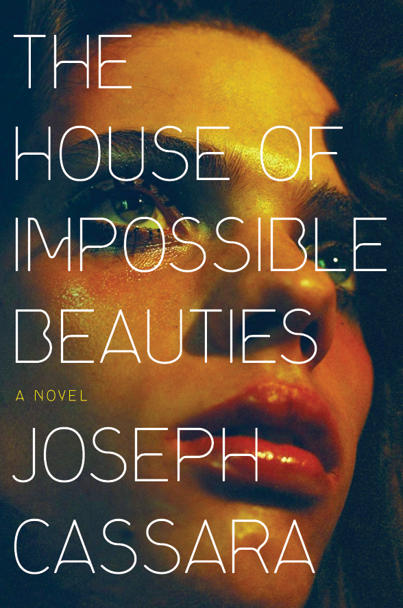
Over on Lit Hub, Sara Wood wrote about the process of designing the cover for Joseph Cassara’s debut novel, The House Of Impossible Beauties. After several detours and dead ends (including 3D illustrations with Tarzana and lipstick on cigarettes with handwriting), she eventually found —
one of the most affecting portraits that I’ve ever seen. It was so unimaginably perfect. There was androgyny, vulnerability, retro glamor, and a dynamic point of view. In this I saw Venus waiting in the wings, preparing to walk in a ball for the first time, with apprehension and adrenaline coursing through her veins.
In her account of the quest for the perfect book cover, Wood doesn’t touch upon the type choices. The prefinal version (which wasn’t used because the photo couldn’t be licensed) featured Alias Enabler (1995). For the final cover (with a re-shot image), the type was made a little smaller, and the font changed to ITC Serif Gothic Light (1970). Both fonts have rather thin strokes and don’t obscure the portrait. They also have the open counter in B in common. I can imagine that Serif Gothic was chosen because it draws less attention to itself than the technoid Enabler with its asymmetrical M and the “frowning” horizontals.
Design: Sara Wood. Art direction: Allison Saltzman. Photograph by Florence & Nicolas.
Prefinal version featuring Enabler.


")


")

")


")


")
")


