
Tipoversos: printed music

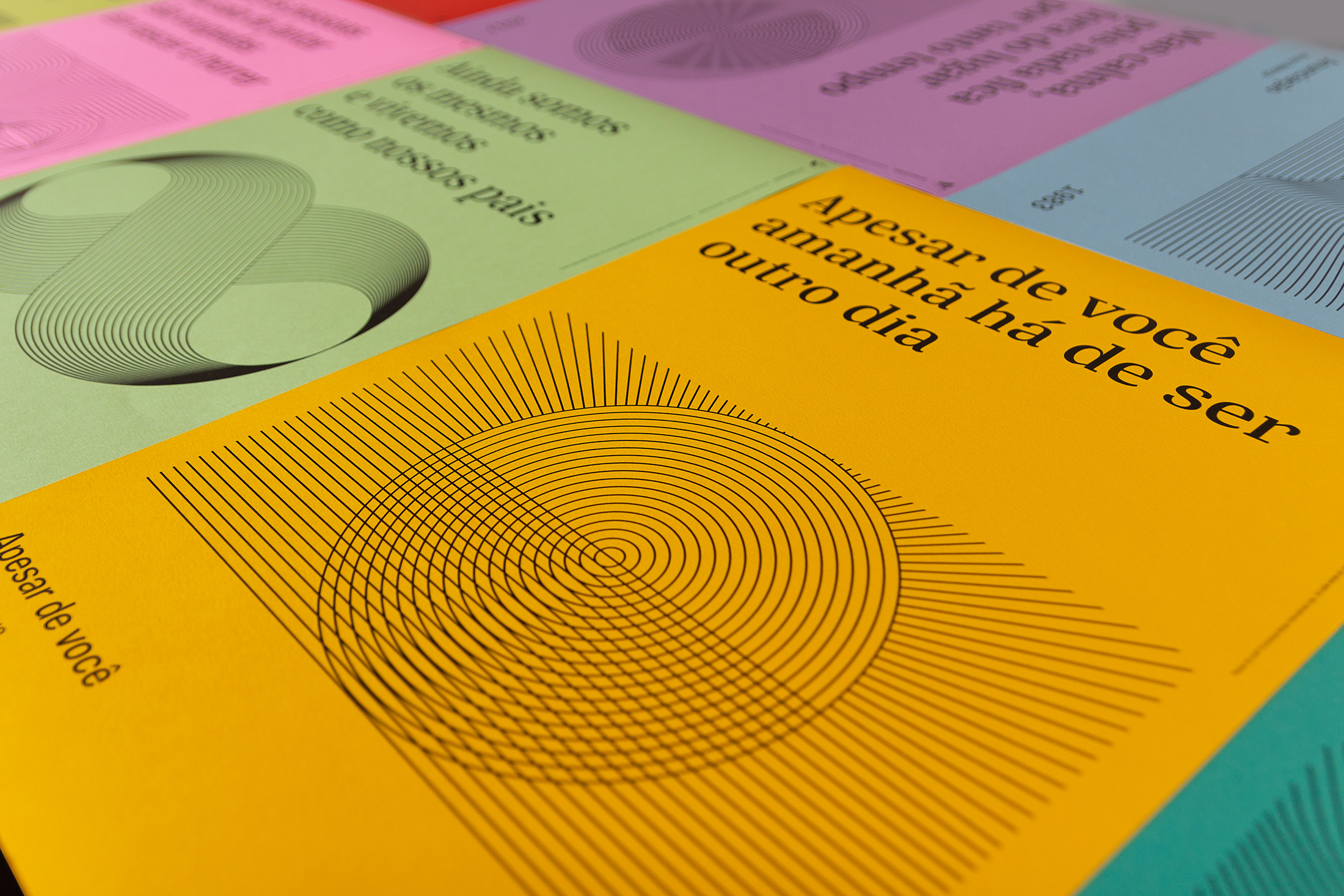
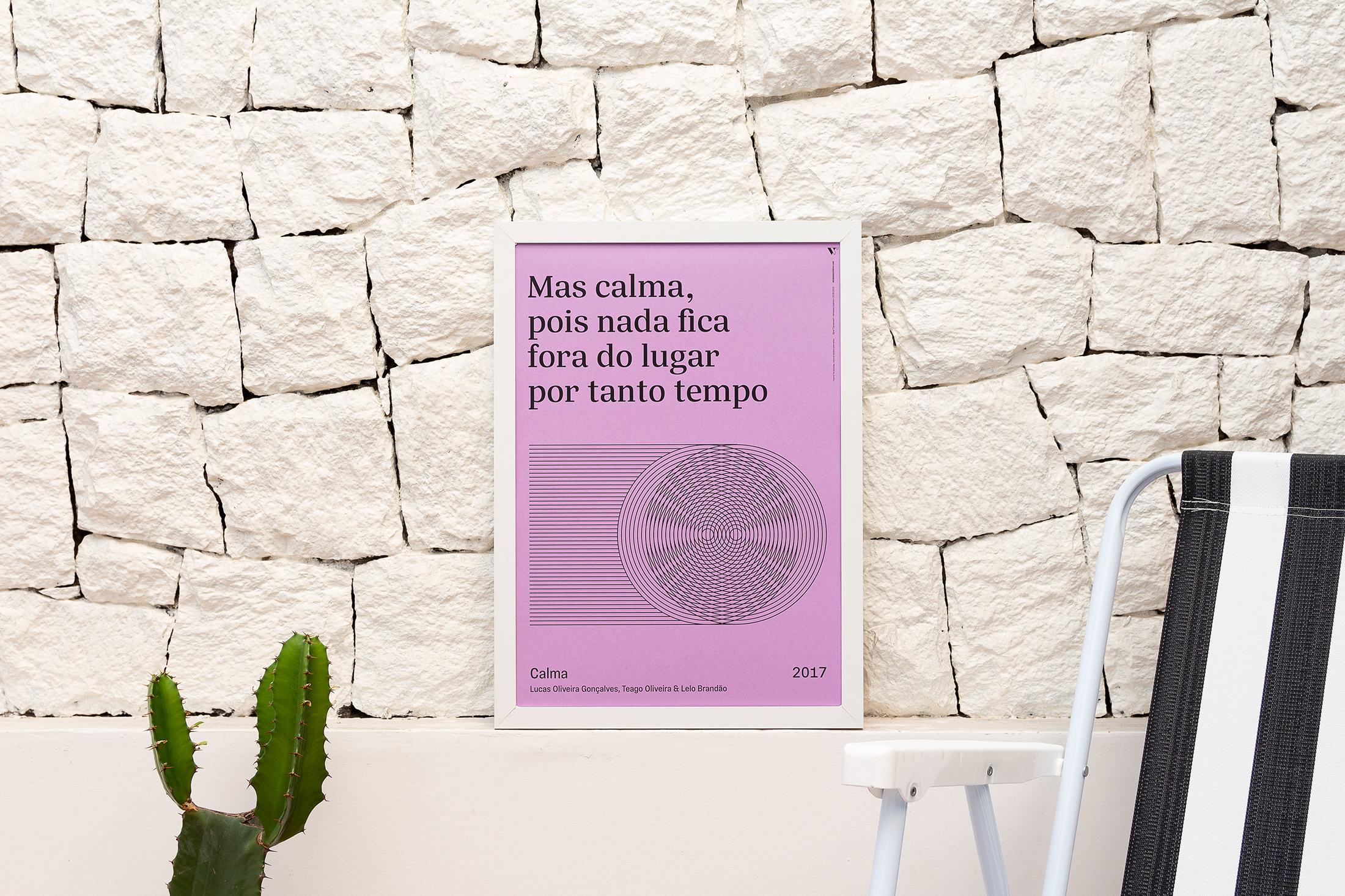
Tipoversos is a series of posters that began to be produced by Vertentes Coletivo in 2018. It presents lyrics of popular Brazilian songs illustrated by geometric lines. The 15 songs were initially chosen based on personal taste, but they all talk about subjects related to Brazil’s recent past and current times. They bring a mix of critique, protest but also a little bit of hope that the country and its people will get through this very difficult time.
Due to the fact that this is a project focused on Brazilian music, it was decided that it would be better to only use fonts created by Brazilian designers. The posters had a few very specific requirements, for example, condensed fonts, a comfortable x-height and good optical balance in terms of weight of the font. Also, we were concerned with choosing fonts designed by both male and female designers. There are a lot of Brazilian women designing excellent typefaces and we thought it was important to showcase at least one of them through our work.
With that in mind the fonts selected were Silva Text Medium (by Daniel Sabino / Blackletra) and Vinila Condensed Regular (by Flora de Carvalho / Plau Design), two excellent examples of high quality typographic work recently produced in Brazil.


")


 album art")


 movie posters, trailer, titles")


