Post Frosted Rice Krinkles (1972)
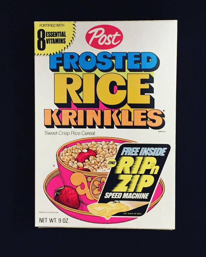
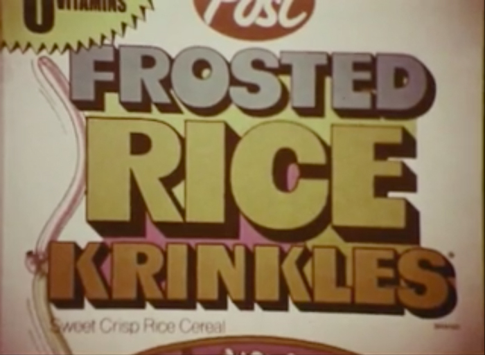
Frosted Rice Krinkles is a discontinued sweet crisp rice cereal brand by Post Foods. It was originally known as Sugar Krinkles and later as Sugar Rice Krinkles. In the early 1970s, probably coinciding with the rebranding as Frosted Rice Krinkles, the package received a major overhaul. The name now was shown in three stacked lines of fat shaded caps; in blue, yellow ocher, and orange.
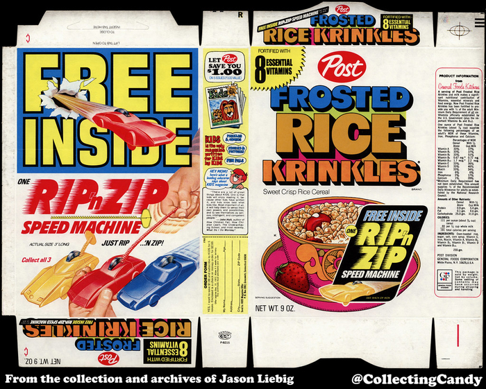
“Free inside: One Rip ’n Zip Speed Machine. Just rip … ’n zip! Collect all 3”. The ad for Kids magazine on the side mentions an expiry date of 12/31/72. There was also a version featuring “3 Jackson Five Groovie Buttons”.
The lettering appears to be a redrawn Albert. This film typeface was available from Lettergraphics in 1968, together with an outlined and shaded companion style named Fat Albert. The solid cut is different in some details. Most notably, the counters (in C or O) and apertures (in F) in Albert are bigger. The lettering on the cereal box looks like a protruded version of Albert, with a deeper shadow than Fat Albert has. Some letters were further streamlined: the stem of K got a consistent width and R now is on firmer footing.
I assume that Fat Albert is a copy of OP-Letter. If this is true, then Albert was probably derived from Fat Albert (and not the other way around). And “Frosted Rice Krinkles” then is shaded lettering based on a solid typeface, which in turn is based on a shaded typeface copied from a piece of lettering by Walter Haettenschweiler. Along the way, some of its more whimsical details were eliminated, but OP-Letter’s charm is still visible in the contrasting stem widths of N or the horizontal terminals in C or S. Neither OP-Letter nor Fat Albert are available in digital form. In April 2019, however, Pink Broccoli released Mushmouth PB, a digitization of the solid Albert.

From left to right: OP-Letter, Fat Albert, Albert (here the digital Mushmouth PB), lettering from the Frosted Rice Krinkles box.
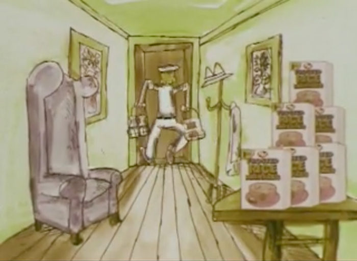
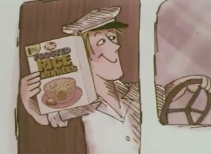
The cereal box with this design is prominently featured in a number of TV commercials. Thanks to Duke University Libraries and the Internet Archive, several of them can be found in AdViews, “a digital archive of thousands of vintage television commercials dating from the 1950s to the 1980s. These commercials were created or collected by the ad agency Benton & Bowles or its successor, D’Arcy Masius Benton & Bowles (DMB&B).” Find more info and images about Frosted Rice Krinkles on MrBreakfast.com.


Formats
- Packaging (1984)
- Advertising (1780)
- Film/Video (868)
Topics
- Food/Beverage (2558)
- Kids (660)
Designers/Agencies
- unknown (3283)
Tagged with
- cereals (16)
- packaging (654)
- 1970s (1355)
- chromatic (611)
- shadow effects (978)
- alternating line colors (140)
- lettering derived from typeface (630)
- boxes (409)
- TV commercials/video ads (66)
- Post Consumer Brands (2)
Artwork location
- United States (8310)
- White Plains (1)
In Sets
- cover art (Alan Jacome) (10)
- vintage (isabel) (76)
- set 1 (isabel) (84)
- late 20th century (slink johnson) (59)
- COOL (Annie Stoll) (156)
- Thesandwichclub (Fernanda Soto) (11)
- winterfair (Joshua Jenkins) (10)
- typefaces i like (Stephanie Laba) (4)
- branding (Mia Harris) (14)
- Cooper Black (Leticia Guevara) (44)
- amino (orlando gillam) (36)
- 3D (Lucas Bevilaqua) (17)

