The Greening of America by Charles A. Reich (Random House, Bantam Books)
Via Michael Bierut:
Remembering the Bantam paperback of “The Greening of America” with its truly relentless deployment of Bookman Swash Italic. Quintessential 70s. RIP Charles Reich, 1928–2019
https://www.nytimes.com/2019/06/17/books/charles-reich-dead.html
Let’s have a closer look at the cover typography for this “paean to the counterculture of the 1960s and its values”. Both the hardcover edition by Random House published in 1970 and the paperback version by Bantom Books from 1971 use versions of Bookman Italic with swashes.
On the dust jacket for the hardcover (shown above), the title and author name are set in a phototype version of unclear origin. It typically goes under the name Bookman Bold Italic (Swash) and is distinguished by mechanically slanted letterforms without optical correction. Mark Simonson pragmatically refers to it as “Sixties Bookman” and gives a “c. 1965” date. Here it’s used with only a few of its many swash alternates – and the inescapable undone-laces ligature for The, of course. The black text is in a different Bookman, though. This is the original ATF Bookman Oldstyle (c. 1901), or probably a phototype version thereof. It’s less bold and the ear of its g points upwards, not sidewards. Note that these lines are not really center-aligned, but rather stacked and staggered, another thing that was fashionable in the 1970s.
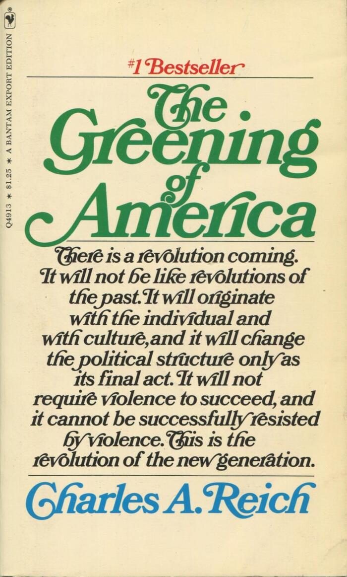
The paperback cover (shown below) uses yet another Bookman: The star of this swashfest is Bookman Italic Swash by Photo-Lettering, Inc. It’s used both for the title and the text, apparently specced “with as many fancy extensions as possible”. PLINC’s Bookman is not to be confused with their earlier Photo-Bookman, or Benguiat Bookman, which is a precursor of ITC Bookman (1975). It’s better drawn (also by Ed Benguiat?) than “Sixties Bookman” and can easily be told apart by its wider e and the upward-pointing ear in g. The phototype company from New York first showed this version in their 1967 Alphabet Yearbook (Alphabet Directions No. 6).
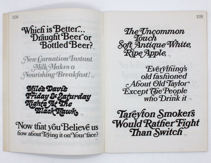
Spread from PLINC’s 1967 Alphabet Yearbook. The face used for the Bantam paperback, 4446 Bookman Italic Swash Bold 6, is shown in the middle of the right-hand page (“Everything’s”). A bolder version, 4450 Bookman Italic Swash Heavy 8, is shown below (“Tareyton”). Their upright companion styles are presented on the opposite page: 4448 Bookman Swash Heavy 8 (“Which”) and 4444 Bookman Swash Bold 6 (“Now that”). The other faces are 5653 Papirtis Bodoni Ital Swash Shaded F (“New Carnation”), 5552 West Cooper Nouveau Swash 10 (“Miles Davis”), and 5559 West Fantini Ital Swash 8 (“The Uncommon”).
Formats
- Books (5414)
Topics
- Literature (2503)
- Politics (693)
Designers/Agencies
- unknown (3278)
Tagged with
- Charles A. Reich (2)
- Random House (44)
- Bantam Books (53)
- hardcovers (1074)
- paperbacks/softcovers (1485)
- book covers (4786)
- book jackets (749)
- italics (396)
- swashes (583)
- 1970s (1355)
- counterculture (44)
- discretionary ligatures (312)
- center-aligned text (1563)
- stacked and staggered (323)
- first editions (166)
- sociology (39)
- revolution (14)
- United States (99)
- embossed/debossed (497)
- gold (351)
- overlap (304)
- phototype (56)
- only type (1103)
- overlayered type (112)
Artwork location
- United States (8297)
- New York City (2329)


















6 Comments on “The Greening of America by Charles A. Reich (Random House, Bantam Books)”
OK, I’ll bite. I wanted to know how close I can come to the paperback cover with Bookmania, an extensive revival of Bookmans made by Mark Simonson in 2011. I gave myself a time limit of 15 minutes. (Admitted, it took 20 mins in the end.) Aren’t we blessed with our digital tools?
Some observations: As Bookmania isn’t a direct revival – certainly not of PLINC’s Bookman – but rather a compilation and expansion, some swash forms are slightly off, see e.g. p or R. I’ve used Bookmania Semibold Italic, which seems a tad lighter. The Bold Italic is too heavy, though. The spacing was tightened. Bookmania has contextual alternates that will swallow the dot of a subsequent i for r or g, but not for v or w. I had to insert dotless i’s here. The cover doesn’t use as many swashes as possible. In fact, it could be a lot more frivolous. The black text has six words in a row without any swashes. And Bookmania’s glyph set would have so much more gimmicks in stock, like ligatures for ct it st or terminal swashes, to name but two examples.
This is really fascinating! I love the replication with Bookmania. That Th ligature is gorgeous. (That “Green Revolution” written about in 1970… seems like we’re still waiting for it.)
On a side note, that 552 West Cooper Nouveau is really different from the version of Cooper Nouveau that Photo Lettering has available. Is there something closer to that available anywhere?
The original Cooper Nouveau came in three styles; an upright one, which is an amorphous take on Cooper Black, and a swash italic in two weights. For some reason, when House Industries launched the new incarnation of PLINC, they decided to digitize the lighter italic style only, even when the bold italic was much more popular back in the day.
Letraset issued a very similar face named Lazybones. It’s available in digital form from URW and ITC. I think that’s as close as you get.
I guess I need to make a variable version so the weight can be matched more closely. :-)
Did I see some predecessor to Lazybones in that Alphabet Yearbook?
Yes, that would be David West’s Cooper Nouveau Swash 10. Note that our typeface sample shows the lighter weight, Swash 7.