Chronos & Kairos by Julius Heinemann

Chronos & Kairos is an artist’s book by Julius Heinemann, designed by Florian Lamm of Lamm & Kirch. For the typography, Lamm made early use of the Eliza family by Pawel Wolowitsch. Then still work-in-progress, the synthesized serif was released with Camelot Typefaces in 2020:
Eliza is a conceptual exploration of transitional typefaces. The square as a key element is a reference to the digital age – the pixel. It is the smallest unit of our todays communication. Introduced into the humanistic construction of a serif typeface, it creates a dialogue between two extremes: the familiar, humanistic liveliness, and artificial, modern rigidity. Eliza can be seen as an allegory for the conjunction of human and machine.
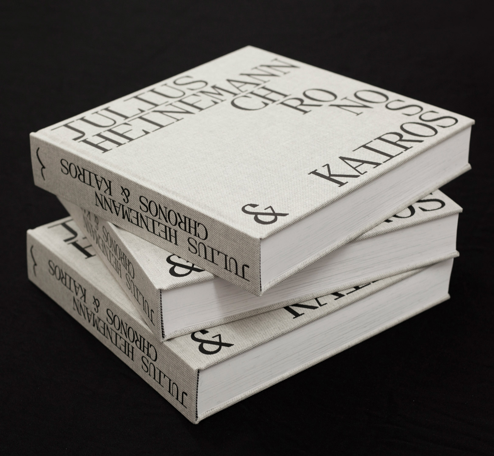
The title on the cover and spine of the cloth-bound book features Eliza Mono in all caps, with “Chronos” arranged in staircase form. The monospaced variant is used with the alternate non-descending J.
The entire book was printed in duotone silver/black. Heinemann’s works are accompanied by a text by art historian Marta Ramos-Yzquierdo (Spanish and English). Chronos & Kairos was published by Edition Taube in an edition of 400 copies.
ISBN: 978–3–945900–18–5