
Dudzik gelateria

Primot was designed specifically with a vintage gelateria in mind. It’s that moment where font specimen and real life usage meet, yet exceed all the expectations of the type designer.
I particularly loved seeing the variety of sizes in which the logotype – a slightly modified version of the out-of-the-box type – was applied, from cupon and embroidery to neon sign and outdoor signage.
It was thought as a ‘logotype-ready’ typeface, and it was a delight to see the care taken in making the slight customizations to make the wordmark stand out. Because it’s so specific, it was not our bestseller by a mile. Also because it’s mostly frictionless to add to your type menu, Primot is our most synced typeface at Adobe Fonts, which may be one of the reasons we are starting to see it more and more. Lastly, because it was made to such specific cases, It’s unmistakable when you see it in the wild.
From Halo Creative’s Behance presentation:
The Dudzik family approached us to carry out a brand design project for a place that exists — and thrives — from the 70’s. They wanted us to come up with a name, design a logo and all the other elements of the identity for their ice cream store.
From the very beginning we knew, that creating a new identity for a place that already exists, and is loved by everyone will be quite a challenge. We understood their need to adjust their ice cream store to the modern standards — after many years of operating, the place needed a refurbishment, and the lack of a brand made it hard to function in the new media, which is a crucial tool in communicating with the client nowadays. We also knew that in this particular project the analysis and strategy building should be swapped with emotions and subjective feelings. Also, that the project will be good and serving its purpose only when it’s approved by the whole family.
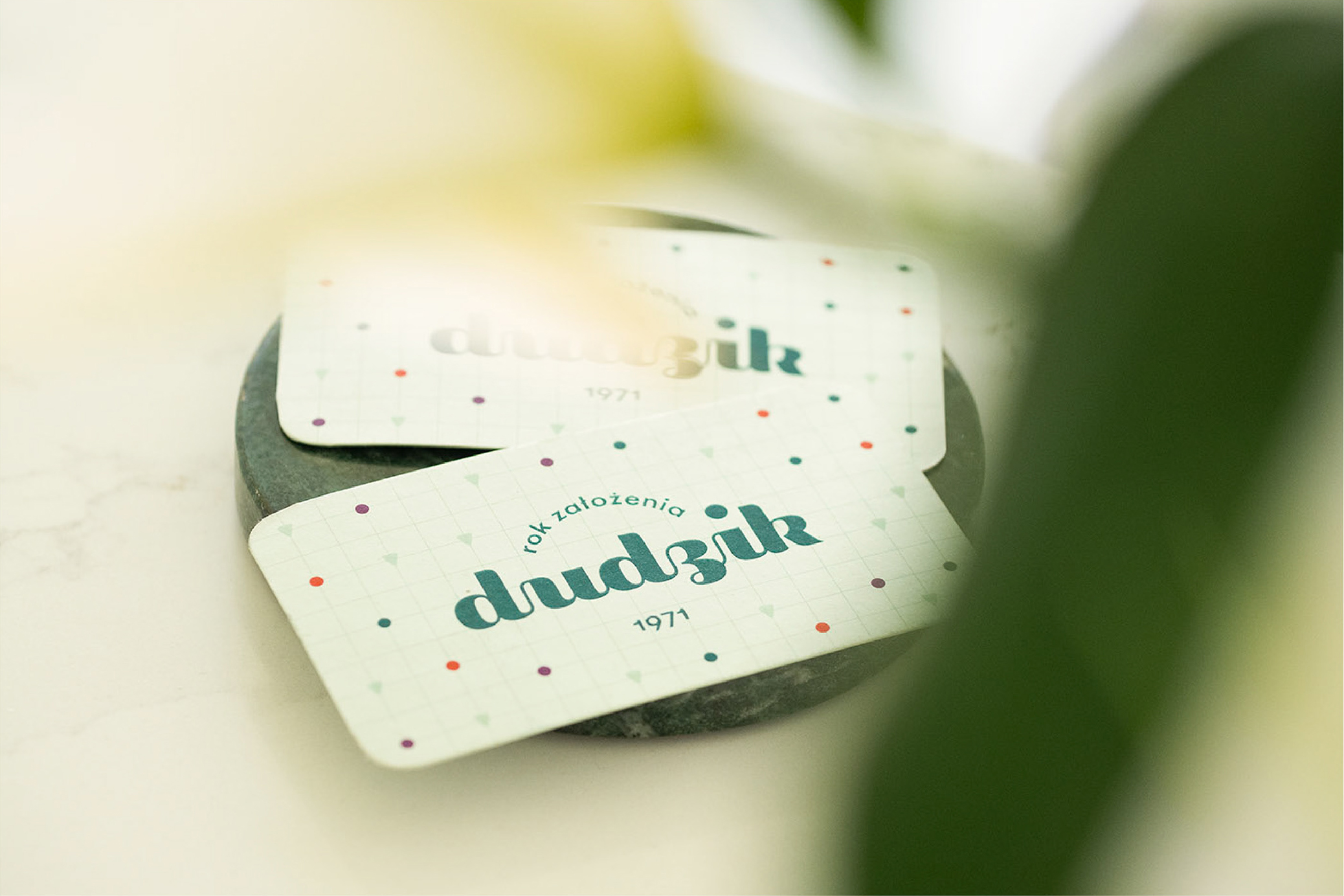
At first, we decided the place should bear the name of the family. This was a very important element of the message — after all, people have been going to Dobczyce for the Dudzik ice cream for years.
We’ve designed two versions of the logo — a simple one, with just the name; the other reminding about the ice cream store establishment date. We wanted to make sure, that everyone would recognise the ice cream they know and love for years, despite the visual identity change. In the visual identity we used the ice cream colours: pistachio, blueberry, and raspberry; white and dark green. We wanted the colours to match the ice cream — in pastel colours, made from natural ingredients.
All of the projects were printed out on natural, mate paper coloured in mass and cotton, so that the clients enjoy being surrounded by our identity elements.
We designed a logo, business cards, reward cards, 2 materials, out of which aprons and pillow cases for the guests, labels with the ice cream flavours, a stamp, stickers, ice cream cups, neon sign, signboard, and some elements of the interior decor.
Design and production of the bench and wooden structure by Michał Kowalczuk.


.jpeg)


")


")


