
Het Bandenboekje / Het Frame-boekje

Het Frame-boekje en Het Bandenboekje (“The Frame Booklet” and “The Tyre Booklet”) are two instructional booklets for bicycle repair and construction, issued by the Centraal Bureau voor den Rijwielhandel (“Central Office for Bicycle Trade”) in Amsterdam, the Netherlands.
Both booklets have a cover printed on “elephant skin” paper, with titles set in Egmont. The interior uses Romana, assisted by Nobel and a handful of other typefaces in the advertisement section in the back of the booklets.
The booklets are not dated, but some of the ads mention both what they have on offer currently, and what they will have in stock once the war is over. This makes it likely that the books were issued between the winter of 1944 (when half of the Netherlands were liberated from the Nazi occupation) and the end of WWII in the Netherlands on May 5, 1945.
Printed by Drukkerij De Globe, Amsterdam

Title page. Het Frame-boekje came with a paper ruler (centimeters and inches). “Linophile” is obviously a pseudonym.

Page from Het Bandenboekje. Note that the printer uses a few habits that later went out of fashion: subheadings are right-aligned within the text block; the printers used spacing for emphasis instead of italics; they used double quotes where nowadays single quotes are the custom. In addition, the opening quotes are placed on the baseline, a habit that has disappeared in the Netherlands altogether, with exception of a few newspapers and institutes that still favor this style.

Spread from Het Frameboekje, with page numbers on top of the page; right-aligned subheads, and tables placed center-aligned.

Instructional illustration, showing the use of Bahr’s Normograph for lettering. From Typotheque:
The Normograph, for example, invented by vocational school teacher Georg Bahr, was patented in Germany in 1909 and in America in 1912. Bahr’s Normograph did not contain a full character set, but only a few elementary shapes — stems, arms, curve segments, diagonals — that needed to be combined into letters and numerals.

Advertisement for Cyclia, with a few weights and sizes of Nobel. “We are happy to advise you about purchasing...” followed by a list of bicycle parts (this is also a modest suggestion for type designers looking for Dutch words for type specimens). “Handelsonderneming” uses Monoline Script.
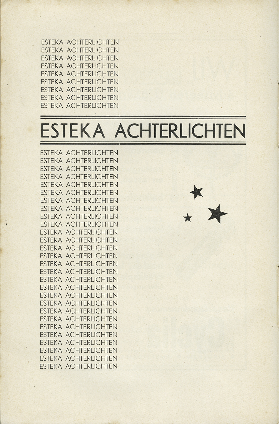
Esteka Achterlichten (“Esteka Rear Lights”); Esteka is probably a phonetic acronym for S.T.K.
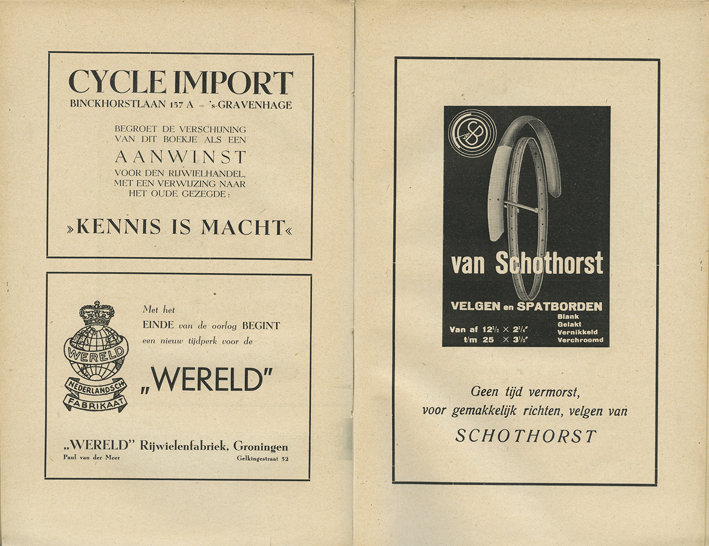
Advertisements; spread from Het Bandenboekje. In contrast to the body text, the ad on the right hand page does use Romana Italic. The “Wereld” advertisement says: “The end of the war marks a new era for the world / De Wereld”.

Advertisement for wooden wheels: “In normal times, I should not belong in this booklet. However, in these times, the bicycle repair gentlemen cannot do without me if they want to keep their trade on track”. The ad below, using Gill Sans and Beton, mentions both current service (in war time) and future stock (in time of peace).
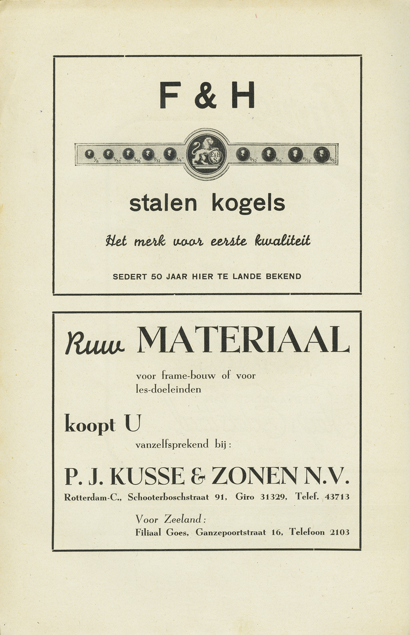
Ad for steel bullets, using Monoline Script and Breite halbfette Grotesk; the bottom advertisement for ‘raw material’ pairs Monoline Script with Egmont.


")


