Papierfabrik Fleischer letterhead
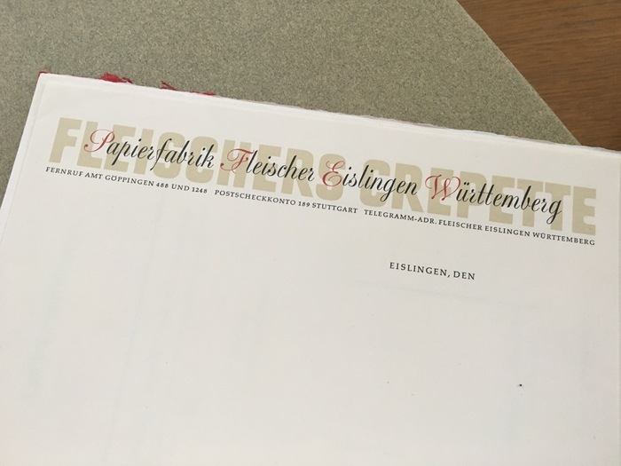
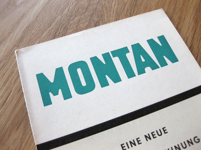
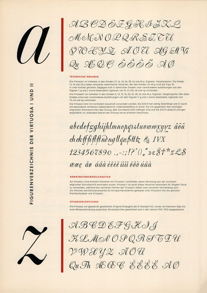
This letterhead accompanied a paper sample from Fleischer, a papermaker in Eislingen, Württemberg, Germany. I was delighted to find it in Jack Stauffacher’s collection, not just because it’s a lovely example of mid-1950s German design, but because it features two underappreciated — and contrasting — typefaces in use.
Montan was designed by Anna Maria Schildbach in 1954 at a time when very few women were credited as type designers. I enjoy its strength and heft, dispelling the common assumption — especially at the time — that feminine letters are delicate and florid. Montan didn’t survive the transition to phototype and was quickly forgotten. Fortunately, the face was digitized by Carmen Mauerer in 2012. Unfortunately, Mauerer’s site is no longer operable. She is occupied with more important things, such as speaking up for refugee rights as a member of Mainz’s city council.
The overlaying script is Virtuosa, a lesser-known product of Hermann Zapf. Its unusual upright nature is possibly a design compromise to help it work as metal type, and it was “corrected” in the digital version (Virtuosa Classic) which has the more conventional slant of a formal script. I admire the look of the original Virtuosa, however. Even its disconnected forms have a certain charm.
Formats
- Branding/Identity (6656)
- Ephemera (1032)
Topics
- Graphic Design (2587)
Designers/Agencies
- unknown (3280)
Tagged with
- paper (32)
- overlap (305)
- letterheads (344)
- typeface combinations (3121)
- about type design (290)
- type on type (379)
- colored initials (27)
- 1950s (279)
- German (language) (1955)
- contrasting typefaces (392)

