
Parasite movie poster and trailer

Theatrical one-sheet for Bong Joon Ho's Parasite (2019).
Parasite – original Korean title: 기생충 – is a 2019 South Korean dark comedy thriller directed by Bong Joon Ho (The Host, Mother, Okja, etc.). The typography on the poster and in the trailer uses classic centre-aligned and all caps typography with a twist (the Korean-language poster uses a literal ‘twist’ in the movie logo, see last image).
The movie logo is set in uppercase Gotham, customized with oldstyle serifs on various terminals. On the poster, the director and cast names are set in various weights of Gotham.
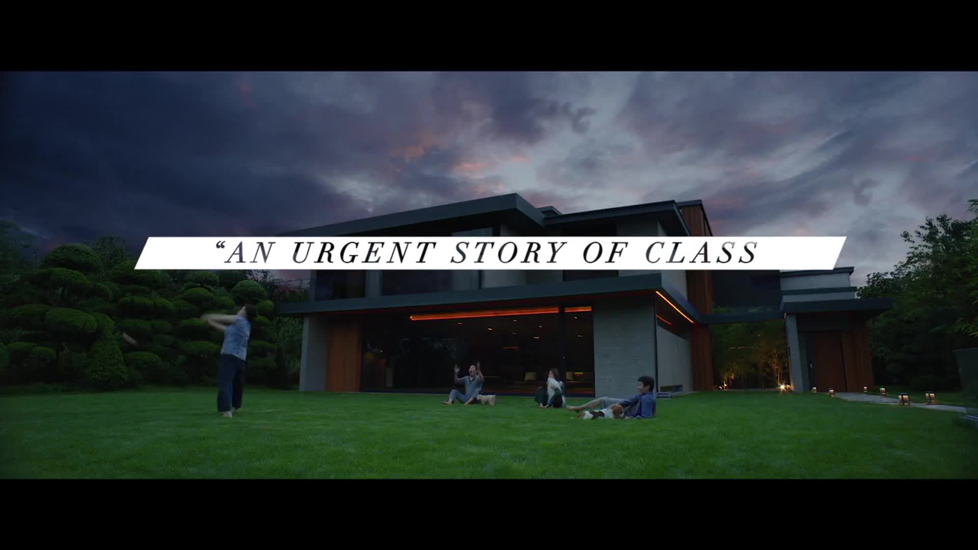
Near the top, the tagline “Misplaced Familyhood” is also set in all caps, using Garamond (it looks like it could be Garamond Premier Display).
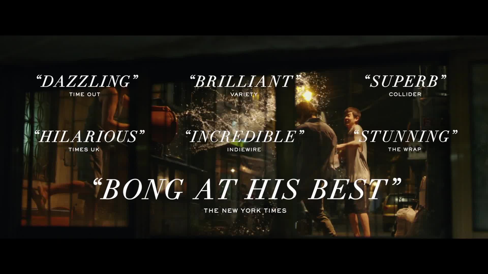
The nicely animated reviews/blurbs throughout the trailer are set in loosely spaced Linotype Didot eText Italic along with the sources set in Gotham.
The billing block at the end is also set in varying sizes of Linotype Didot.
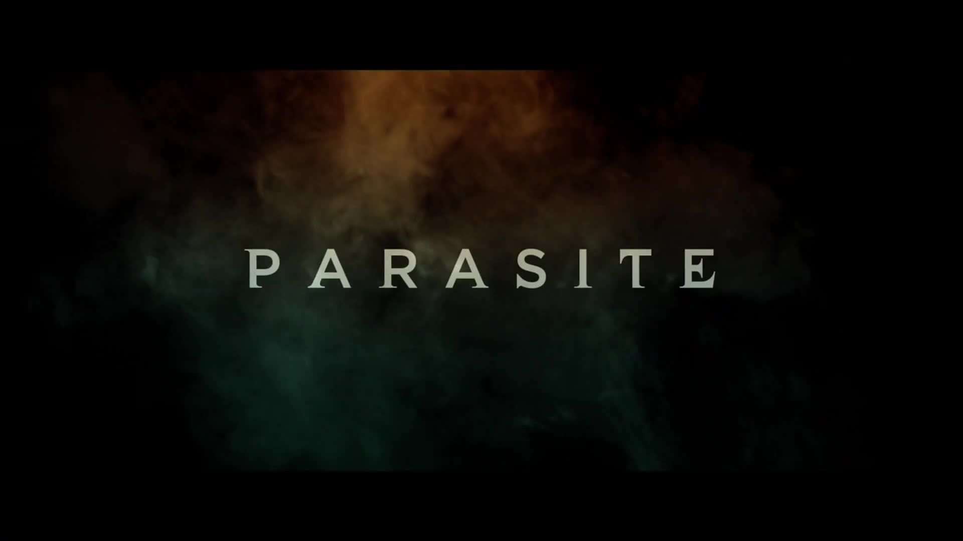
Parasite title (from trailer).

Blurb (from trailer).
Blurb (from trailer).
Blurbs (from trailer).

Billing block (from trailer).
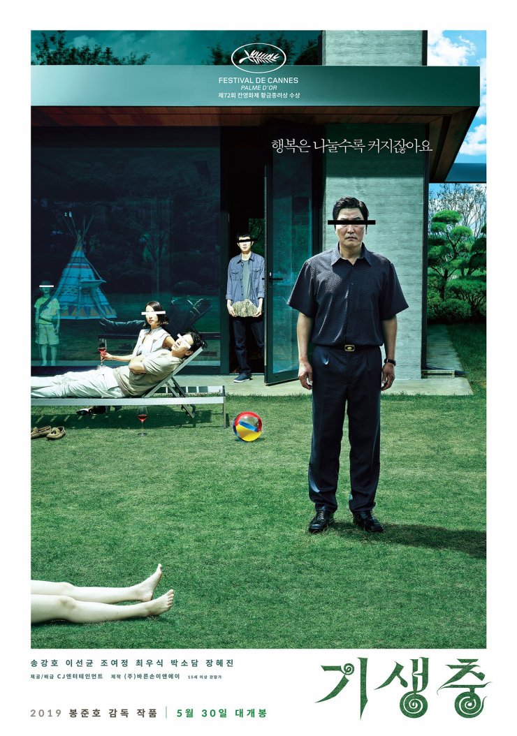
Original Korean-language poster by Kim Sang-man


</cite> exhibition")


")


")


 poster, titles, promotional materials")


![“Ich/Wir brauchen Schweiz.” [“I/We need Switzerland.”] campaign](https://assets.fontsinuse.com/use-media/131074/thumb/6007bfbd/@2x/jpeg/I-need-Switzerland--1-22-screenshot.webp "“Ich/Wir brauchen Schweiz.” [“I/We need Switzerland.”] campaign")


14 Comments on “Parasite movie poster and trailer”
The sans/serif hybrids of the 1990s (Amplifier, Dead History, Missive, Time in Hell) are back!
See also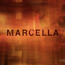
Possibly inspired by animated showing of variable fonts and the suggestion that the boundaries between sans and serif are fluid.
How do you get the logo font?
There is no font that looks like that out of the box. Like Brian writes, it’s Gotham with added serifs. See the typefaces that Stephen mentioned for readily available fonts with a similar feel.
The design is by Kim Sang-man!
Thanks, Jahan! Sang-man is indeed credited for the original Korean poster shown at the end. From mubi.com:
Yeah, I was the one who told Adrian about the designer. ^_^ I got the info from the brilliant guys at the Korean Design agency Propaganda.
See also: M Night Shyalaman’s tv series, Servant
Thank you, Chia. That’s Times New Roman with some serifs removed. For a typeface that is similarly trimmed out of the box, see Cutoff.
For every jingle with ukelele, handclaps, glockenspiel and whoaoaoaoah hipster chorus, there is an equal and opposite white on black loosely spaced all caps Didot Italic.
[translated from German]
Garamond and Didot: The stroke weight is too similar, as is the typographic color. The letterforms of the static Didot and of the dynamic Garamond don’t match either. It’s remarkable that the decision was made that way regardless.
I found out that agency was known in the credits as “Brand Strategy, Messaging, Creative and Graphic direction for CJ ENM by MMBP and Associates”.
Thanks, Jay. Added.