
Bonavista Coffee Company

Bonavista Coffee Company is a micro coffee roaster based in Newfoundland with an amazing mission to become totally Direct Trade. Owner Jon Howse travels to coffee producing countries to meet with farmers and pay higher prices for better farming practices and higher quality coffee.
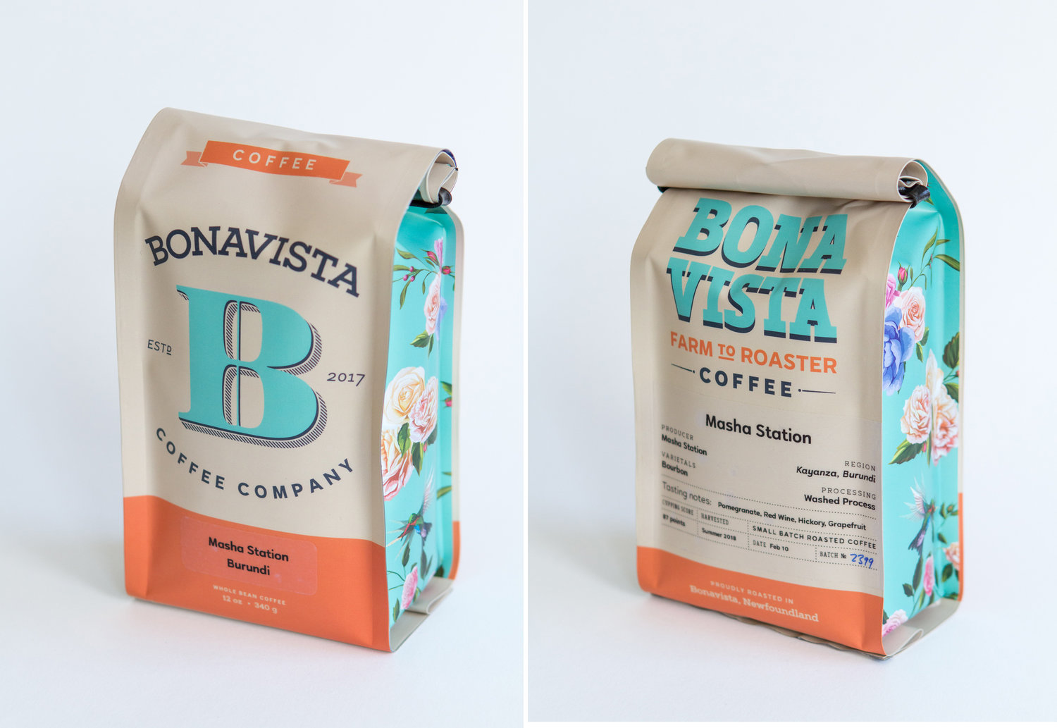
The visual identity reflects the forward-thinking nature of the company with simple pastel colours. The strong history of early European explorers and cartography is emphasized by the giant B monogram. This is contrasted by two modern typefaces: a post-geometric sans, Halcyon, brings a bold, modern look; and a strong slab serif, Artegra Slab, emphasizes the hard-working nature of the small community of Bonavista. Halcyon is an incredible workhorse type family that really deserves more attention. It has geometric forms but a charismatic overall feel and true italics.
The two package designs differentiate coffee and espresso brewing methods and roast profile. Layout and hierarchy bring the farmer and place of origin to the forefront, with extensive information on the back for the curious customer or coffee connoisseur. Side panel illustrations for the espresso bag were drawn by artist Knoah Bender.


")


 film titles, posters, soundtrack cover")


