
Clip Books of Line Art, Volk (1955)
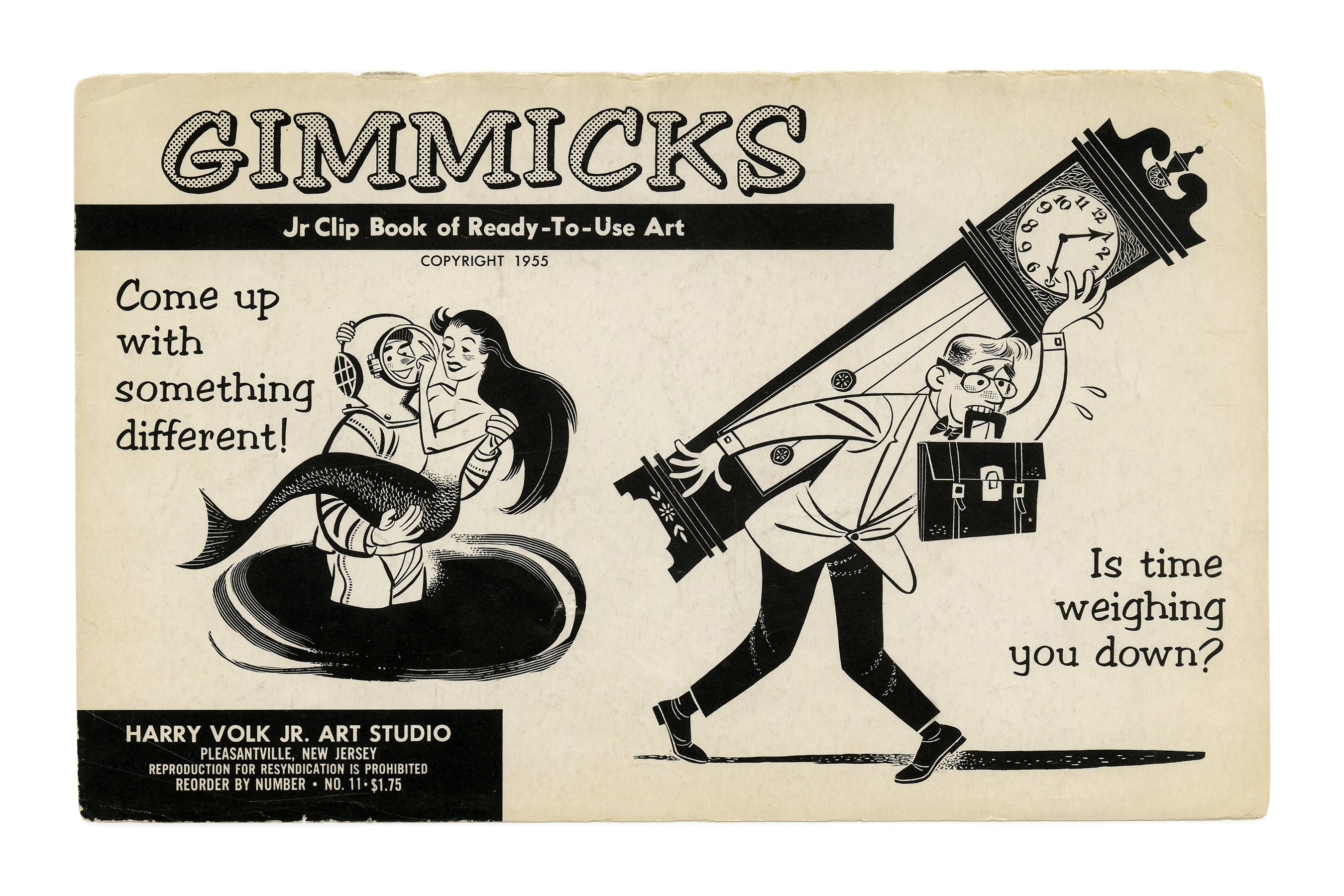
“Gimmicks” (No. 11) ft. Filmotype Vessel, an open and shaded variant of Filmotype Arrow, here filled with a halftone pattern, and August.
Covers for various clip books of line art issued in 1955 by Harry Volk Jr. Art Studio, Pleasantville, New Jersey. All typefaces used for these covers were available from Filmotype, with many of them being originals by the American phototype company.
“[…] ex-journalist Harry Volk had come up with the idea of publishing stock artwork – high quality line-drawings of people and objects, generic, any-purpose illustrations and cartoons known in the trade as ‘spots’ – and in Harry’s case as ‘clip-art.’ […] Printed on glossy stock, costing the end-user pennies, these drawings were cut-and-pasted into advertisements, brochures, newsletters appearing all over the country, even used as artwork on packaging, on TV and displayed on billboards. […] For years the Volk Clipbooks of Line Art were ubiquitous, a presence in the art departments of virtually every non-major ad agency, house-organ and art service in the US.” — From The Adventures of the Real Tom Sawyer by Thomas B. Sawyer, via Today’s Inspiration.
The company was founded around 1952, and the first booklets were published in 1954, initially under the name “Clip Books of Ready-To-Use Art”. Some issues from this second volume still feature that name. See more covers in the Flickr album by Bart Solenthaler, who also maintains The Bart&Co. Historic Clip Art Collection. For more posts on Fonts In Use with information about the typefaces used on the covers of these booklets, see Harry Volk Jr. Art Studio.
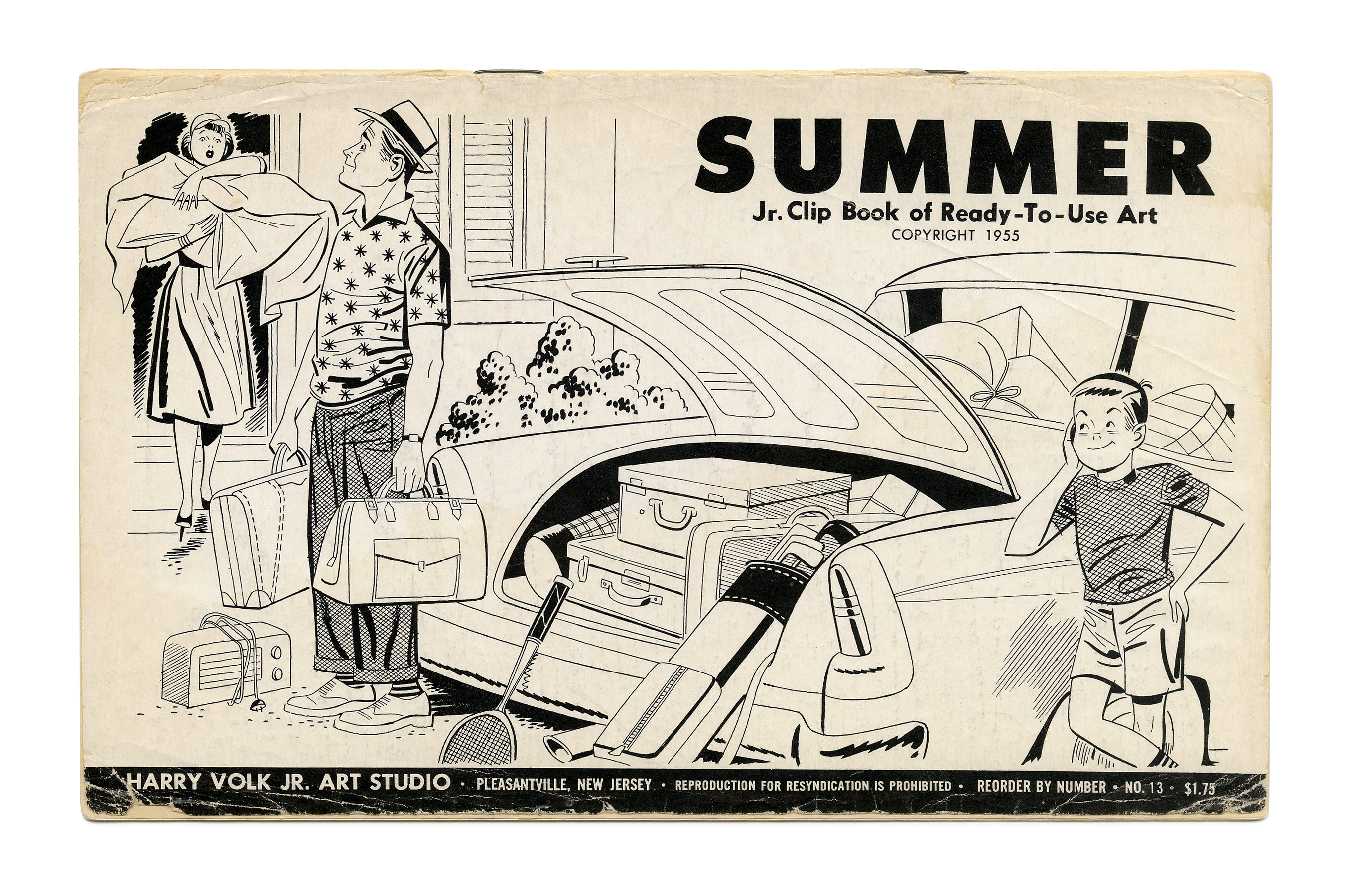
“Summer” (No. 13) ft. three weights of Futura.

“Gimmicks” (No. 17) ft. all-caps Filmotype Arctic and Venus Extended.

“Gimmicks” (No. 20) ft. Filmotype April and Alternate Gothic.
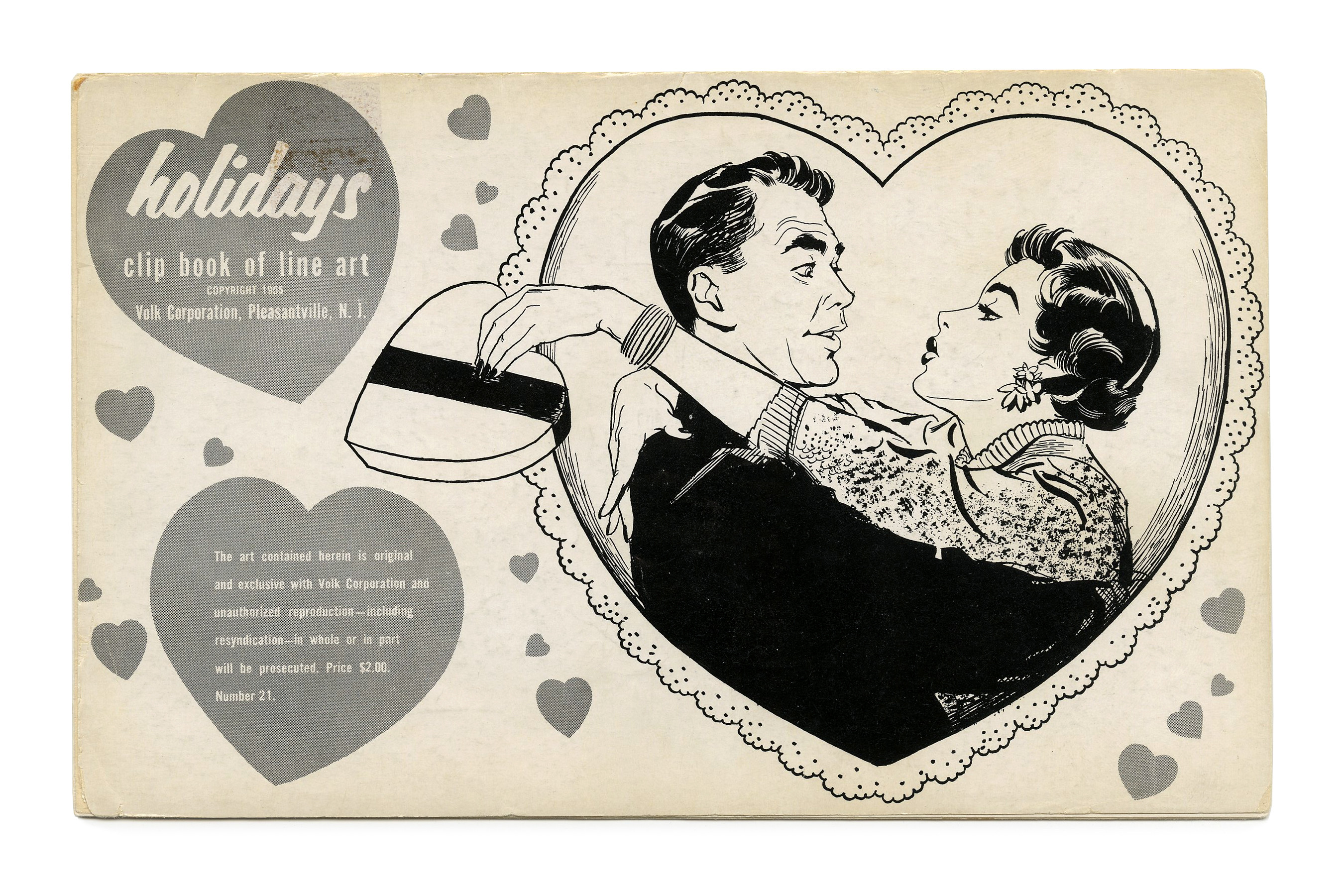
“Holidays” (No. 21) ft. Filmotype Lion.

“Hazards” (No. 166) Filmotype Army.

“Mail Order” (No. 170) ft. Filmotype Quiet and Filmotype Lion.

“Sports” (No. 171) ft. Filmotype Army and Venus Bold Extended.
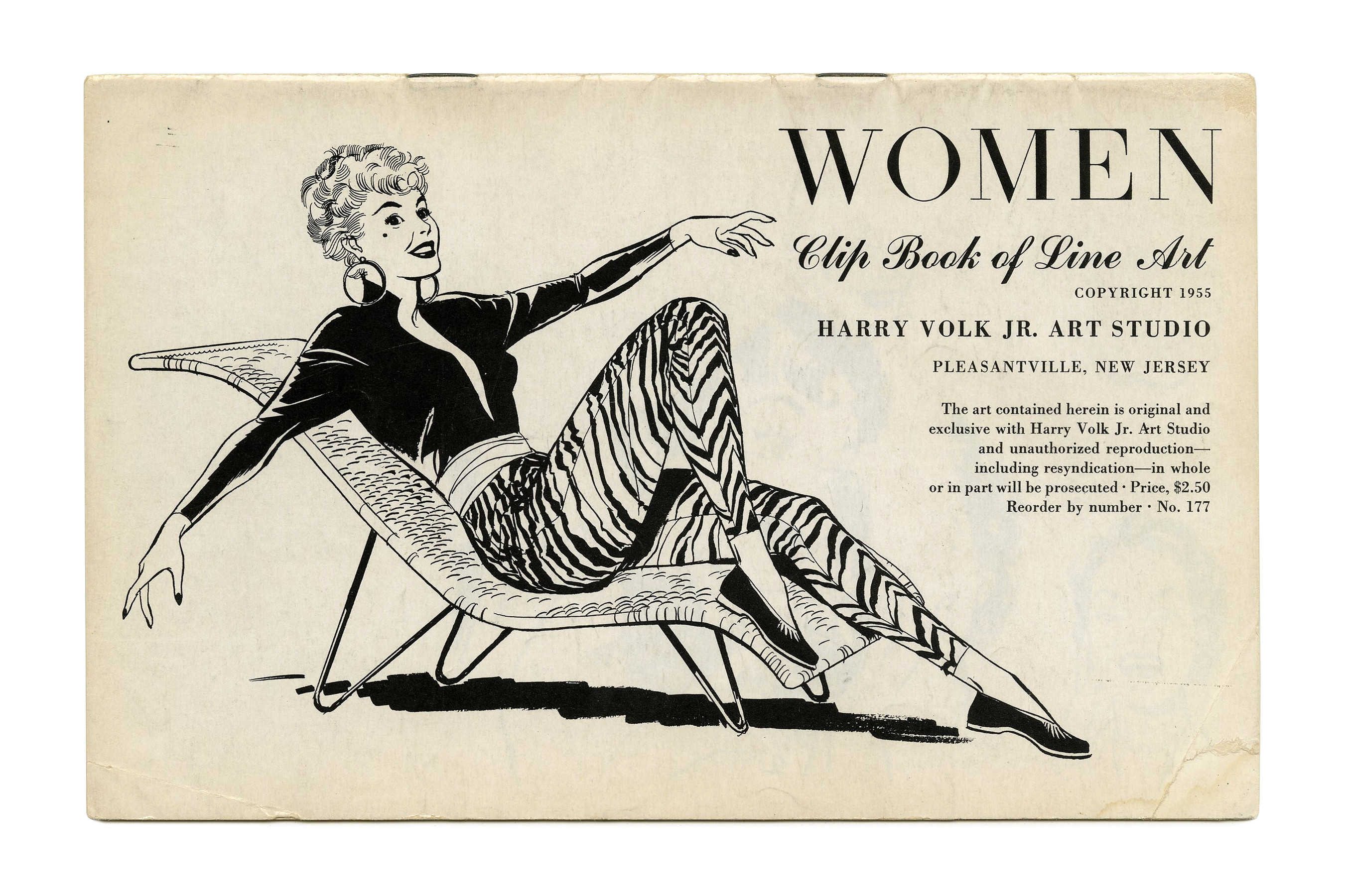
“Women” (No. 177) ft. what looks like Filmotype Randolph, a Didone with bilateral serifs in places where they usually don’t belong. Randolph doesn’t appear in 1955 and c.1958 catalogs, so maybe this is a hand-lettered precursor. Additional typefaces include Commercial Script and Bodoni.
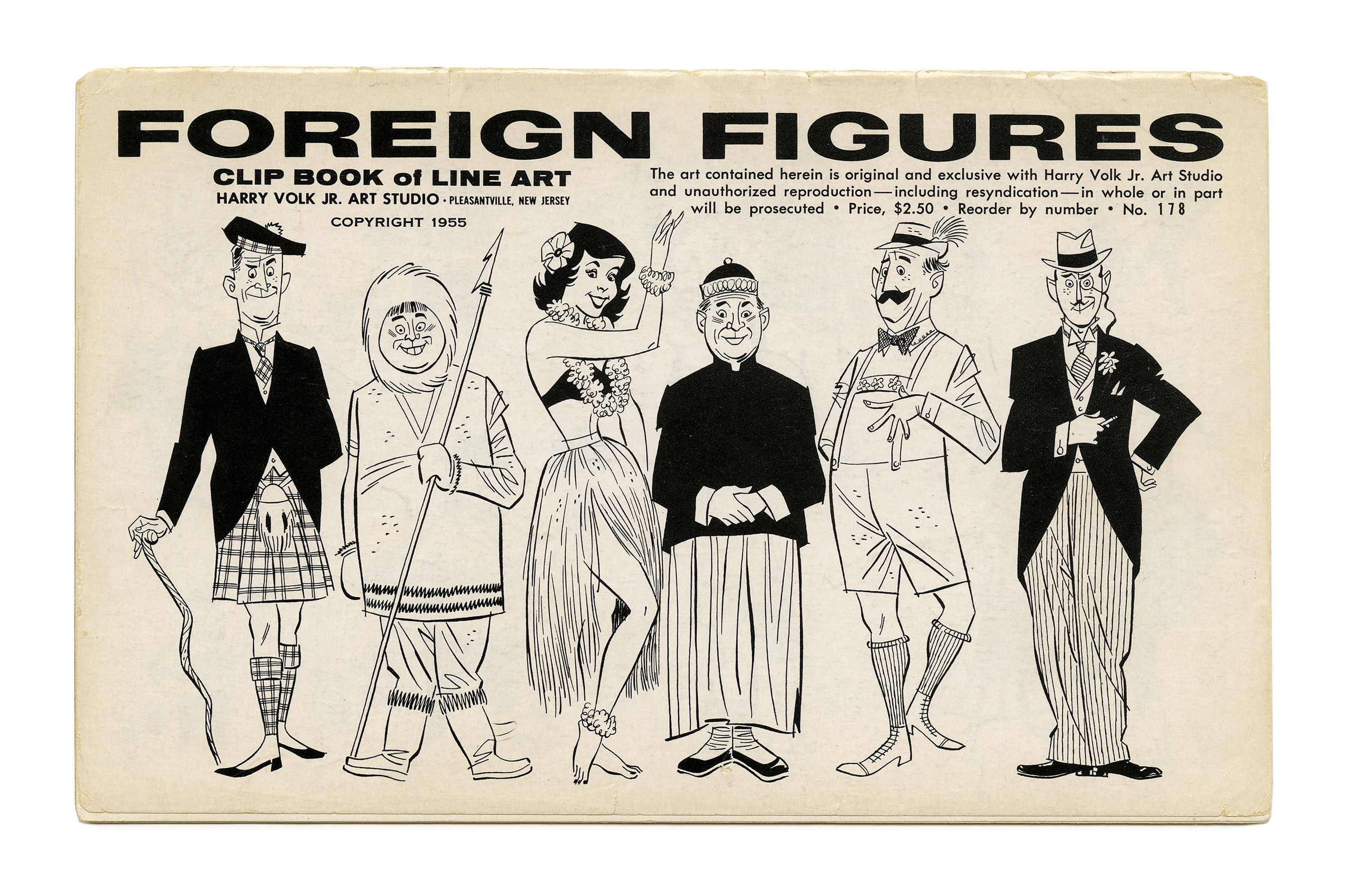
“Foreign Figures” (No. 178) ft. Filmotype Fox. Illustration by Bob Bugg (?). Secondary typefaces include Venus Extra Bold Extended, Futura, Alternate Gothic, and Copperplate Gothic.

“Office” (No. 182) ft. Filmotype Pixie and Bodoni.

“Couples” (No. 183) ft. Filmotype Hamlet.

“Sales” (No. 186) ft. Filmotype Havana (or maybe Filmotype Horizon) with Century Schoolbook Italic.
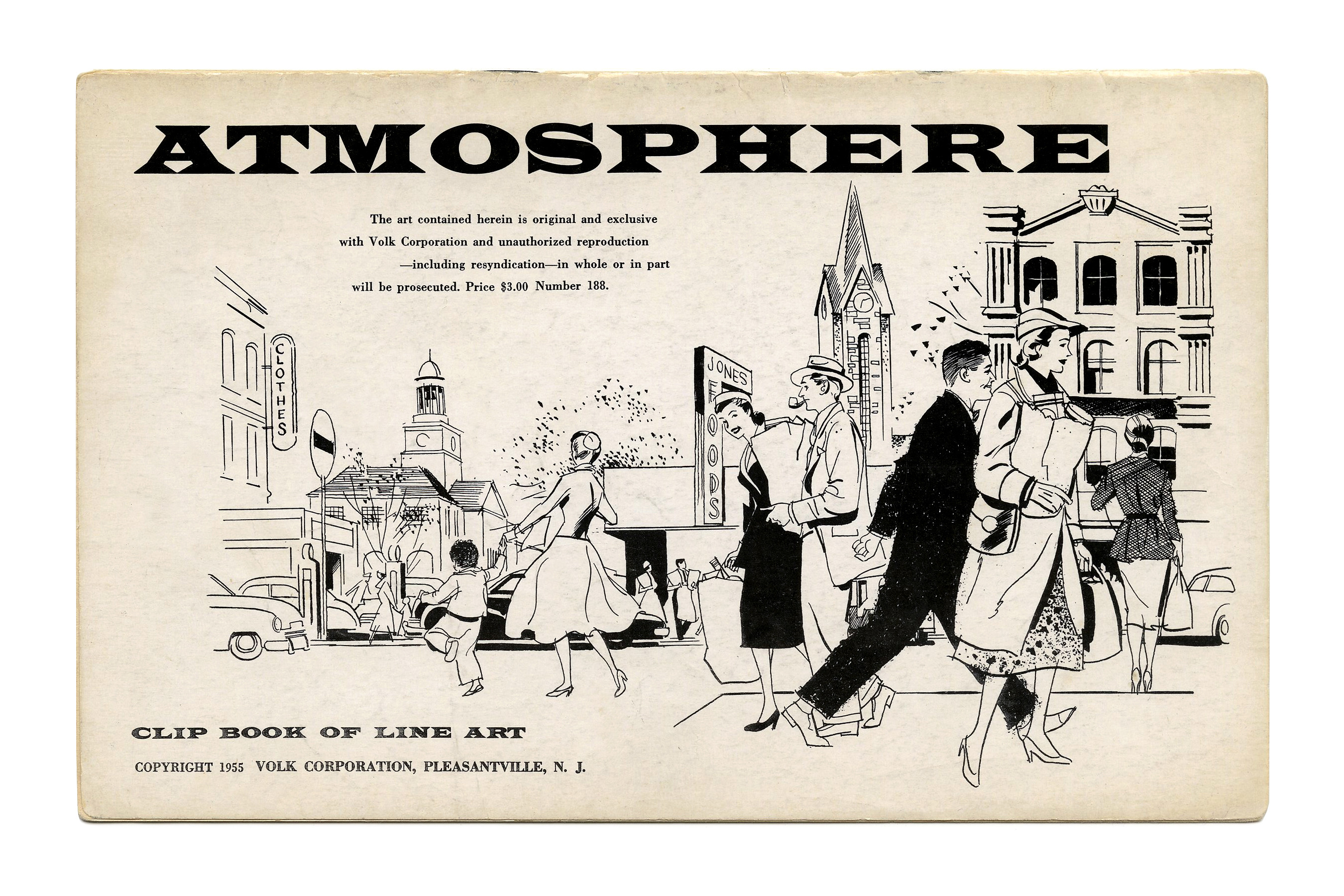
“Atmosphere” (No. 188) ft Latin Wide.
![“Zanies” (No. 189) ft. stacked glyphs from [edit: rather , see comments] in alternating shades. The text in the balloons was typed on a typewriter.](https://fiu-original.b-cdn.net/fontsinuse.com/use-images/138/138760/138760.jpeg?filename=49337671982_92042e6b52_3k.jpeg)
“Zanies” (No. 189) ft. stacked glyphs from Filmotype Wells [edit: rather Latin Wide, see comments] in alternating shades. The text in the balloons was typed on a typewriter.

“Heads” (No. 191) ft. Filmotype Arctic with Alternate Gothic.


2 Comments on “Clip Books of Line Art, Volk (1955)”
The font used for “Zanies” appears to be the exact same font as the one used for “Atmosphere”. If Filmotype Wells were actually being used there, it’d look a tad shorter, but not to the same extent as Latin Bold is.
Thanks, Bryson. Agreed. Filmotype carried adaptations of several styles of Stephenson Blake’s Latin, incl. the Wide (as “LW”), as well as original additions. Wells is basically the same as Latin Wide, squeezed to 75%. Shown below is a snippet from a mid-1970s Filmomaster catalog, with the Latins.