
Jorge Ben – A Banda Do Zé Pretinho album art
Contributed by Herb Lubalin Study Center on Dec 28th, 2019. Artwork published in
.

Source: www.brazilcult.com License: All Rights Reserved.
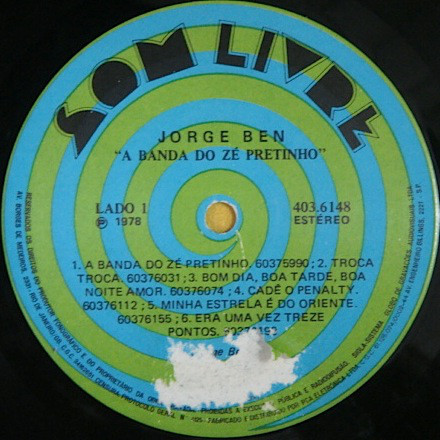
Jorge Ben’s album cover using Milton Glaser’s Baby Teeth typeface (Dotted style). The choice of the face works well since the letters are square-proportioned so the leg of the R lines perfectly with the diagonal of the N. The vinyl record labels use the rarely seen Riverside Drive typeface that Peter Max designed for Photo Lettering in 1970. The title of the album is set in ITC Souvenir (Demi Italic style).
The design is by Hélcio Mário Noguchi, a prolific Brazilian designer.

Source: www.brazilcult.com License: All Rights Reserved.
Source: www.brazilcult.com License: All Rights Reserved.


")


1 Comment on “Jorge Ben – A Banda Do Zé Pretinho album art”
Fun fact: Baby Teeth and Riverside Drive are shown on the same page of Photo-Lettering’s One Line catalog. Not that that’s a surprise, given their similarity.
The Peculiar Manicule has scanned pages from a booklet issued by Photo-Lettering to advertise Riverside Drive. The page reproduced below shows the six variants: Riverside Drive A (outlined), Riverside Drive (solid), Riverside Drive D (outlined & contoured), Riverside Drive B (contoured), Stars E (outlined w/ star pattern fill), and Riverside Drive C (contoured with larger offset):
In 2014, Nick Curtis made a digital interpretation named Maxed Out NF. It covers the solid style as well as B and Stars E.