Arthur C. Clarke paperback series, New English Library
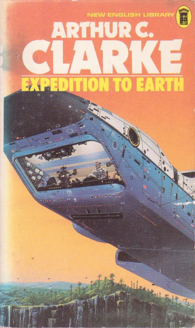
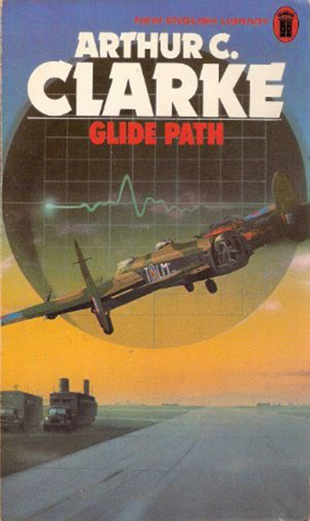
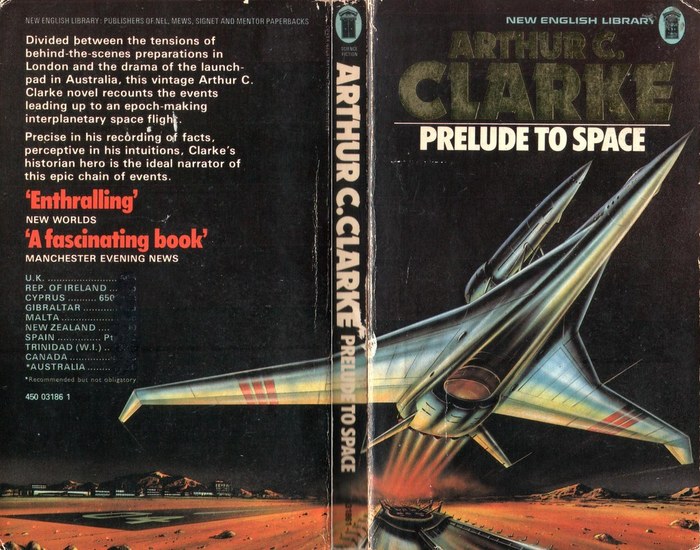
The paperback series with Arthur C. Clarke novels as published by New English Library around 1976 uses Dynamo for the author’s name and Futura Extra Bold Condensed for the title, both in all caps.
Dynamo was designed by Karl Sommer and first cast by the Ludwig & Mayer foundry in Frankfurt/Main in 1930. In or before 1976, Letraset had re-issued the heavy semi slab for dry-transfer lettering, and subsequently expanded the design with a lighter Medium, a Shadow style (both 1977), a Chrome variant (1982), and a Condensed. Coincidentally, Futura Condensed originated in Frankfurt in 1930, too, at the competing Bauer foundry. The Extra Bold that is used here was added by Intertype in the 1950s, though.
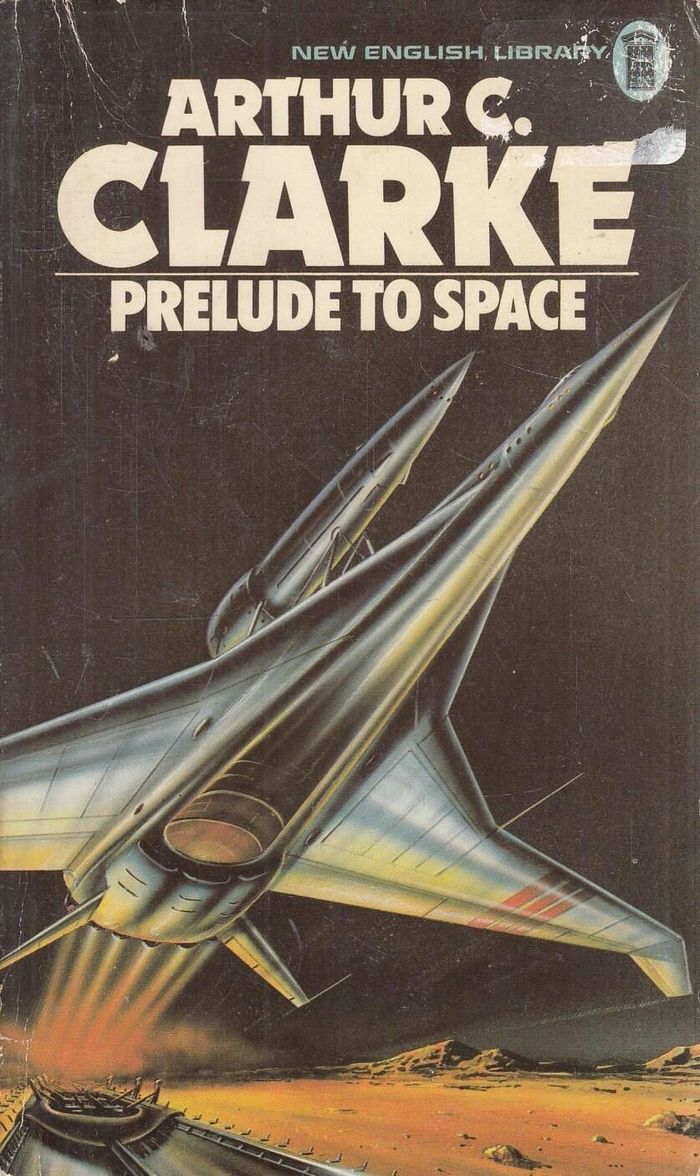
Prelude to Space, 1977. Cover art Gordon C. Davies.
Formats
- Books (5416)
Topics
- Literature (2503)
- Science/Nature (905)
Designers/Agencies
- Gordon C. Davies (1)
Tagged with
- New English Library (14)
- Arthur C. Clarke (7)
- book series (428)
- book covers (4787)
- paperbacks/softcovers (1486)
- science fiction (407)
- 1970s (1355)
- all caps (5958)
- typeface combinations (3118)
- back covers (1664)
- space travel (116)
- Mars (13)
- Earth (50)
- spacecraft (41)
- book spines (1220)
- blurbs (152)
- novels (539)
- reversed type on an image (1017)
- borders and rules (918)
- all caps Futura Extra Bold Condensed (6)
Artwork location
- United Kingdom (2758)
- London (1520)

















However, if you want to have a very good selection of font styles, you should get the following families: For this, please take a look at the comments on this page!