
Raaka Chocolate

Raaka Chocolate has been crafting bold and innovative chocolate out of their factory in Red Hook, Brooklyn since 2010. By using an unroasted process, they are able to stay true to their cacao’s vibrant, fruity flavors – which are sourced from single-origin growers across the world.
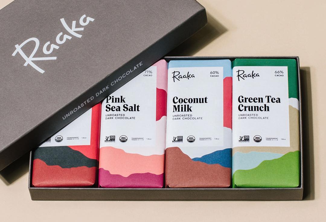
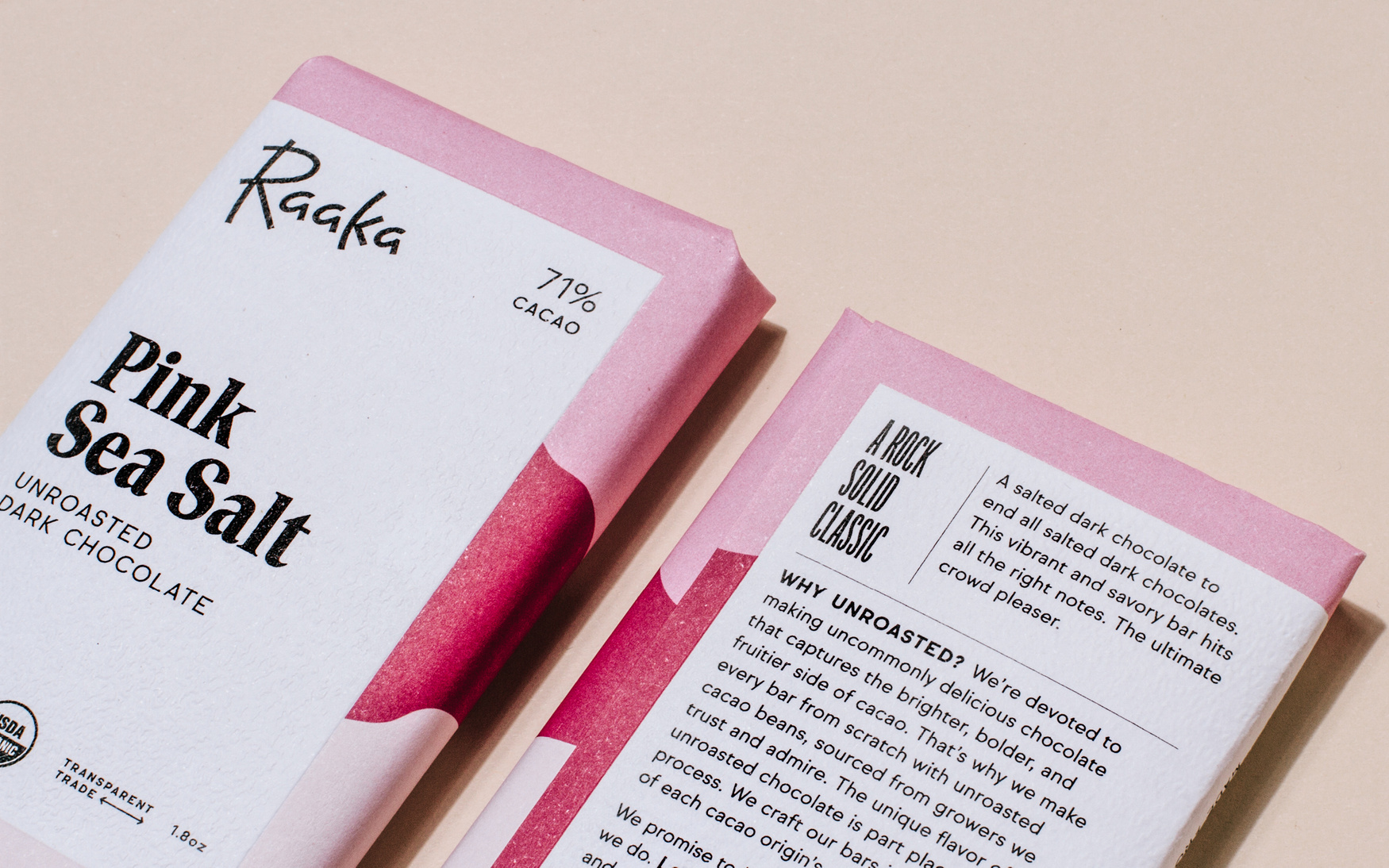
Andrea Trabucco-Campos and Simon Blockley teamed up to redesign the entire packaging line and build a new brand identity. They redrew the script logo and introduced a custom font designed by Trabucco-Campos. Alku is used for the names of the various flavors, each of which has a unique colorful pattern inspired by the origin landscapes. The bold serif is contrasted with Sul Sans (R-Typography) and Origin Super Condensed (Production Type). The towering letterforms of Origin appear for headings on the wrapper interiors. Committed to transparent trade, Raaka here educates customers about the cacao supply chain and processes.
Photography by William Mullan.


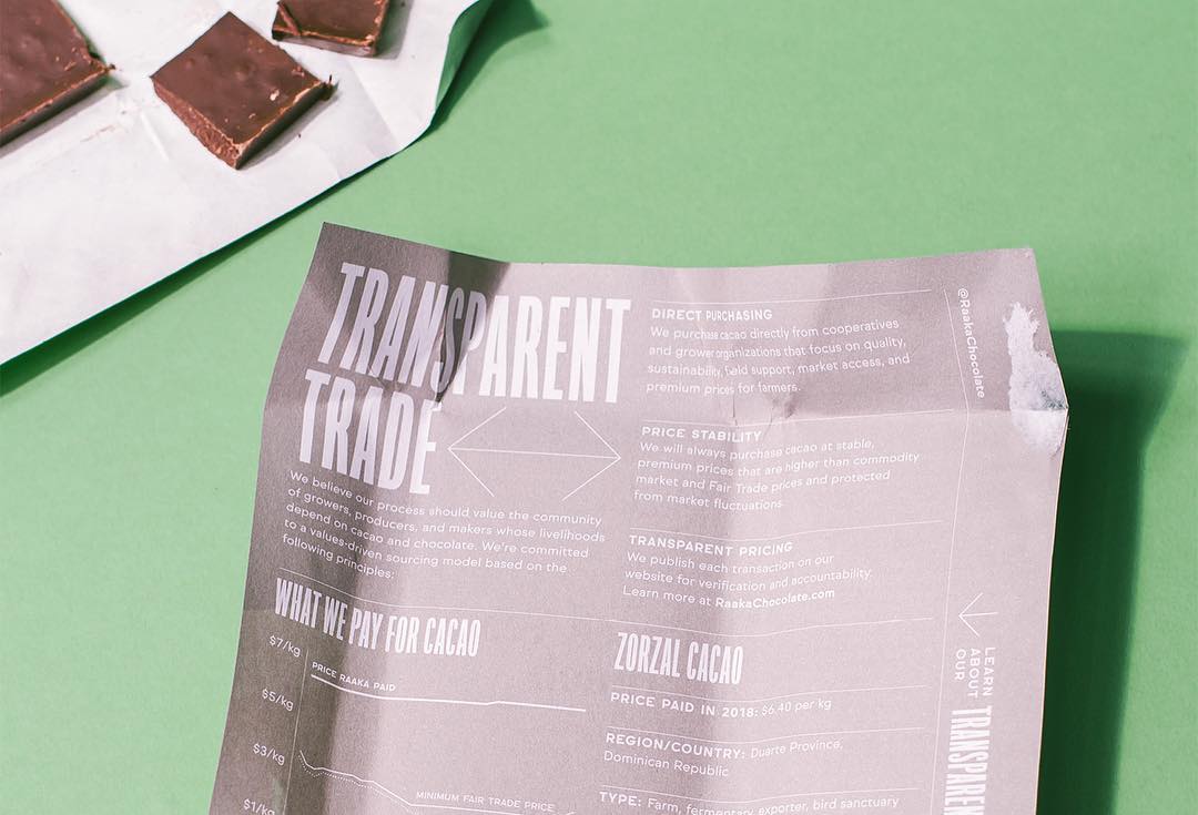

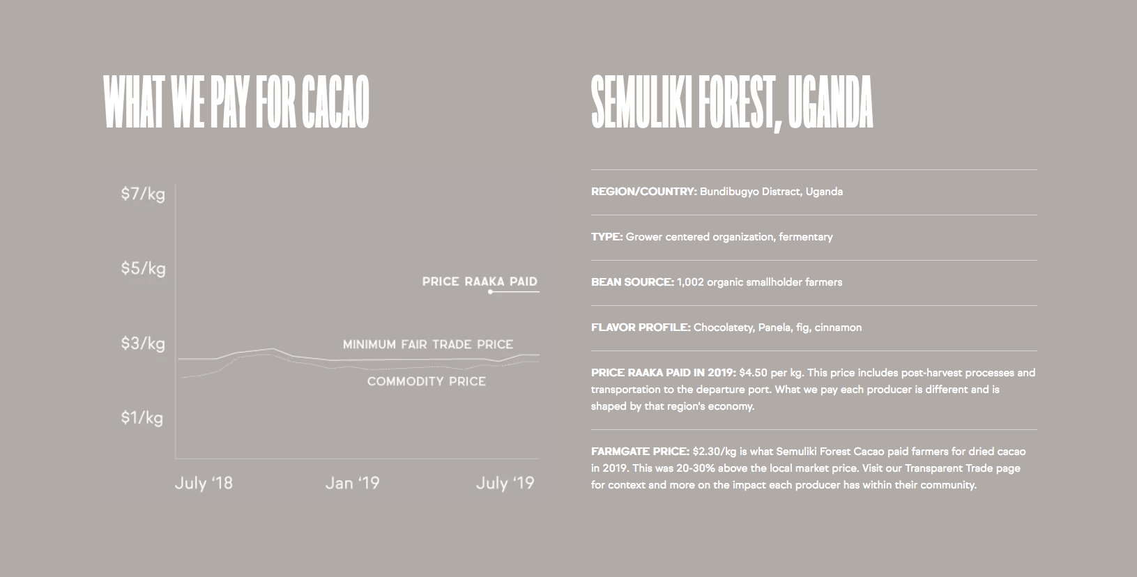
Origin Super Condensed is also used for headings in the website, as well as for the graphics introducing their producer partners, see below.


")


5 Comments on “Raaka Chocolate”
www.raakachocolate.com/page…
A typeface with a Finnish name created for a chocolate company with a Finnish name doesn’t have an Ö in the set? For shame!
Ouch indeed. Below the full character set of the Alku webfont. For better or worse, the current version of the webfont does not fully support any non-Finnish languages either.
It’s an attractive font, and obviously an American company has little reason to anticipate needing umlauts on their website. Their suppliers being all around the world they could’ve been a slight hint.
I’ll settle for reading the missing glyph on that page as a small piece of karmic retribution for their skin-deep interest in my native tongue. (Raaka being Finnish for 'raw’, alku for 'beginning’.)
It’s not a shame to focus on the core needs when developing a custom font. I don’t know about the details of the brief, but I’d assume that the character set was determined based on the primary use, including an English-only website and the flavor names of the packaging. They knew they’d need an ó for Yacón, and hence it was included. You never know what kinds of texts the web editors will feed into the system later on. It’s not efficient to cater for all eventualities and pay for a full-blown Latin Pro character set upfront, which then remains unused 99% of the time. And even then, unforeseen things like this can happen. It’s a different situation for a client with a more diverse corpus, like a newspaper. But for a small-scale chocolate maker, I think it’s pretty rad to commission a custom typeface in the first place!
Certainly! Still, it would be even better if the relationship with the typedesigner would continue after the initial launch. The website now uses fallback typefaces for at least Ö ( ) * ’.
On their website, Raaka is impressively complete and transparent about the origin of their products, and about their relationships with suppliers. Hopefully, one day they will decide that this completeness must be reflected in their corporate letter too.