
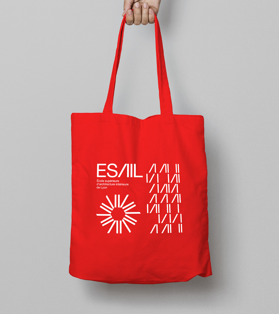
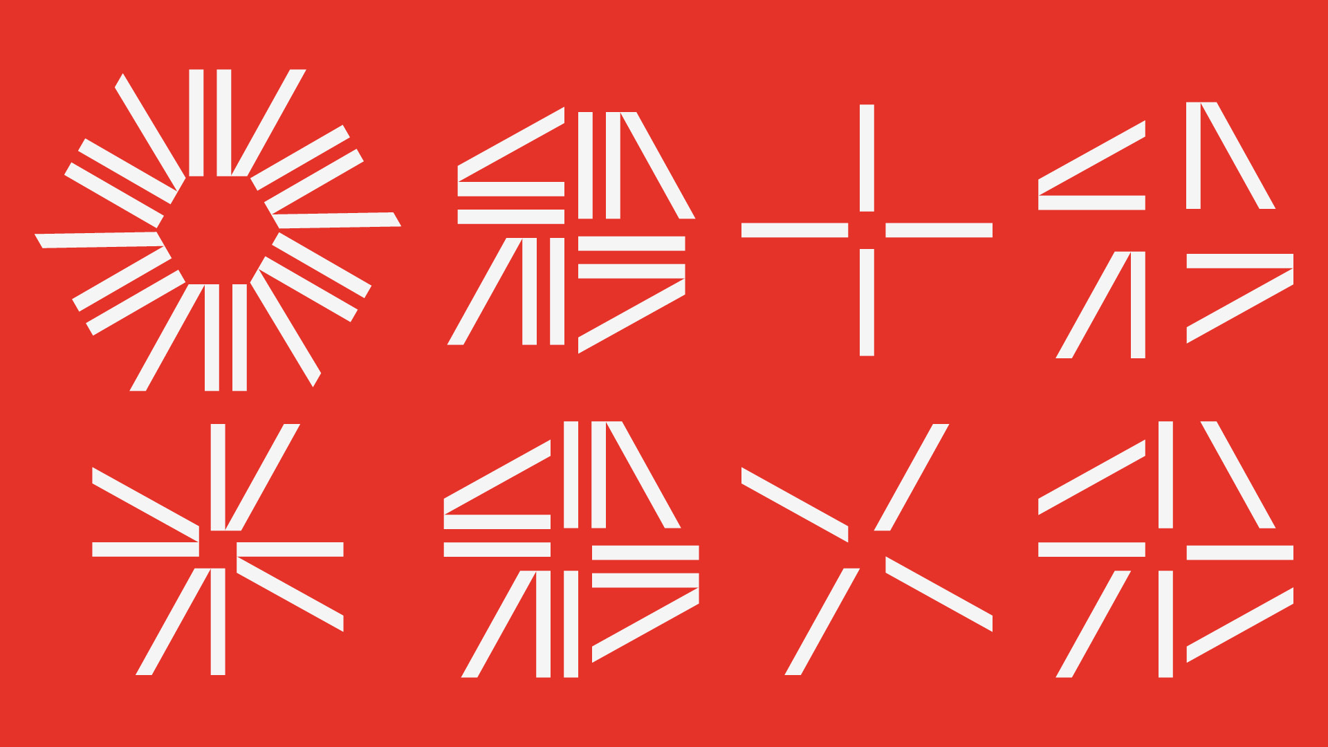
ESAIL identity

Our agency was commissioned to design the new visual identity of the École Supérieure d’Architecture Intérieur de Lyon. Ranked among the ten best interior architecture schools in France, ESAIL wanted to acquire a contemporary image in line with the quality of its teaching. The school is both a place open to experimentation but also a springboard to the professional world.
Helvetica is used throughout, from the smallest texts to the logotype, constructed using partially modified type. The letters E, S, L, are institutional information, they keep classic and regular attributes. The A and the I of ‘architecture’ and ‘interior’ define the university: by giving them a particular treatment, the glance and the interest are carried directly on these two disciplines.


")

” / “What A Wonderful Thing Love Is” German single cover")

 identity")


")


