Beck’s campaign Brazil
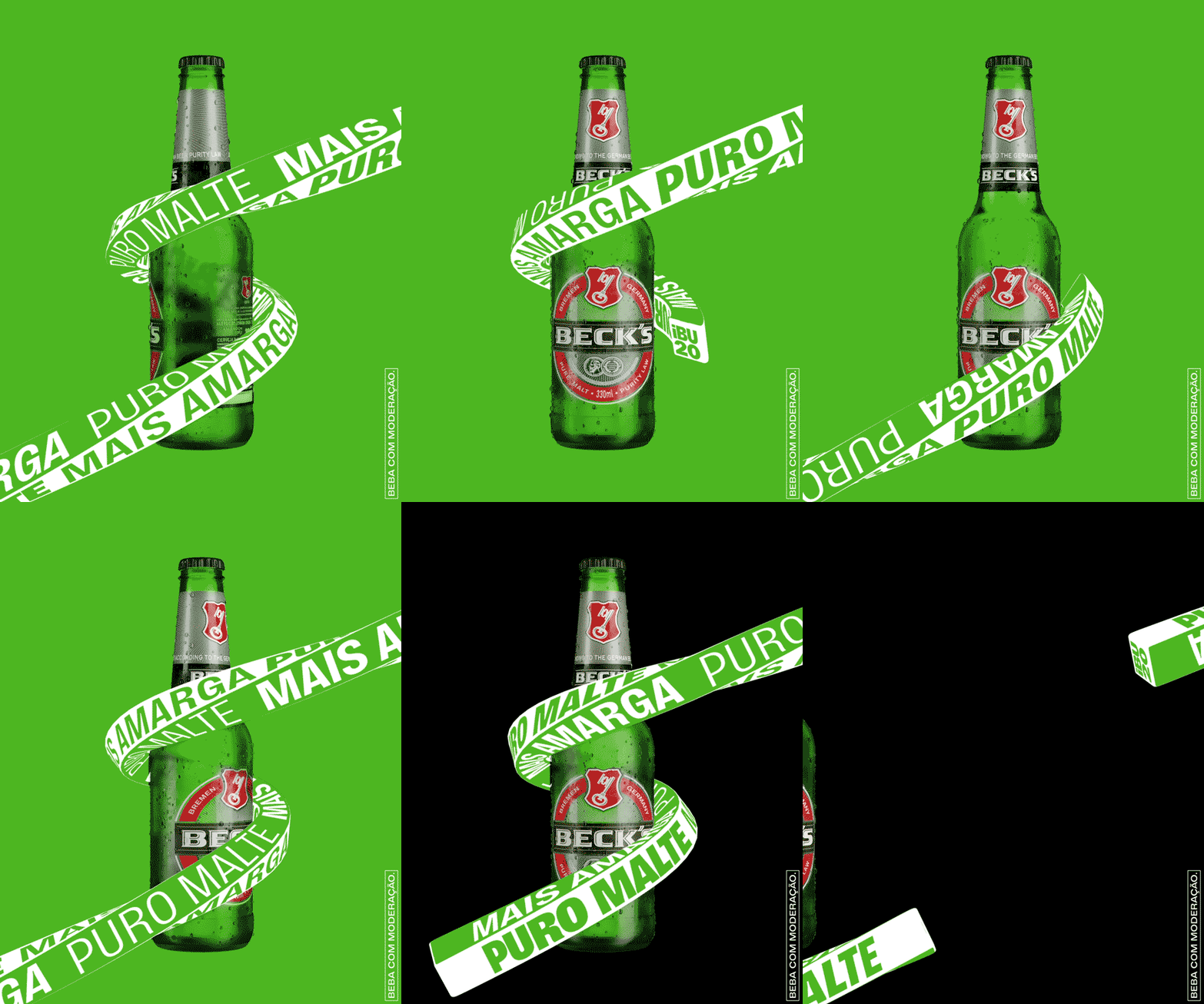
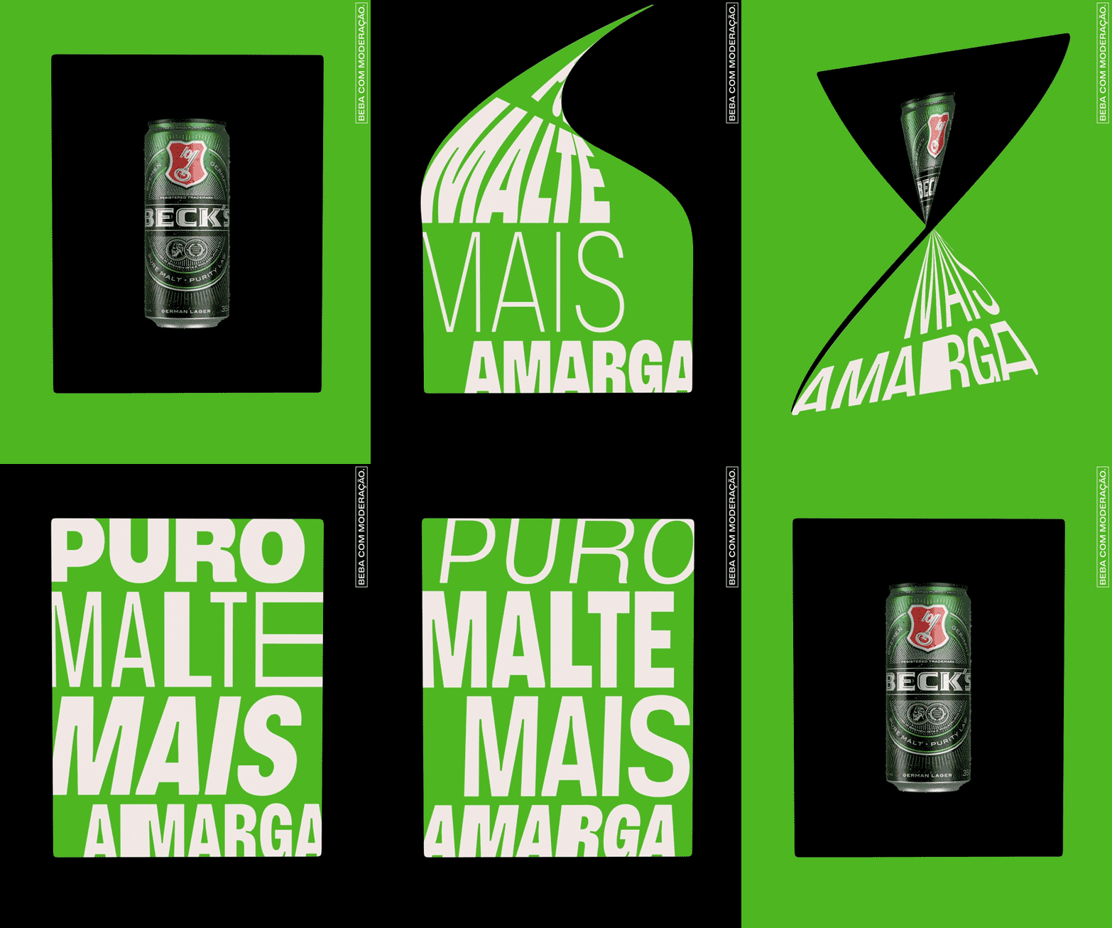
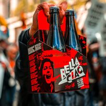
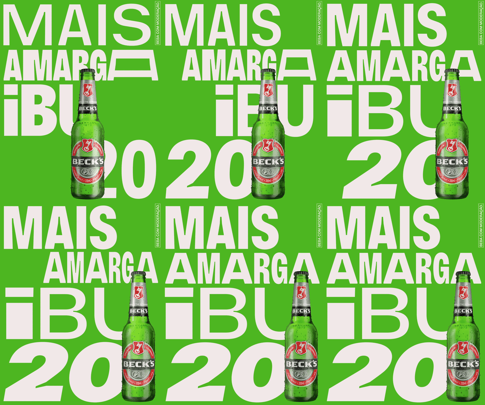
AKQA was responsible for the launch of Beck’s beer in Brazil. The campaign is an all type motion galore, with type interacting with the can and the bottle, taking a leading role.
Stretching, roling, expanding, multiplying, the campaign is used in many situations throughout social media as well as in-store ad activations such as LED displays and the such.
Vinila is neutral enough for use in a wide gamut of formats, yet its inktraps make it easily recognizable and unique. Flora de Carvalho’s Vinila started out for a small label in a music packaging project. Her intention was to create a legible neo-grotesque in text sizes that could bring a lot of texture/personality when used large.
Eduarda Nieto, a Miami Ad School graduate and D&AD pencil award winner, art directed the project. Motion design was done by Polar (formerly known as Estudio Arco), with 3D by Lucas Mayer. The studio has been tackling kinectic typography like few others.
As the engineer that helped bring Vinila to the market (it was released through Plau), it was a joy to see the use of our very first variable font in the context for which it was designed for. See more animations on Nieto’s website.



Formats
- Branding/Identity (6656)
Topics
- Food/Beverage (2552)
Designers/Agencies
- Polar, Ltda. (17)
- AKQA (4)
- Eduarda Nieto (5)
- Lucas Meyer (1)
Tagged with
- beer (181)
- animation (278)
- variable fonts (136)
- Beck’s (3)
- animated type (318)
- advertising (178)
- campaigns (265)
- series (926)
- beer cans (79)
- beer bottles (56)
- green (647)
- green and black (159)
- multiple widths (453)
- multiple weights (352)
- variable font gradients (15)
- repetition (683)
- ink traps (61)
- Portuguese (language) (409)
- alcohol (278)


