
Clip Books of Line Art, Volk (1972)
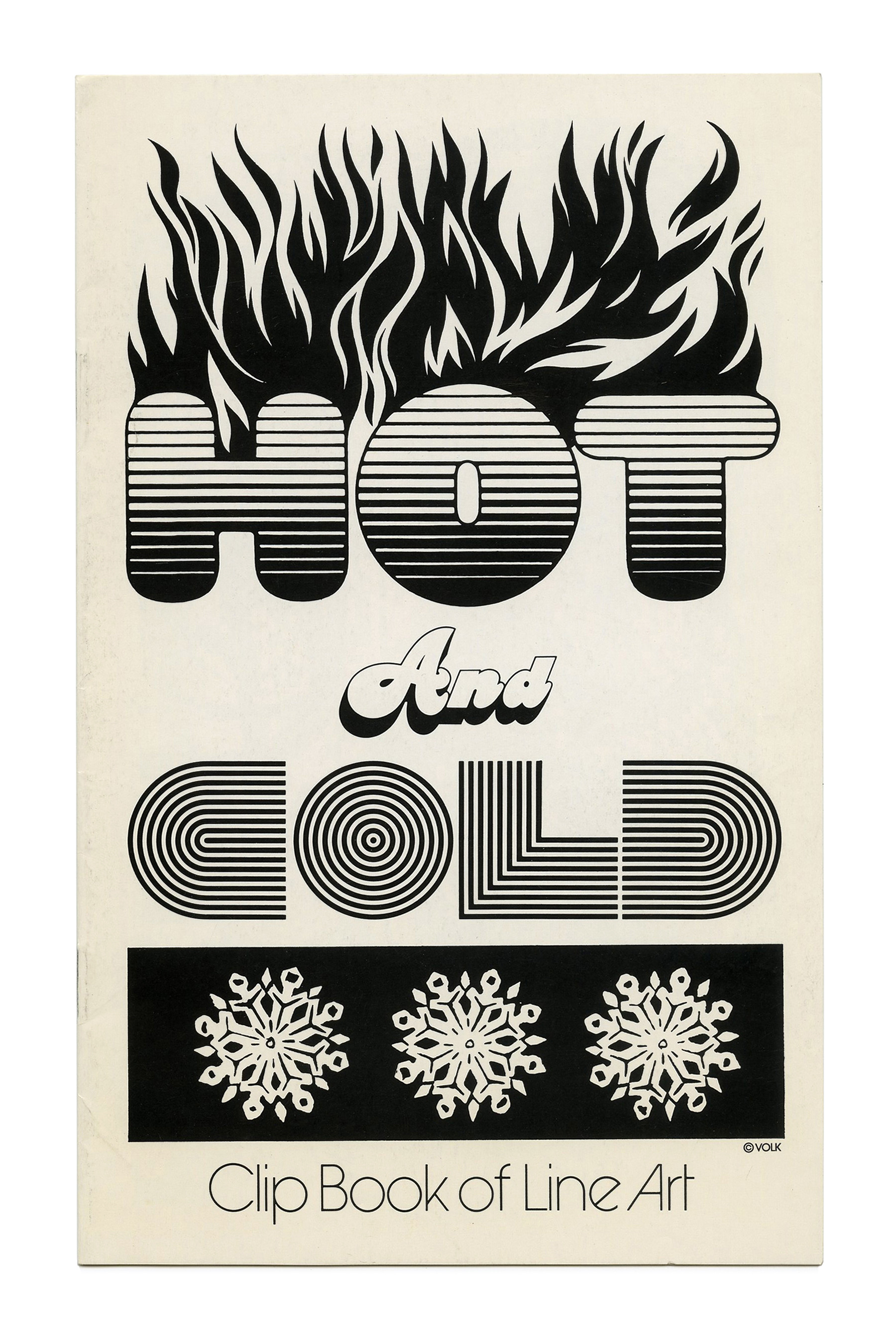
“Hot & Cold” (No. 228) ft. Chwast Blimp and Benguiat Charisma Script. “COLD” appears to be based on Opresco Fingerprint, with the outer lines removed. All three faces are original designs carried by Photo-Lettering.
Covers for various clip books of line art issued by Volk Corp in 1972. This volume continues the portrait format that was introduced in the year before. Just as in 1970 and 1971, many of the display faces like Brave and Free or Futura Dot are novelties from the extensive catalog of Photo-Lettering. Jolly Roger and the refreshingly blasphemous Helvetica Flair originated at Phil Martin’s Alphabet Innovations. The covers with Countdown and Premier Shaded might be among the earliest examples for Letraset originals used by Volk. On most covers, the line “Clip Book of Line Art” is set in ITC Avant Garde Gothic with alternates for e and A.
See also the dedicated post about the subseries titled Grafika which includes booklets published in 1972. For more information on Harry Volk Jr. Art Studio, see the post about the clip books issued in 1955.

“Distaffers” (No. 227) ft. Kabel Black, contrasted with Kabel Light.
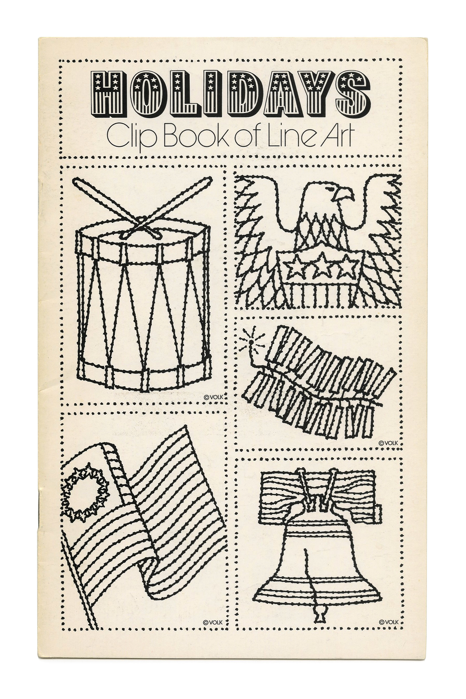
“Holidays” (No. 229) ft. Brave and Free.
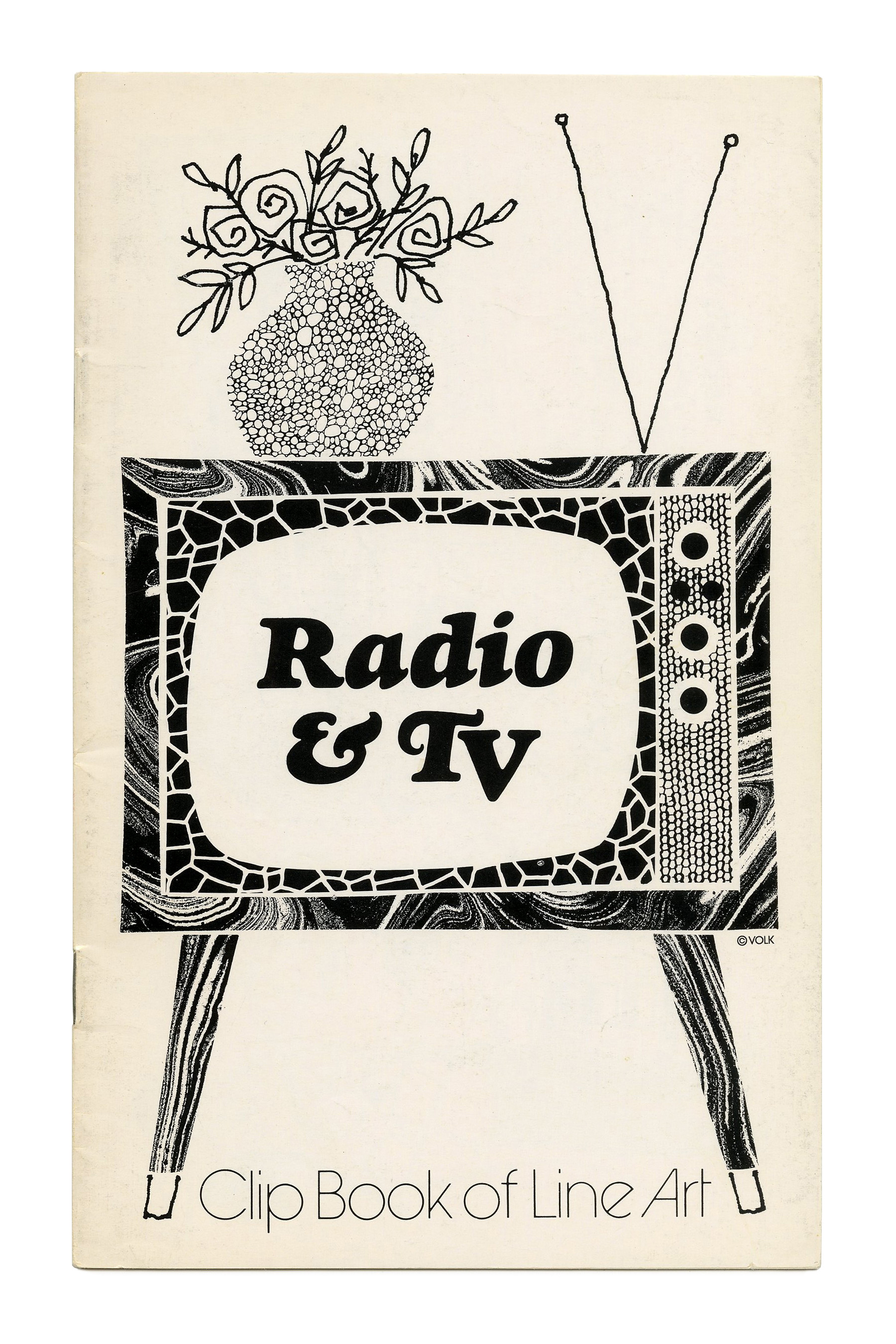
“Radio & TV” (No. 230) ft. Goudy Heavyface Italic.

“Insurance” (No. 231) with a graphic depiction of why you might need one, ft. Kabel Black.

“Opposites” (No. 234) ft. all-caps Kabel Black.
![“Occupations” (No. 236) ft. and [see comments].](https://fiu-original.b-cdn.net/fontsinuse.com/use-images/132/132551/132551.jpeg?filename=50916816198_2b796f4e33_3k.jpeg)

“Expressions” (No. 240) ft. tightly spaced Charter Oak.

“Mail” (No. 241) ft. Profil. The subline here uses a bolder weight from ITC Avant Garde Gothic, to avoid a too great contrast in weight next to the chunky shadowed slab serif. Illustration by Tom Sawyer.

“Holidays” (No. 242) ft. all-caps Goudy Heavyface Italic, paired with the similar (and earlier) Cooper Black Italic, here distinguished by swash caps.

“Summer” (No. 563) ft. Novel Gothic.

“The Golden Years” (No. 564) ft. Kabel. Sensitive typophiles may cringe at the combination of two very similar typefaces.

“Autumn” (No. 565) ft. Jolly Roger.
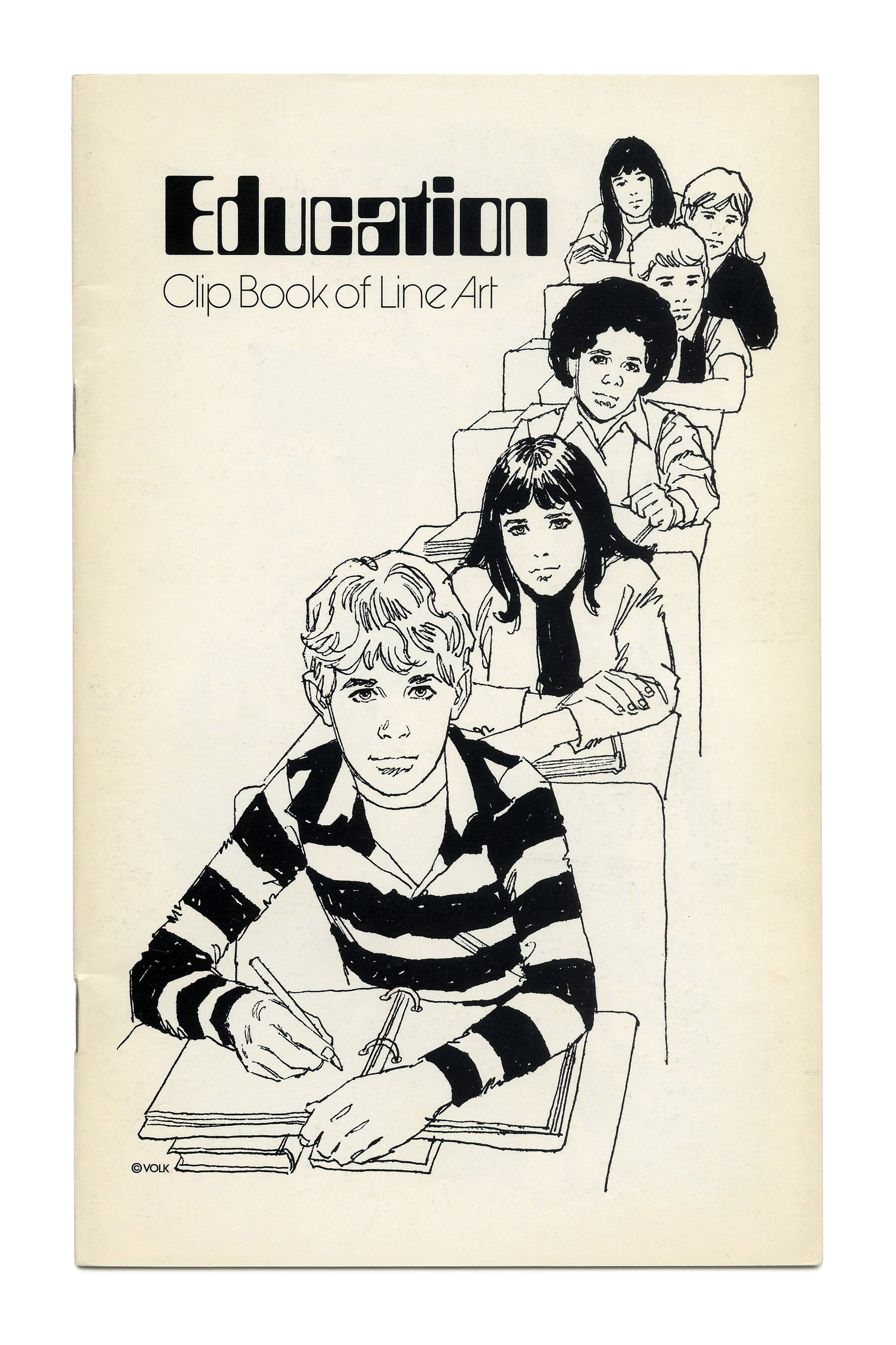
“Education” (No. 566) ft. Countdown, designed by Colin Brignall (Letraset, 1965).

“Groups” (No. 567) ft. Premier Shaded, designed by Colin Brignall (Letraset, 1970). Illustration by Tom Sawyer.
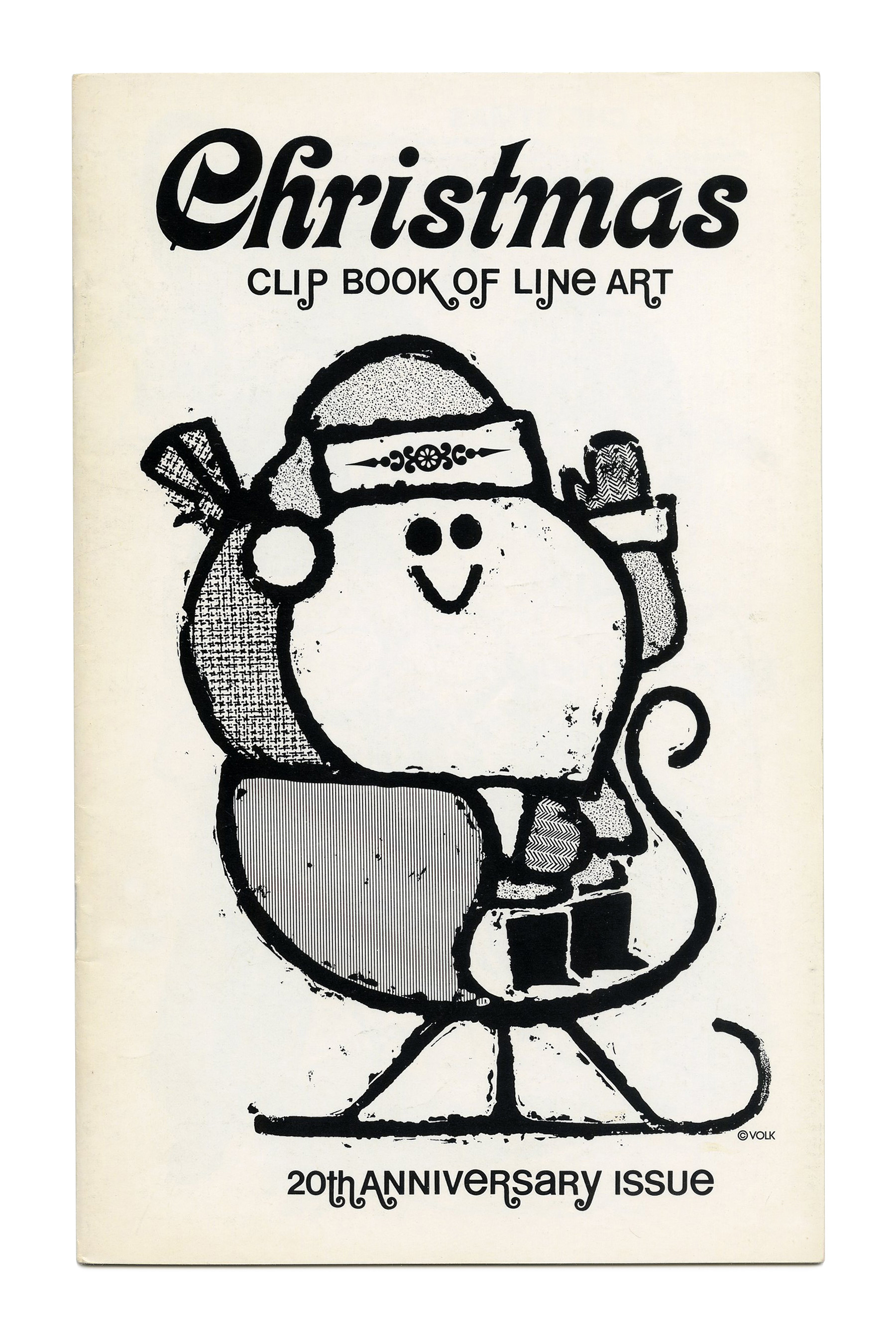
“Christmas” (No. 568) ft. Kalligraphia and Helvetica Flair.

“Couples” (No. 569) ft. slanted Futura Dot. The addition “20th Anniversary issue” suggests that Volk was founded in 1952 or 1953. The oldest booklets published in Bart Solenthaler’s collection are from 1954.

“Transportation” (No. 572) ft.Buxom. Just like in “Mail” (No. 241, see above), the weight of “Clip Book of Line Art” is increased to hold up against the heavyweight.

“Sales” (No. 573) ft. Uncle Bill.

“Women” (No. 575), pairing Normande Italic with handwriting.


“Teens” (No. 577) with more Jolly Roger.


")


")
")


")


 </cite>poster series")


5 Comments on “Clip Books of Line Art, Volk (1972)”
I can see Helvetica usage on the Occupations cover (the “Clip Book of Line Art” portion, to be exact).
Forget that comment about Helvetica… The “Clip Book of Line Art” portion of the Occupations cover is actually set in Akzidenz-Grotesk. Admittedly, both of those faces look very similar to each other when their key differences aren’t shown.
Right you are! Added.
Actually, I’m sorry if this seems a bit spammy, but upon further inspection, I noticed a few things that make it seem that Helvetica is being used instead of Akzidenz-Grotesk, such as the lowercase p and the lowercase k. The former has a shorter leg on the p than the latter. I suppose Akzidentz happen every now and then on this website. (Pun totally intended)
In principle, Akzidenz-Grotesk has diagonal terminals e.g. in c or e, whereas Helvetica features horizontal terminals. When you suggested AG, I checked for this detail and looked no further. What complicates things is that there isn’t just one AG, or one Helvetica. In the original foundry AG, differences across the sizes are huge.
These booklets from the 1970s weren’t printed from metal type. Volk used some phototype adaptation. Filmotype is a likely candidate, as many of their originals were put to use on the clip book covers.
I checked a Filmomaster catalog, and lo and behold: Their adaptation of Helvetica (as HL) deviates from the original in exactly this detail, and exhibits an angled terminal. It also has the slight flaring present in the sample. Filmomaster’s AG (labeled SR after the American name, Standard) has an e that’s different, with a very small aperture. It also features round dots, unlike in Berthold’s original design.
Glad we could sort this out. Filmomaster’s Helvetica it is. Thanks, Bryson!