
Hap Palmer – Homemade Band album art

First time I’ve spotted Slapstick in use! Despite its long tradition, the genre of letterforms made from logs or wood planks may not be the best-respected one. For this children’s album with instructions how to make your own instruments from plywood and broom handles, I can’t imagine a better choice, though.
Hap Palmer’s name is set in Stymie. Born in 1942, the singer/songwriter and teacher from Los Angeles “pioneered the integration of music and movement in the area of early childhood education”. The album was released by Activity Records in 1973 and distributed by Educational Activities, Inc. Art direction, illustration, design by Kristie Kelly, with photography by Peter Travis.

Originally drawn by S.E. Norton for Photo-Lettering between the late 1940s and early 50s, Slapstick was digitized by Erik van Blokland in 2011, with three layers that can be combined for chromatic effect. The digital Slapstick can be tried out on photolettering.com and licensed from House Industries.

The record labels are quite different in design, but feature some interesting typefaces, too. “Activity Records, Inc.” is set on a curve, in bichromatic caps from Pluto. The title is in Parsons, with an A that doesn’t lend itself to all-caps settings. At least the metal original came with a less sprawling alternate form. The track list is composed from Univers in two weights.
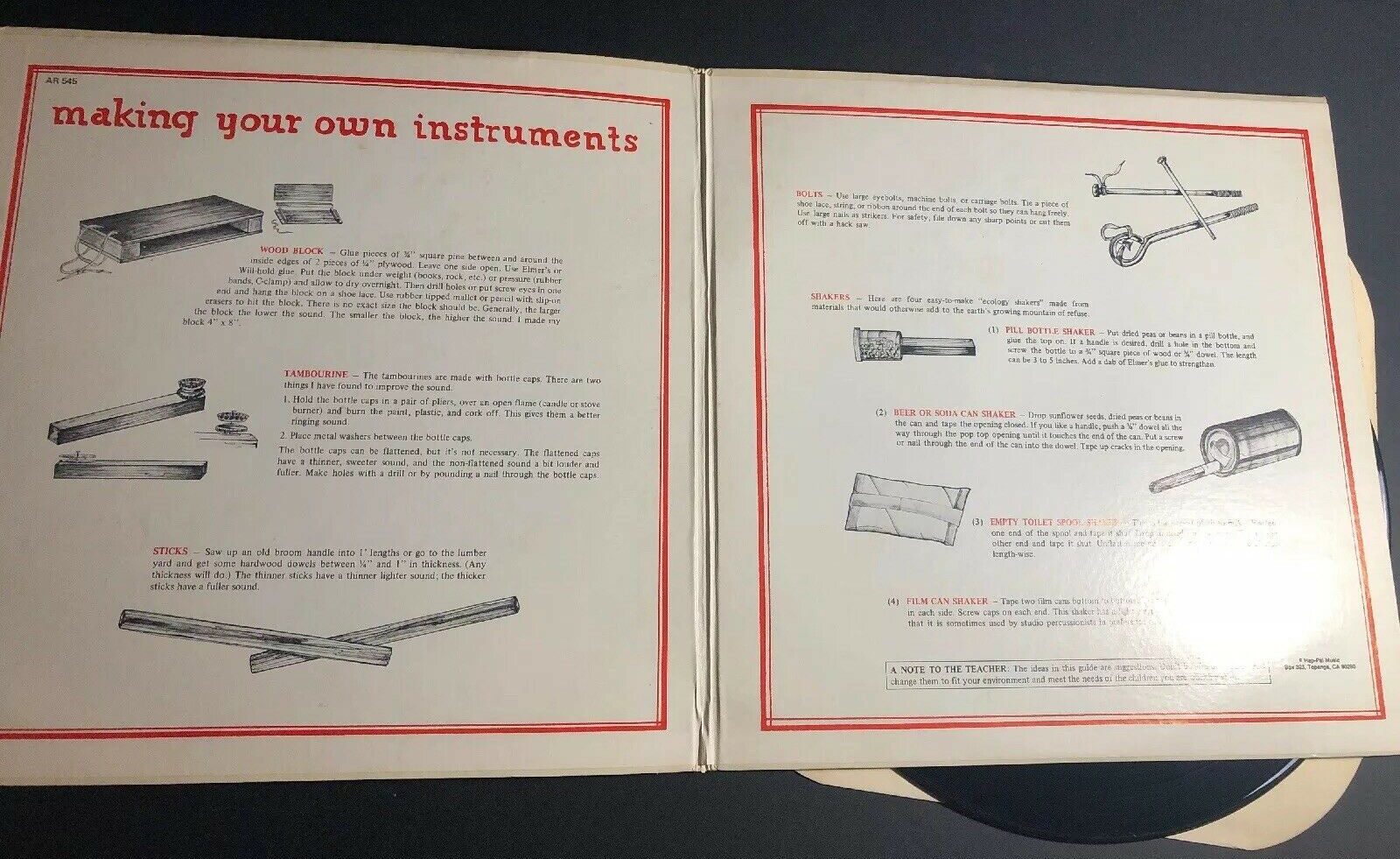
The gatefold has instructions for “making your own instruments”, with a headline in Parsons.

Back cover with Norton Slapstick, more Univers, and text in what looks to be Times New Roman.


