Kraftwerk – Autobahn album art, Vertigo
We’ve published a post about the German single sleeve for “Autobahn” earlier this week and mentioned that it uses the same basic artwork as the album cover as released on Philips Records, with Futura caps and the painting by Emil Schult (who, like Hütter and Schneider, studied in Düsseldorf). The UK release on Vertigo is very different, both in design and typography, and warrants a post on its own.
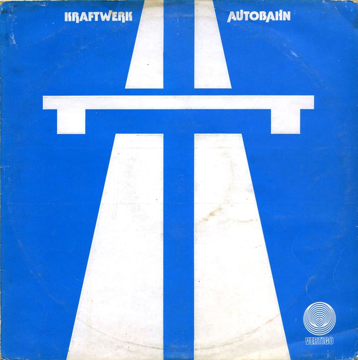
Most commentators emphasize the use of the motorway sign as the only pictorial element. It effectively turns the record cover into a traffic sign that declares: “From here on, no limits”. And indeed this audacious appropriation of a universally known symbol and everyday object is genius, and a consequent continuation of the striped cones that adorned the group’s first two albums. (Aside: As a kid, I couldn’t recognize the perspective road lanes with bridge. To me, it was the “trousers symbol”: two legs, complete with belt and suspenders. Today I can’t unsee an A for Autobahn in it. Not sure if this second layer was intended.)
Since this is Fonts In Use, let’s take a closer look at the type. While the use of Futura caps strikes me as almost too obvious – they’re a short hand for reduction/precision, Germany, cars, with endless “future” right in the name – the letterforms used for the UK release baffled me. I would have understood the choice of something like Bauhaus Geometric. But Tabasco?

Detail of a dry-transfer lettering sheet showing the caps of Tabasco Bold. Originally released by Schaedler in New York, the phototype family spanned three weights (Light, Medium, Bold) plus a biline variant named Paprika. The Medium and Bold were adopted by Letraset in 1973/1974. Ascending/descending alternates were available for a range of letters.
This face may have some of the same features, like simple construction and monolinear lines. However, it’s much more lively, not sterile at all, with bulging curves, and feels like the (already twisted) 1970s view of Bauhaus letterforms cross-bred with Advertisers Gothic from 1917. In sum, rather funky and American than Teutonic and robotic. This is reinforced by the use of the hyper-extended alternates. Then I read what Colin Buttimer wrote on his excellent (but sadly dormant) Hard Format blog, and the font choice makes more sense:
Typographically, the design is fascinating as well. The letters R, W, R, A, U, A and H in the title are escaping from their settings, literally tracing new roads, setting off for destinations unknown. At the same time they’re dancing – the W, U and H waving and punching the air and the Rs and As stretching their toes out. The letter forms presage the tremendous influence the group would have on dance music and on the musical world as a whole.
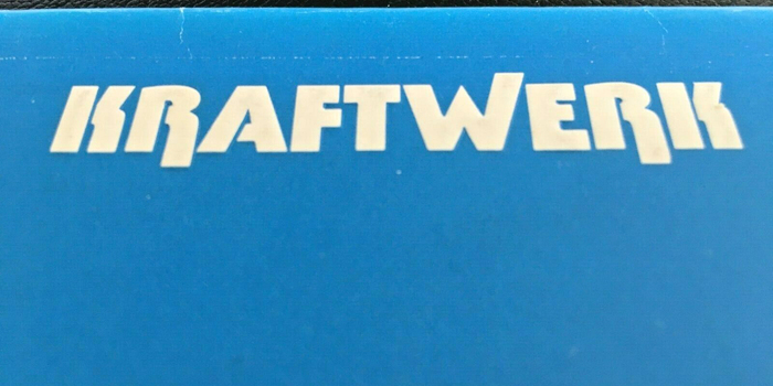
Printed in a single color, the cover is enhanced by blind-embossing the white lettering and the symbol.
No designer is mentioned. It has been suggested that it could be the work of Barney Bubbles, who was commissioned by Vertigo Records for other cover designs. Discogs credits him for their version of the previous Kraftwerk album from 1973.
For the 2009 re-release on Kling Klang, Schult’s painting had to make way for the more iconic motorway symbol. Unsurprisingly, Tabasco was ditched in favor of “timeless” Futura caps. The cover adaptation has one major flaw: The road doesn’t bleed off the edges. Again Colin Buttimer nails why this is crucial:
Autobahn is fascinating because of its translation of the concept of travel into musical form. This transmission from one medium to another wasn’t a new one, but the extent to which it reduced the distance between musical composition and referent was and remains striking. Its central motif isn’t a melody, but the sound of cars approaching and moving away from the listener. The design perfectly encapsulates this by appropriating the motorway symbol and placing it so that it fills the cover from top to bottom. There is no end to the journey in graphic terms, it’s implied that the road continues outside the frame of the cover. Similarly the music ends with one more passing car rather than the sound, say, of an engine being turned off (Autobahn’s railway counterpart, Trans-Europe Express, ends with the sound of train brakes squealing).

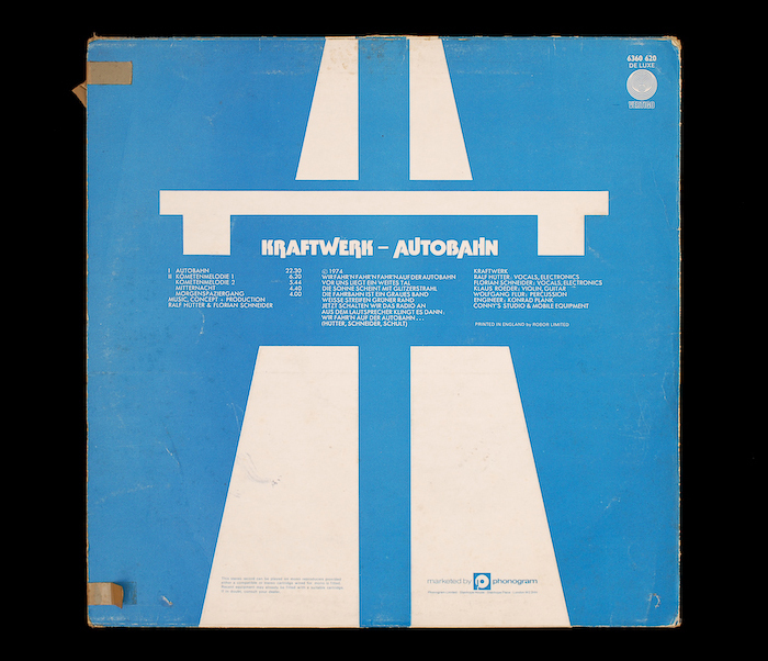
Detail from the back cover, with track list, lyrics of the title track, and credits, alls set in all-caps Futura.

John Coulthart comments:
#nowplaying The vinyl, not the tape which isn’t exactly hi-fidelity. The cassette was the first Kraftwerk I bought, however, so it’s a sentimental keepsake. The cover caught my attention before I even heard the music. I’d stand outside the local record shop every week wondering what all the albums with strange artwork sounded like. One day this appeared. “Wow, they used a traffic sign!”
Formats
- Album Art (3423)
Topics
- Music (5173)
Designers/Agencies
- unknown (3280)
Tagged with
- Kraftwerk (9)
- Vertigo Records (14)
- album records (2172)
- 1970s albums (285)
- reversed type (2918)
- all caps (5958)
- hyper-extended glyphs (290)
- symbols (70)
- highways (11)
- embossed/debossed (497)
- one color (279)
- blue (784)
- alternate glyphs (1134)
- electronic music (498)
- back covers (1666)
- track listings (934)
- lyrics (147)
- vinyl records (2748)
Artwork location
- United Kingdom (2760)




















1 Comment on “Kraftwerk – Autobahn album art, Vertigo”
Here’s the mentioned cover for 2009 re-release, featuring Futura in place of Tabasco, and the traffic sign with roads that don’t extend beyond the edges.