Jean-Pierre Ska – “Globetrotter” and “Le Verre De L’Amitié” single covers
In the late 1960s/early 1970s, bottom-heavy faces were very much de rigueur. Seymour Chwast designed Art Tone and released it through Photo-Lettering before 1968. Others soon jumped on the gravity bandwagon, see Chaucer (Lettergraphics), Rhythmic Shaded (Facsimile Fonts), or, a bit later in 1972, Bottleneck (Letraset).
When Lausanne-based Studiopizz was commissioned to design the sleeve for a single by Swiss singer Jean-Pierre Skawronski in 1970, they either didn’t have access to any of these faces. Or they wanted to create something unique. For the wordmark they customized Carousel, with a deep-drawn baseline.

For comparison: the unmodified letterforms of Carousel. The casual fat face is one of the first Letraset originals. Designed by Gary Gillot and his team at Letraset’s studio, it was issued in 1966, just like Fred Lambert’s more formal Annlie.
Some of the modifications are skillfully done: serifs in n were made symmetrical, the bottom aperture in k made narrower, and the second r was given a contextually wider pedestal. Other decisions can be challenged: Wouldn’t e and S benefit from a less flat basis? Does the kink in the counter of a have to be maintained?
A similar idea can be found in the logo of British rock band Cream as used on several German covers from 1966 on. There, the basic letterforms are taken from Ludlow Black. This band logo may have inspired Somalia, a bottom-heavy adaptation of Cooper Black, made by Zürich-based phototype firm Morographic in 1969 and reproduced in Lettera 4 (1972).
The same treatment of Carousel was reused for a second single by Jean-Pierre Ska from 1971, see below.
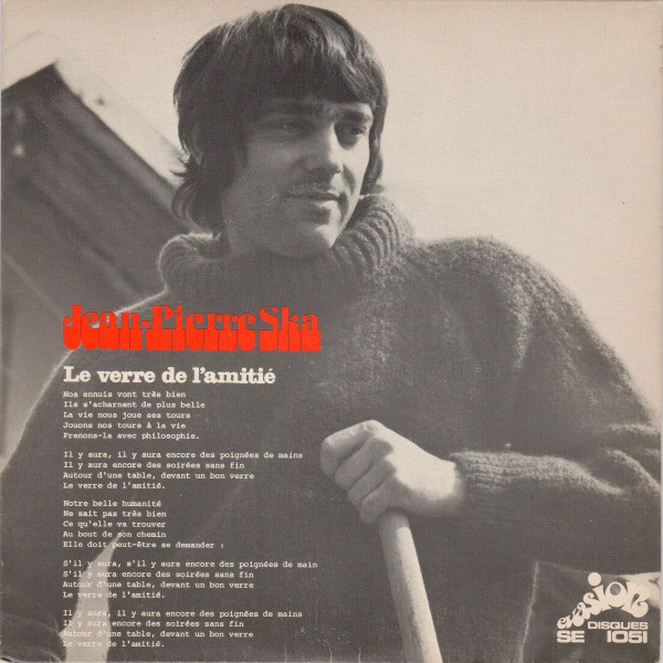
“Le Verre De L’Amitié” …
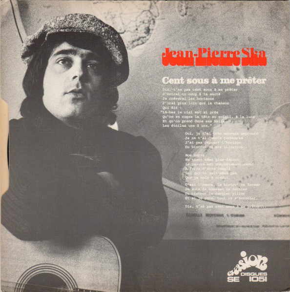
… with B-side “Cent Sous À Me Prêter”, Evasion Disques, 1971.
Formats
- Album Art (3437)
Topics
- Music (5192)
Designers/Agencies
- Studiopizz (1)
Tagged with
- Jean-Pierre Ska (1)
- Evasion Disques (2)
- single records (816)
- chanson (22)
- pop music (381)
- 1970s (1355)
- modified typeface (1469)
- band/artist logos (171)
- French (language) (1986)
- vinyl records (2753)
Artwork location
- Switzerland (912)
- Lausanne (136)


















1 Comment on “Jean-Pierre Ska – “Globetrotter” and “Le Verre De L’Amitié” single covers”
Great one! Almost time for a new extended bottom tag.