Rudolph the Red-Nosed Reindeer movie titles
The classic Christmas TV special opens with letterforms that can be traced back to the Lettera alphabet book series, Ben Shahn lettering, and Romanesque capitals.
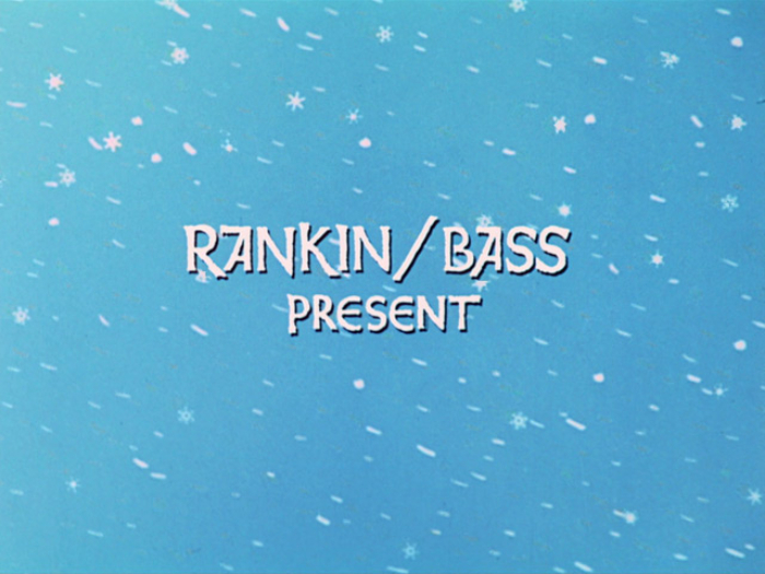
“Rankin/Bass present” is lettering based on Weiß-Initialen Serie II, or Weiss Initials Series II, with the alternate forms for A and E, rendered bolder, with rough contours and a bouncing baseline.
Rudolph the Red-Nosed Reindeer is a Christmas TV special that first aired on December 6, 1964. It was produced by Jules Bass and Arthur Rankin Jr. – then doing business as Videocraft International, Ltd., and later as Rankin/Bass Productions – in collaboration with the Japanese MOM Productions. From Simon Byrne’s article for Watch the Titles:
Based on the Johnny Marks song of the same name, it tells the story of the famous misfit reindeer with the glowing red nose who – together with his friends Hermey the elf and the bearded prospector, Yukon Cornelius – have a series of adventures, including run ins with an abominable snowman, a winged lion and an island of unwanted toys.
The stop-motion classic has been telecast every year since 1964, making it the longest continuously running Christmas TV special in the United States. It was directed by Larry Roemer, with assistance from Kizo Nagashima. The animation was supervised by Tadahito Mochinaga.
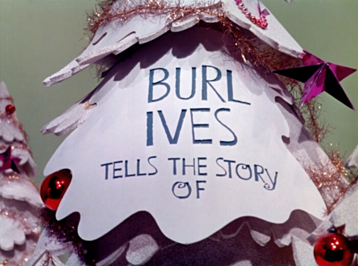
The story’s narrator is Sam the Snowman, voiced by Burl Ives.
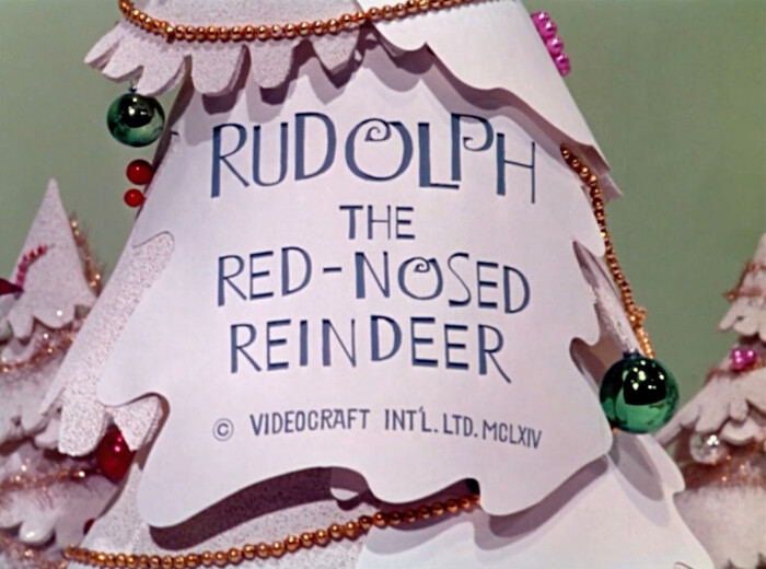
Instead of MCMLXIV (1964), the roman numerals read MCLXIV, i.e. 1164. An error, or an obscure nod to the Romanesque period?

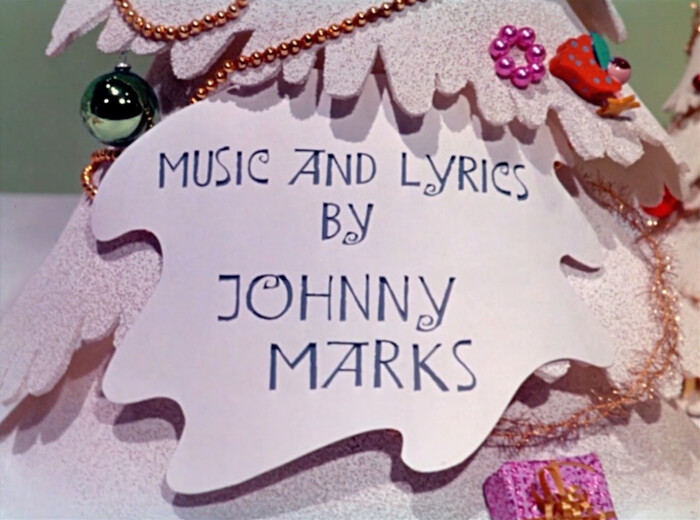
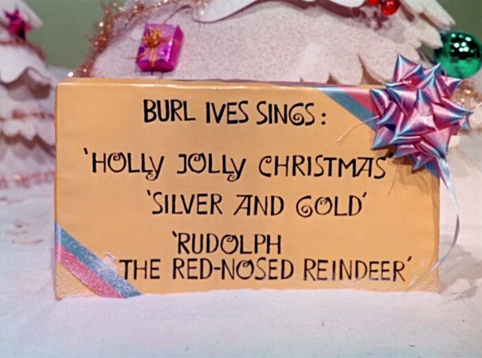
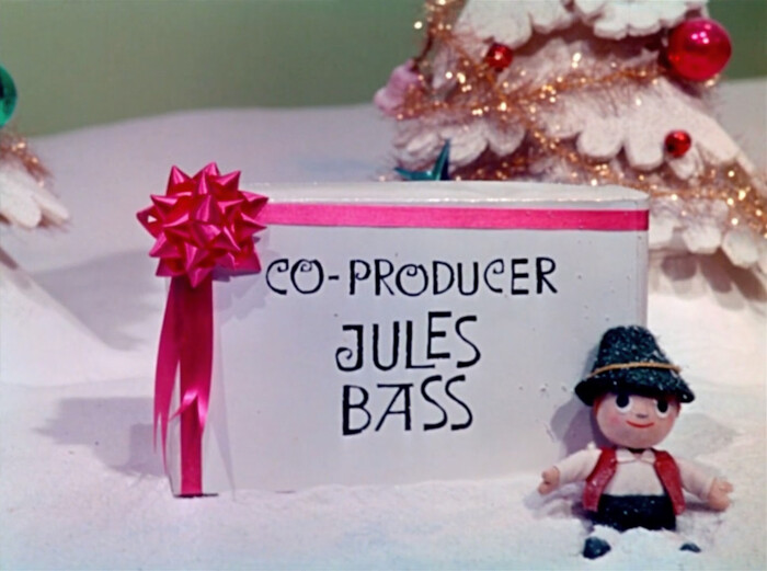

The opening titles feature hand-drawn capitals with an unconventional distribution of thicks and thins, peppered with perky curls, with roughed-up contours as found in ruling pen calligraphy, and playfully arranged on a bouncing baseline. They are not taken from a typeface, and yet are closely patterned after prefabricated letterforms.
The source is Lawless Type, an alphabet reproduced in the second volume of Lettera. Started by Armin Haab and Alex Stocker in 1954, this book series was published in four volumes by Niggli in Teufen, Switzerland. The books were distributed in over 70 countries, and used by designers both as inspiration and as a direct source of display letterforms. Lettera 2 was edited by Haab together with Walter Haettenschweiler and came out in 1961. In the appendix, Lawless Type is described as follows:
With latinizing tendencies and italic elements, the skilled typographer can produce a sans serif with a naive effect all of its own. The individual faces [this should read ‘glyphs’ when compared to the original German text], however, must be readapted to each sequence of letters.
A note on YouTube by the Miser Brothers Press, who distributes merchandise related to the TV special, says that “[t]he lettering that is featured on the packages in the original end credits [not shown here, but stylistically in tune with that seen in the opening credits] was done by Tony Peters and Arthur Rankin, Jr.” Peters was the storyboard artist and Rankin was the producer. Rankin, who had worked as a TV art director, also drew the characters, so he probably directed Peters on the lettering.

Lawless Type was designed by Walter Haettenschweiler. While the first edition of Lettera 2 exclusively credits the prolific designer from Zug, the fifth revised edition from 1976 additionally mentions co-editor Armin Haab. According to Martino Stierli,
it was inspired by the American artist and graphic designer Ben Shahn (1898–1969), who professed a socially critical realism but also experimented early on with typography and graphic design. Haettenschweiler’s homage to Shahn […] embodies elegance and festivity in its strict linearity, but by means of its title also expresses a certain rebellion against too much faith in rules.
In: Haettenschweiler. Schriften für die Welt, Logos für Zug. Zug: DNS-Transport GmbH, 2006 [my translation from the German]
Below is a piece of Shahn’s lettering that exemplarily illustrates this style of his, made for Haggadah for Passover from 1966. It includes the A with the asymmetrical top bar and the curling G. See also the painted jacket maquette on Letterform Archive’s website. This particular work can’t be the one that Haettenschweiler referenced, as it was published several years after Lettera 2, but Shahn employed this style already in earlier works.
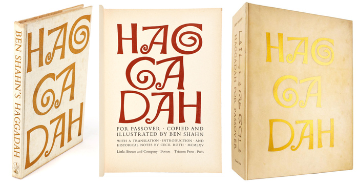
Haggadah for Passover. Copied and illustrated by Ben Shahn, with a translation, introduction, and notes by Cecil Roth. Boston: Little, Brown & Company and Paris: Trianon Press, 1966.
Left and center: cover and spine, title page. Images: Invaluable.
Right: vellum box stamped with gilt lettering. Image: Henry Sotheran Ltd.
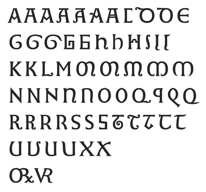
A sampler of letterform variants found in Romanesque lettering, compiled by Gerard Unger and reproduced from his doctoral thesis, Alverata: hedendaagse Europese letters met wortels in de middeleeuwen. Universiteit Leiden, 2013.
Shahn didn’t invent the peculiar construction for A and G himself either. His lettering in turn takes cues from medieval inscriptions from around the 11th and 12th century. In his doctoral thesis from 2013, the late Gerard Unger examined the history and design of such Romanesque capitals. According to his research, capitals from this period – which precedes the Gothic style – are characterized by the blending of three types of letters from different times and cultures – namely derivations of Roman capitals, of uncials, and insular or Celtic letter forms, homogenized in terms of weight and contrast – as well as by exuberant variation and inventiveness. Among the endless variations collected by Unger is “the A with a flat top or with a transverse bar on top”. He also mentions the “coiled G” as a form frequently found in this period [all quotes: my translation from the Dutch].
Unger touches upon revivals and echoes of Romanesque capitals in the 20th century. One example is Shahn’s lettering. Unger offers a possible explanation for the presence of Romanesque-inspired forms in the artist’s work: immediately after completing his training in 1922, Shahn traveled through Spain and Italy, among other places. He probably saw Romanesque inscriptions or manuscripts along the way and made notes of them, later incorporating them into his graphics.
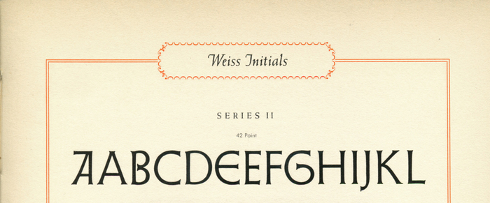
Detail from a specimen for Weiss Initials Series II, showing its alternate forms for A and E as well as the curling G
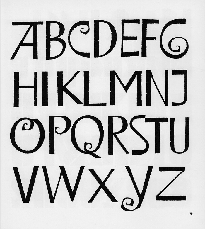
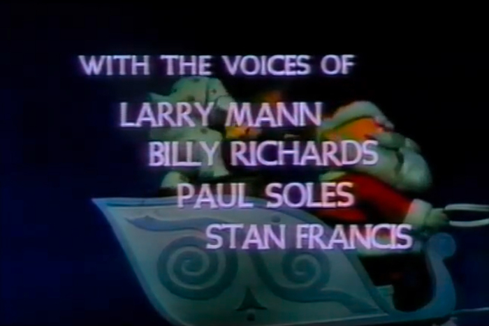
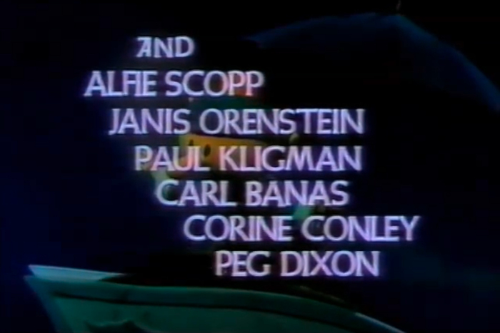
A second example is Weiß-Initialen II, a set of initials by Emil Rudolf Weiß. To Unger, it is “as clear as day that these were designed along the lines of the Romanesque capitals”. First cast by Bauer in 1931, Series II was later extended as Weiß-Lapidar, with added numerals and punctuation as well as a second bolder weight. At least in a broadcast from around 1989, the end credits of Rudolph the Red-Nosed Reindeer aren’t rendered in Lawless Type. They are set – you guessed it – in Weiß-Initialen II.
For further reading on Romanesque letters, see Gerard Unger’s doctoral thesis (in Dutch) and the design notes for Alverata, his interpretation of “contemporary European letters with roots in the Middle Ages”.
Lawless Type was adopted for phototypesetting, under various names, but to my knowledge, there is no direct digitization. There are two digital fonts based on the title lettering for Rudolph the Red-Nosed Reindeer: Island of Misfit Toys, a freebie with alternates made by Steve Ferrera in 2006, and Snow Job JNL, drawn by Jeff Levine in 2017. The former was used for a series of postage stamps issued by the USPS in 2014 [see comment]. Bensgothic is a font based on Ben Shahn’s lettering, started by Harold Lohner in 1998. For information about digital interpretations of Weiß-Initialen, see our typeface page.
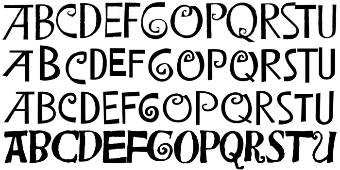
From top to bottom: Lawless Type (Walter Haettenschweiler, 1961), Island of Misfit Toys (Steve Ferrara, 2006, using those glyphs that come closest to Lawless Type), Snow Job JNL (Jeff Levine, 2017), and Bensgothic (Harold Lohner, 1998)
Formats
- Film/Video (868)
Designers/Agencies
- Tony Peters (1)
- Arthur Rankin, Jr. (1)
Tagged with
- Christmas (178)
- reindeer (4)
- Santa Claus (33)
- Rudolph the Red-Nosed Reindeer (4)
- snow (23)
- gifts (53)
- stars (289)
- trees (79)
- stop motion (5)
- animation (279)
- type integrated with image (366)
- Rankin/Bass Productions (2)
- MOM Productions (1)
- Larry Roemer (1)
- Kizo Nagashima (1)
- Tadahito Mochinaga (1)
- 1960s (623)
- title sequences (319)
- lettering from alphabet sample (30)
- lettering derived from typeface (630)
- all caps (5975)
- end credits (111)
- alternate glyphs (1136)
- bouncing baseline (292)
- television (124)
- Burl Ives (1)
- Roman numerals (227)
- high profile (582)
Artwork location
- United States (8315)











2 Comments on “Rudolph the Red-Nosed Reindeer movie titles”
Small correction: I misremembered, and failed to reread Chris’s contribution properly. The postage stamps from 2014 don’t use the Island of Misfit Toys font, at least not directly. In that application, the letters either are heavily modified and cleaned up, or custom drawn.
Island of Misfit Toys was used in the TV movie A Miser Brothers’ Christmas (ABC Family, 2008), however.
For those of you who’ll pay a visit to Zurich in the coming weeks, take note that the Museum für Gestaltung currently hosts a fabulous exhibition about Walter Haettenschweiler and his work. The show includes many of his original alphabet designs and paste-ups made for the Lettera books. Haettenschweiler from A to Z is on display until February 19th, 2023.