The Forever War (1976) and Mindbridge (1977) by Joe Haldeman (Orbit)
![Cover art by Patrick Woodroffe. [More info on ISFDB]](https://assets.fontsinuse.com/static/use-media-items/115/114631/upto-700xauto/5ee0aa0a/The-Forever-War.jpeg)
Cover art by Patrick Woodroffe. [More info on ISFDB]
![Cover art by Josh Kirby. [More info on ISFDB]](https://assets.fontsinuse.com/static/use-media-items/115/114578/upto-700xauto/5ee0aa0a/mindbridge.jpeg)
Cover art by Josh Kirby. [More info on ISFDB]
Covers for two books by American science fiction author Joe Haldeman, including his acclaimed second novel The Forever War. First published in 1974, this book is “widely perceived to be a portrayal of the author’s military service during the Vietnam War, and has been called an account of his war experiences written through a space opera filter.” It won the Nebula Award in 1975 and the Hugo and Locus awards in 1976. These paperback editions were published in 1976 and 1977 by Orbit Books in the United Kingdom. [Via Joachim Boaz]
The font in use is the extra bold style from a series that goes under two names, Design and Syncopation. Design probably came first, but I couldn’t verify this. (The name doesn’t make it exactly easy to find out more.) [Update: see comments]
The ultrageometric face with Art Deco overtones, high-waisted caps and (too) little optical correction was used already in 1971. It’s shown under the name Design in Typeshop’s 1973 catalog and in Lettergraphics’ 1976 catalog. Shin Oka of Daylight Fonts gives credit to Phil Martin of Alphabet Innovations, but doesn’t mention a source for that info. The same face is shown in Headliners’ 1978 catalog as (neo-)Syncopation and was advertised in U&lc Vol. 13 No. 2 (1986) as a Headliners original, whatever that means. It comes in at least four (Design) or six (Syncopation) weights, plus Outline and Shadow variants. Both versions include alternate glyphs for ‘bcdeghmnpqsyADES’ in all styles.
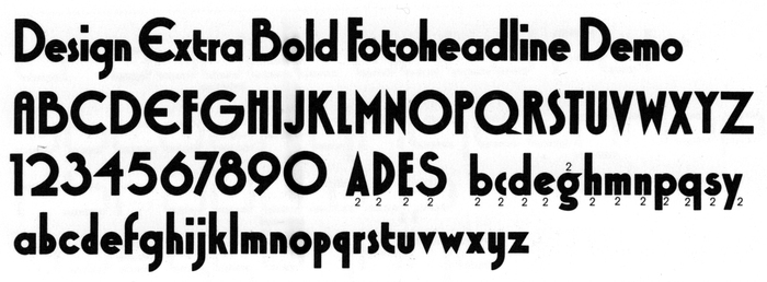
Glyph set of Design Extra Bold with alternate glyphs, as depicted in Typeshop’s 1973 catalog. Syncopation has the same alternates.
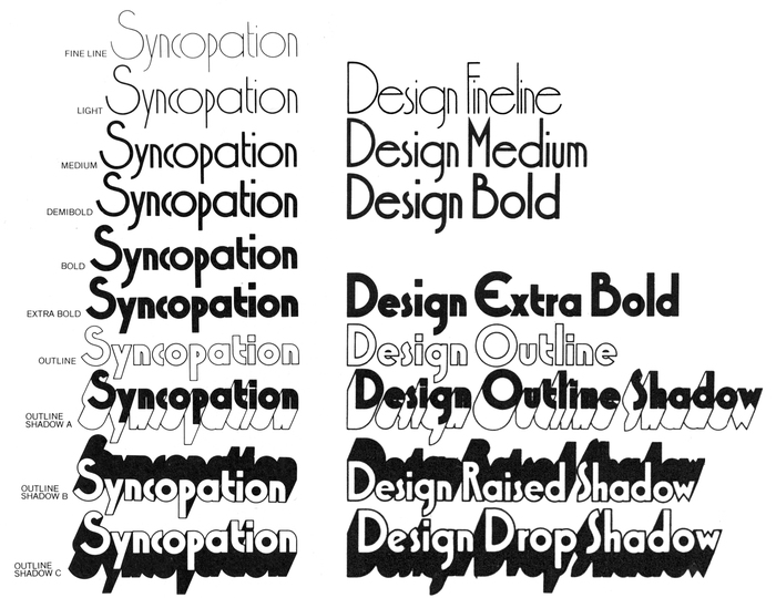
Style range of Syncopation as shown in Headliners’ 1978 catalog (left) compared to the style range of Design, compiled from samples in Typeshop’s 1973 catalog (right).
Steve Jackaman’s Xctasy Sans (Red Rooster, 1997) is “influenced by the 1960’s typeface, Design Fineline”. His digitization comes in four weights, with most of the alternates. OPTIDesign (Castcraft, 1990–1991) is another digital version in a single Medium weight.
Formats
- Books (5431)
Topics
- Literature (2508)
Designers/Agencies
- Patrick Woodroffe (4)
- Josh Kirby (3)
Tagged with
- Joe Haldeman (3)
- Orbit Books (4)
- book covers (4802)
- book series (428)
- science fiction (407)
- paperbacks/softcovers (1491)
- all caps (5970)
- center-aligned text (1567)
- reversed type (2920)
- war (86)
- spacecraft (41)
- space (108)
- typeface profile (82)
- one typeface (1611)
- 1970s (1355)
Artwork location
- United Kingdom (2760)


















1 Comment on “The Forever War (1976) and Mindbridge (1977) by Joe Haldeman (Orbit)”
Update: Stephen checked his shelf, found an earlier Headliners specimen, and now we know that Syncopation (very likely) predates Design. It’s shown by Headliners in 1970 as their latest release and is credited to Acey Cypres. Thanks, Stewf!