
I ❤️ NY
On his 92th birthday, and one year after his death, we commemorate Milton Glaser’s most iconic creation.
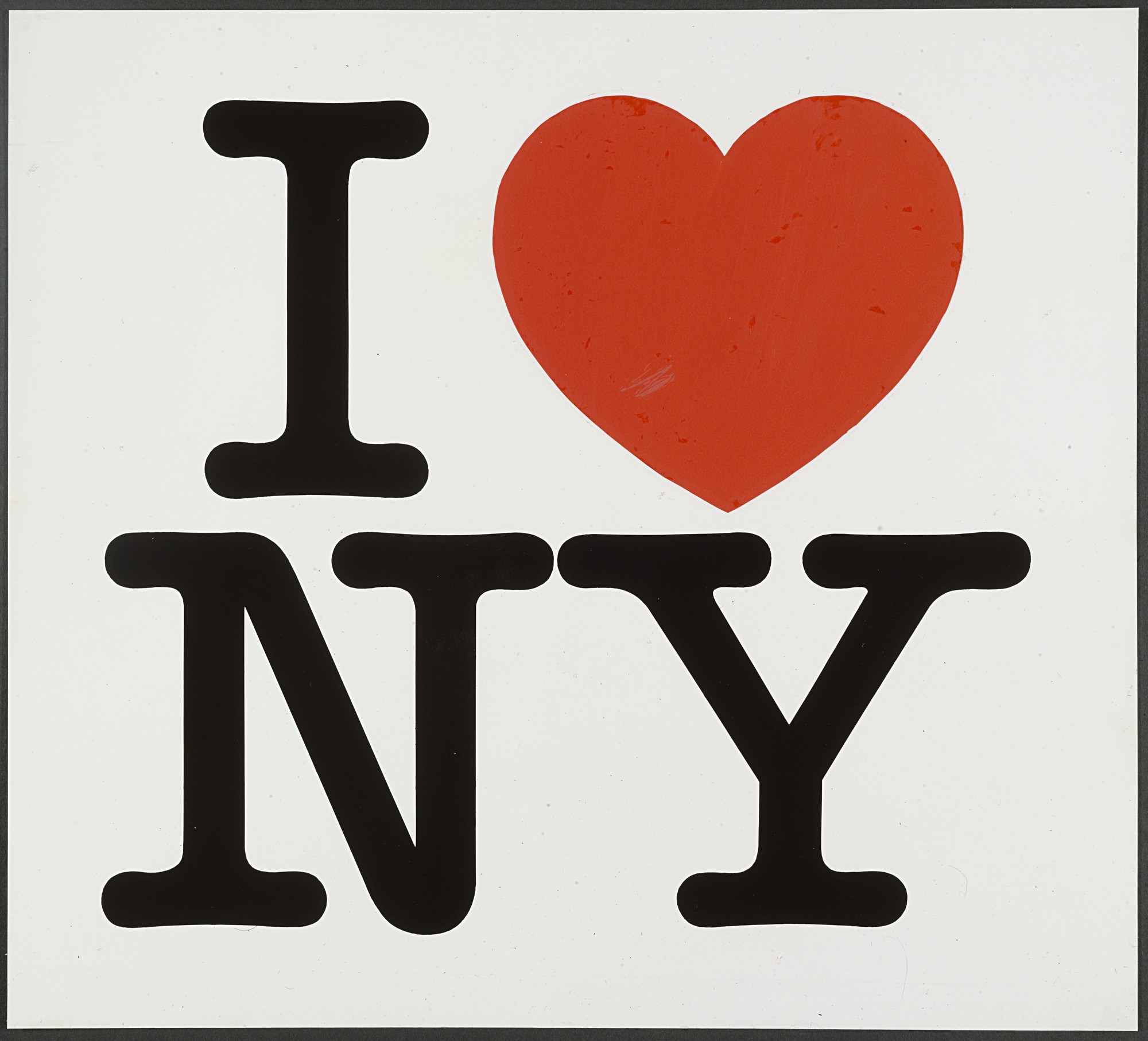
“I ❤️ NY” presentation board, two-line version, 1976, as archived in MoMA’s permanent collection.
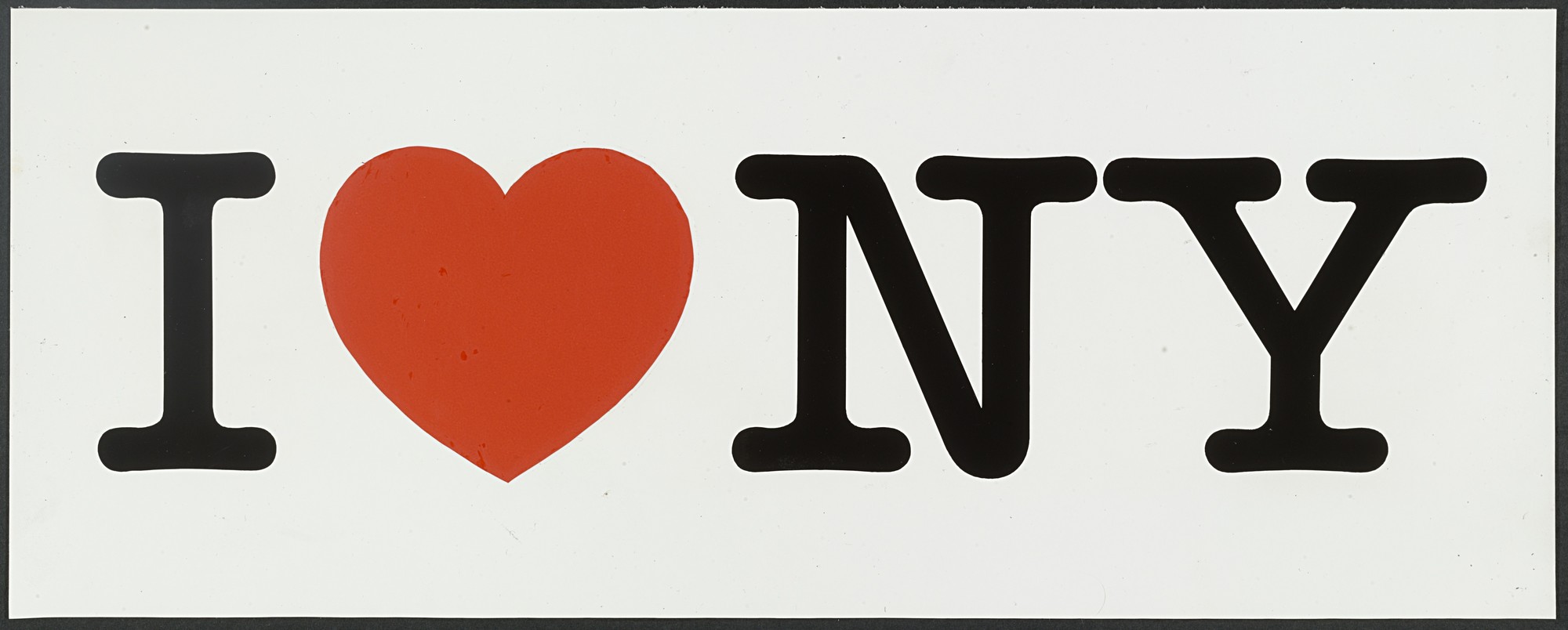
“I ❤️ NY” presentation board, one-line version, 1976, as archived in MoMA’s permanent collection.
Much has been written about what is probably Milton Glaser’s most famous work. His logo for the “I Love New York” campaign was drawn in 1976 and introduced on July 15, 1977. Not only is there an entire section about it on the graphic designer’s Wikipedia page, the logo even has its own entry in the encyclopedia. There, one can read about how it came into being. At a time when New York City’s reputation was in tatters and the city on the verge bankruptcy, the State of New York hired advertising agency Wells Rich Greene to work on a PR campaign to boost tourism. Commissioned to work on a logo, Glaser famously sketched out the basic idea for it in the back of a taxi, on a paper envelope. That doodle is now in the MoMA’s permanent collection, together with the concept layout and the original presentation boards, with variants in one line and in two lines.
Milton Glaser created a logo that New Yorkers and tourists alike could identify with. Along the way, he invented a whole new form of visual expression. While the combination of letters and pictures in rebuses is an age-old device, the formula of “I ❤️ ____” did not exist as a popular meme before this logo. In fact, even the formula of “I [symbol] [something]” wasn’t really established yet, and the use of emoji still years in the future. This is almost as big of a cultural contribution as the actual logo itself.
For this article on Fonts In Use, we focus on the chosen typeface.

Glaser’s idea, as scribbled in a taxi on the way to a meeting for the campaign. The original sketch is in the collection of the MoMA, donated by Glaser.

Concept layout, 1976, as archived in the MoMA collection.
Most sources will tell you that the letters in the logo are from ITC American Typewriter. Officially released by the International Typeface Corporation in 1974 for phototypesetting, it’s a proportionally spaced typewriter face with long serifs and rounded terminals. A precursor appeared in the 1971 catalog of NYC-based typesetting studio Photo-Lettering as Typewriter 4, with alias American Typewriter. The ITC release came in three weights, all in regular and condensed widths. The Light and Medium styles are by Joel Kaden (1914–2003), who isn’t credited with any other typeface designs. The Bold plus an outlined variant were added by Tony Stan (1917–1988), a local type designer who worked on many faces for Photo-Lettering and ITC. American Typewriter was presented in U&lc magazine in 1974, a hundred years after the first commercial typewriters with monospaced typefaces had been introduced:
The resulting “typewriter look” has for generations been the machine’s hallmark – a hallmark instantly recognized by the man-in-the-street, in-the-office, in-the-shop, and in-the-home. More elaborate escapement mechanisms threaten to obsolete this familiar style, but its hundredth anniversary is an appropriate time to salute the shapes that have so intimately tied themselves into every area of our history. American Typewriter strikes a happy compromise with its forerunner. The rigid spacing is dispensed with but the distinctive typewriter flavor is generously enhanced. And there is just enough nostalgia in American Typewriter to give it top billing in contemporary typography.

American Typewriter as introduced in ITC’s U&lc magazine, volume 1, no. 3 (1974).
On closer examination, one can see that the “I ❤️ NY” logo doesn’t use American Typewriter out of the box: the letterforms are slightly bolder than the Medium weight. Especially the serifs were made considerably thicker, and the cupping was reduced. According to John L. Waters,
Glaser wanted the logo to be informal. “It was somewhere between typography and a note,” he says. “l wanted a counterpoint to the voluptuous and erotic nature of the heart.” Glaser asked his colleague George Leavitt to modify the letters of the American Typewriter typeface so that they would be less rounded.
Leavitt was a long-time collaborator of Glaser, and is credited for “lettering execution” for many of his type designs, including Baby Teeth, Baby Fat, Baby Curls, and Glaser Stencil. When comparing the one-line version of the logo to the one with two stacked lines, one can find small differences, too: most notably, the top left serif of Y is longer in the latter.

The “I ❤️ NY” logo (from the 1976 presentation board), overlain by scanned letterforms from ITC American Typewriter Regular (phototype version as shown in a catalog by Phil’s, 1980) in white.
Despite the small modifications made to the typeface, “the classic, frozen-in-amber application of American Typewriter remains the three black capital letters that surround the red heart in Milton Glaser’s ‘I Love New York’ logo,” as Michael Beirut has put it. “Any attempt to rip it off (and would anyone even dare to guess how many there have been?) doesn’t quite work unless it’s set in American Typewriter.”
Thanks to its beautiful simplicity, the logo has indeed seen countless imitations and riffs. The organization that manages licensing for the “I ❤️ NY logo” is notoriously protective of the trademark. It’s even difficult for photographers to sell a photo containing the logo. New York Times graphics editor Larry Buchanan wanted to get to the bottom of the magnitude, as Lilly Smith recounts for Co.Design:
After coming across an episode of the podcast 99% Invisible about the I ♥ NY trademark, and an article detailing a coffee shop’s dispute with the NYSDED [New York State Development of Economic Development], Buchanan went down an I ♥ NY trademark infringement “rabbit hole,” as he detailed on Twitter. He submitted a Freedom of Information Law (FOIL) request […] in 2015, requesting all the cease and desist letters the state had sent for trademark violations of I ♥ NY the previous year. He got a “glorious” 381-page PDF back, chock full of out-there iterations on the logo.

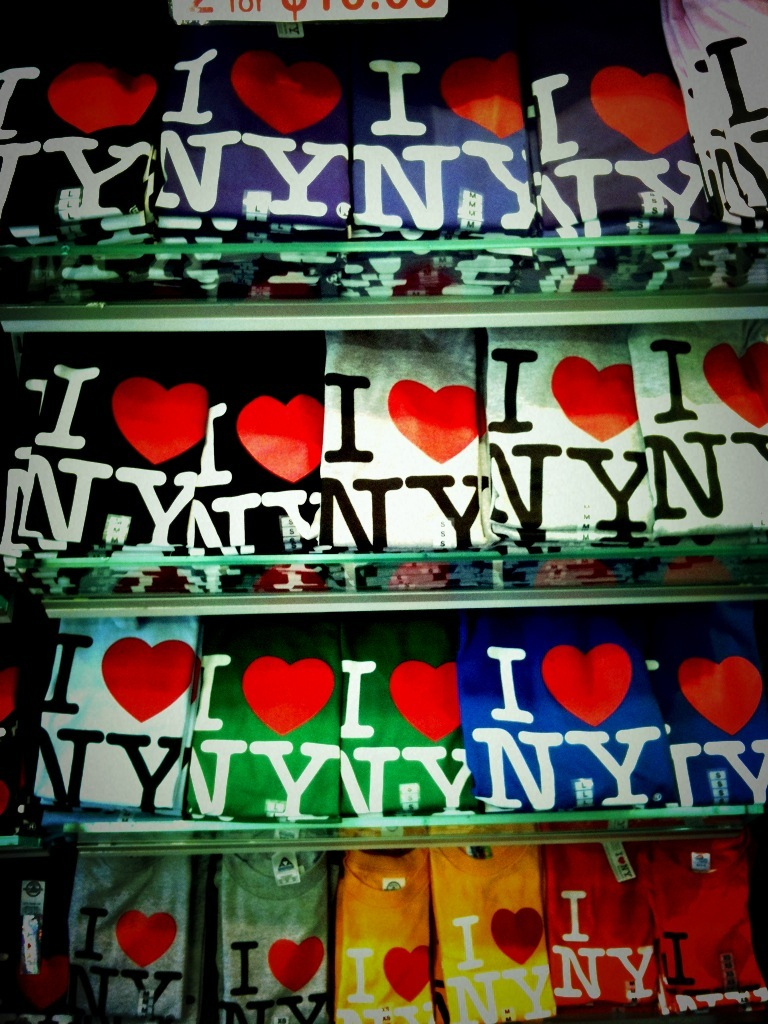
The logo can be seen on a range of merchandise products, from mugs and stickers to bags.
The most popular carrier remains the iconic T-shirt featuring the stacked logo version.
I ❤️ NY More Than Ever
After witnessing 9/11 firsthand, Glaser revisited the logo with the declaration of love to his hometown, and devised a poster. From the School of Visual Arts:
“Over the next couple days, I did – purely out of the way I was feeling – an ‘I Love New York More Than Ever’ [poster], because that what was everyone wanted to say – everybody suddenly realized, like, with a sick parent who’s dying, I didn’t realize how much I loved them.”
The original small poster became an SVA Subway poster that was distributed all over New York and its five boroughs by students from the College the week of September 11, 2001. The image quickly spread and became a symbol of their enduring love for the city.
People in the streets and on their way to work saw this expression of their deep feeling about the city on every storefront and doorway. The same iconic image was used as the front and back page of the Daily News on September 19, 2001.

“The original small poster that was distributed all over New York by students from the School of Visual Arts, the week of September 11, 2001. People in the streets and on their way to work saw this expression of their deep feeling about the city on every storefront and doorway.” — Milton Glaser. The small print is in Frutiger.
For this reinterpretation, Glaser added a small blackened burn to the bottom of the heart. While the big letterforms are, more or less, those of the logo, with thickened and straightened serifs, the added words “More Than Ever” make direct use of the American Typewriter typeface. This becomes evident when comparing the two capitals N’s. The original phototype version featured two forms for R, one with a hook, and one with a flat exit stroke, the latter of which has been used here. While Bitstream’s and Elsner+Flake’s digitizations include only the former, and URW’s only the latter, ITC’s American Typewriter Pro has both, with the flat-footed R as the default.

ITC American Typewriter comes with alternates for R e & $. These are included in ITC’s “Pro” digitization.
According to 99% Invisible, the firm that represents the NYSDED “sends out about 200 cease and desist letter per year to people they believe are in violation of the I ❤️ NY trademark. Ironically one of those letters got sent to Milton Glaser” for his 2001 update. “The state of New York apologized to Glaser, and chalked it up to a bureaucratic misunderstanding.”
Whether the logo earns New York state around $30 million per year, as stated in an article from 2015, or “just” $1.83 million, as mentioned in a 2011 interview with Glaser in the Village Voice, it definitely was a bargain: Milton Glaser didn’t ask a penny for it. He created it pro bono, out of pure love for his city, believing it wouldn’t last longer than six months anyway.

“The same combination of words and imagery was used as the front and back page of the Daily News on September 19, 2001.” — Milton Glaser

Shopping bag spotted in Manhattan, 2005.

“I ❤️ NY” booth with balloons in Toronto, Canada, 2007.
T-shirts in various color variants, 2010.
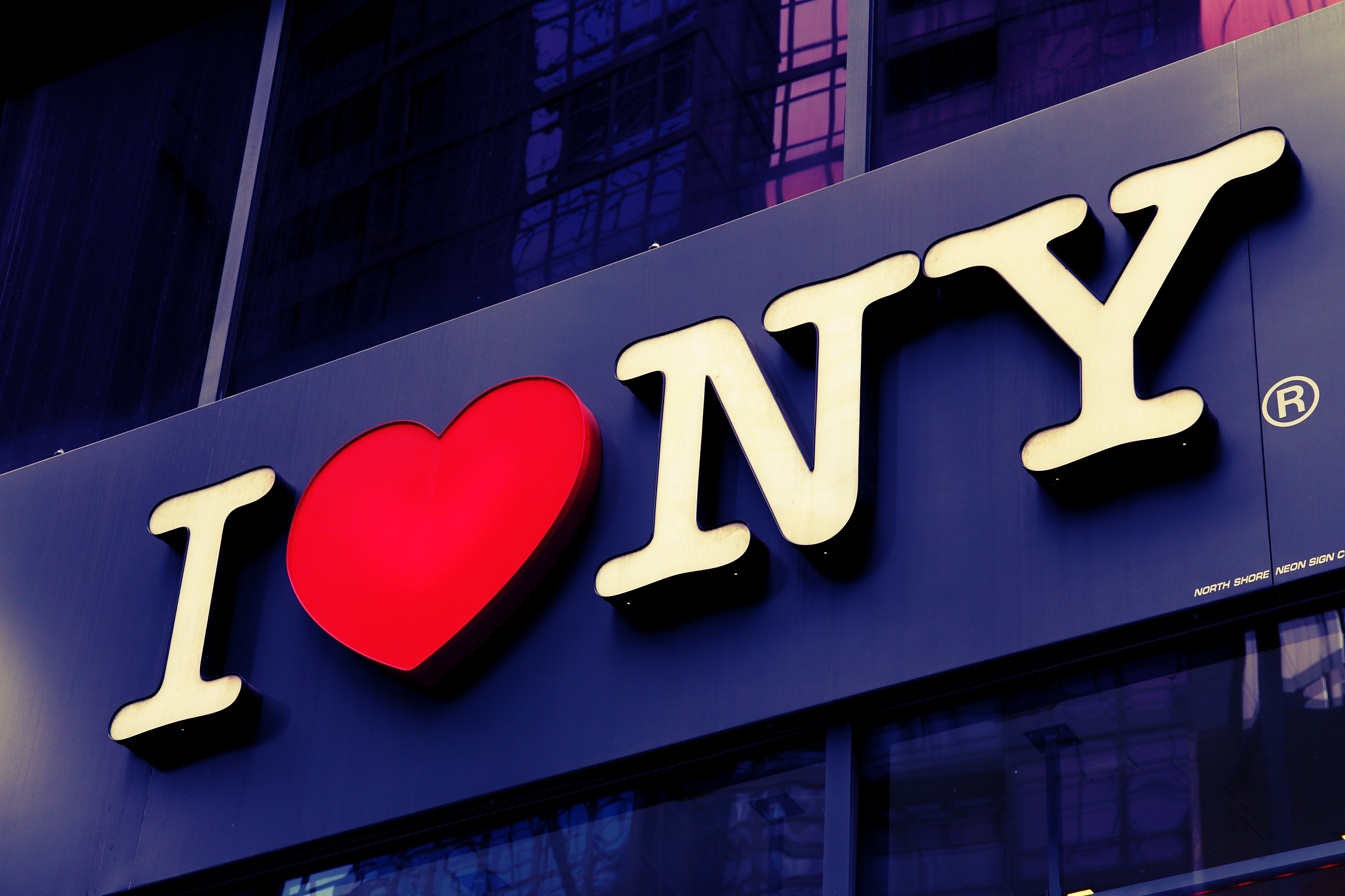
“I ❤️ NY” as illuminated sign on a shop front, NYC, 2013.
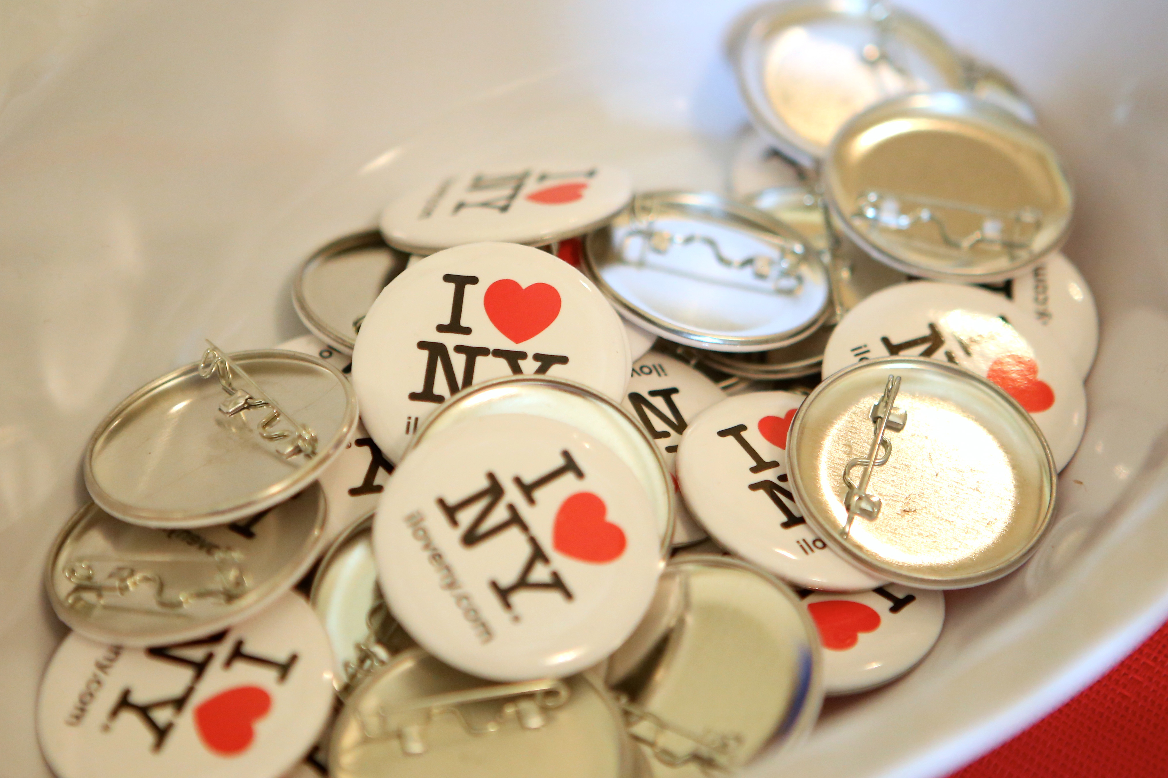
Pinback buttons offered by the U.S. Embassy in Toronto, Canada, 2015.

Three-dimensional version of the logo (with straightened letter shapes) in Pine Valley, Moreau, New York, 2020.

The T-shirts with the iconic logo can be found all over the world, from Times Square (2006) …

… to Malawi, Africa (2007).
At the end of the 99% Invisible episode, Milton Glaser says he thinks that the logo’s sustained success
has something to do with the rigidity of that letterform, and the attempt of the grid to contain the erotic nature of the heart. There’s something that creates an act of closure in people’s minds when they see it. […] They can look at it a hundred thousand times and still not saying “I had enough”. […] There’s simply the mystery of form: Why does a certain curve and a certain color and a certain contrast hold our attention? And why do certain other forms bore us? I don’t know. It’s a profound mystery.

The official logo as used in 2021 on the iloveny.com website by the New York Department of Economic Development.
This article was made with the help and input of Matthijs Sluiter and Nick Sherman.


4 Comments on “I ❤️ NY”
See also Garrison’s previous contribution about Milton Glaser’s “I ❤️ NY Catskills” tourism posters, which were made as part of the campaign.
The posters implicitly address two common misunderstandings around “I ❤️ NY”:
1. The campaign and the logo were commissioned by the New York State Department of Commerce, so the “NY” really represents all of New York state, not just the city – including the Catskill Mountains.
2. The logo reads “I Love New York”, not “I Heart New York”. Some of the posters use the logo, others spell out the slogan. It looks like Glaser occassionally got bored with his own logo, or at least didn’t always find it appropriate to use.
Yes indeed upon closer look, the letters do look much bolder! I will always identify I ❤️ NY as “I love New York”.
For a simple and yet so recognizable letterform logo, Milton Glaser’s contribution will never go out of style. We need more designers like him.
In 1978, Metropolis released a single titled “I Love New York” (or “I ❤️ NY”). Milton Glaser is credited for the cover design, with photography by Matthew Klein and art direction by Stanley Hochstadt.
[More info on Discogs]
Like many people, I have this “I love NYC” mug and use it every morning. Few days ago I was wondering where this visual came from!! Thank you for giving me this great answer!