
Germany and the Germans by John Ardagh

This is my first post, and it seems as perfect a starting point as any to begin a set “Worth Owning for the Type Alone.” I can’t be the only one fed up with spotting a delightful font choice for the blurb text on the jacket, only to be bludgeoned with Times New Roman, or at best Electra or Sabon, when I open up to an actual page. Over the years I’ve made a point of chasing down books with exemplary or unusual body copy choices.
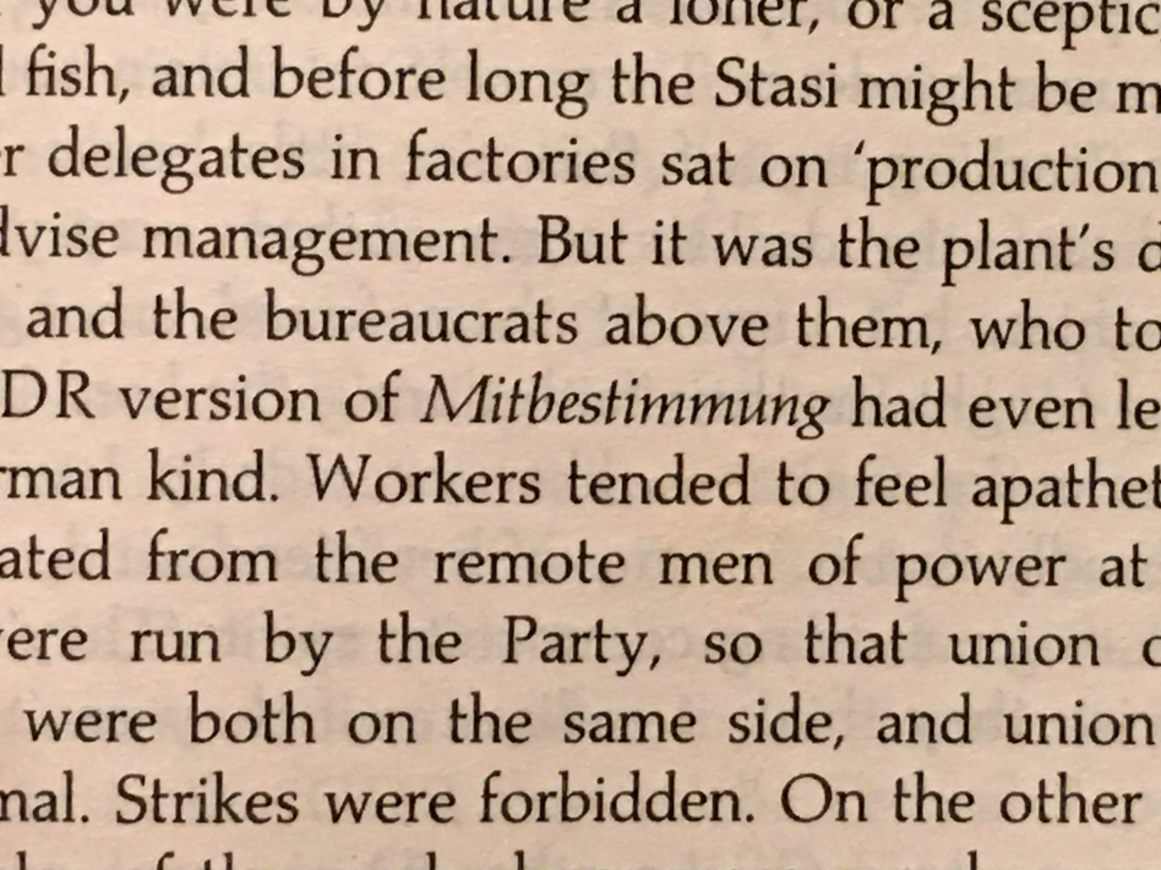
Back in the late 1990s I picked up this 1995 edition of this book by John Ardagh, and I immediately noticed that something about its Palatino was different and better than the 1985 Laserwriter Palatino design we have all grown… used to. It would take many more years of casual type technology study, and studying Palatino in particular, to understand why the foundry version was so much more beautiful, and how the since lost Monotype and Berthold photosetting versions were more faithful to that original foundry design. By virtue of this book’s original printings in 1987 and 1988, at a time when book photosetting was still viable, that “foundry-er” Palatino was able to reach a little bit further into the future before the Linofilm-based digital version and its Nova successors finally crushed it. There is no digital version of Monophoto Palatino. Some older Berthold versions float around, but nothing quite like this one. Dig how the extenders are just a bit longer, the stems just a bit thinner, the numbers sit a little lower than cap height, and the bold is relatively thicker. The more angular italic is almost reminiscent of Trajanus.
The book itself seems good, and I might even get around to finishing it one day, if I can get past the distracting beauty of Palatino As Everyone Should Know It.
Palatino Italic is used for emphasizing German words.

Detail from the table of contents, with Palatino Bold for chapter titles.

The colophon mentions that the text was filmset in 10½/11½ Monophoto Palatino.

The book cover is set in Copperplate Gothic.


</span>")


")


9 Comments on “Germany and the Germans by John Ardagh”
There used to be a Palatino BQ that Berthold (the real, German one) marketed at the beginning of the 1990s, and which looked a lot more like the metal and phototypesetting versions than the “toned down” Adobe one. It was a PS font, and I doubt it was ever upgraded to OT.
That’s correct, Stéphane. Palatino BQ was made in 1992, shortly before H. Berthold AG went bankrupt. Just like Berthold’s phototype version, which provided the basis, it harked back to Zapf’s original design as released by Stempel in 1950. Here’s an overview of the basic roman glyphs from Palatino BQ.
Here’s the catch, though: The “toning down” didn’t start with Adobe. Already in the 1950s, Zapf himself revised his design, and tamed some of the more calligraphic glyphs, following the preferences of two American designers. Here’s a comment I recently posted on Typedrawers:
Weichselbaumer’s book is near the top of my long list of things to purchase. In the meantime Robert Bringhurst’s own exhaustive recent study of Palatino was a pleasure to read. My own collection of Zapfiana is spilling into its second IKEA Kallax cubelet.
Actually, the Berthold version is available free on various web sites, under various names. The best version I have found is named 'Palmer’, and there is also one called 'Palio’. I have edited the glyphs where they were corrupt, and I now have the complete set. There is also an 'Aldus BQ’ that is slightly different from the one sold by Linotype.
You may be able to find and download files of Berthold’s version and derivatives thereof, but that doesn’t give you a valid license to use these fonts. If it’s for your private study, that might be inconsequential. As soon as it’s about producing published work, I strongly recommend to steer clear of abandonware and unlicensed copies floating around on the internet, in your own interest and that of your clients.
Florian:
There is no 'owner’ for these fonts anymore, and I use them as I see fit.
I’m curious about the relationship between the old pre-1993 H. Berthold AG and Zapf himself. He told me he received no royalties from the company currently calling itself its successor.
John, I don’t have an awful lot of information on that question. In 1973 the H. Berthold AG commissioned Zapf with the design of a typeface for phototypesetting, optimized for small sizes and challenging printing conditions. The project was art directed by Günter Gerhard Lange, and the result released in 1976 as Comenius. It was Zapf’s first major release that was not realized with Stempel/Linotype, and initiated the second phase of his type design career, together with his cooperation with ITC. Weichselbaumer mentions (p314) that Aaron Burns saw the work-in-progress Comenius during a visit to Berlin and suggested to adopt it for ITC. This eventually didn’t work out, but ITC released Zapf Book (1976), Zapf International (1977), Zapf Dingbats (1978), and Zapf Chancery (1979).
Berthold didn’t commission any other designs from Zapf. However, they worked with Gudrun Zapf-von Hesse on Nofret (1986) and Christiana (1991). A Comenius specimen issued by Berthold in 1980 mentions that the company additionally carried Aldus, Palatino, Melior, Optima, Zapf Buch, Zapf International, and Zapf Chancery [under license].
I own both editions (read the second in my school library while studying German; picked up the first as a time capsule) and have finally found them to comment on this. Both are in Palatino but there is no similarity in the impression. The first edition (1987, revised 88) has a much heavier impression and almost no leading. The second shown here is much lighter, with very long extenders. It indeed looks totally unlike familiar versions of Palatino, almost like a light weight. It’s really striking. (First edition filmset by Phoenix Photosetting, Chatham, Palatino is credited but not a source for it. My second edition is identical to Mr. Butler’s, lighter if anything.) Neither is the original version with no foot serifs on pq (which is itself quite fascinating, more organic and almost like a serif version of Optima.)