A Clockwork Orange (1971) unused movie poster
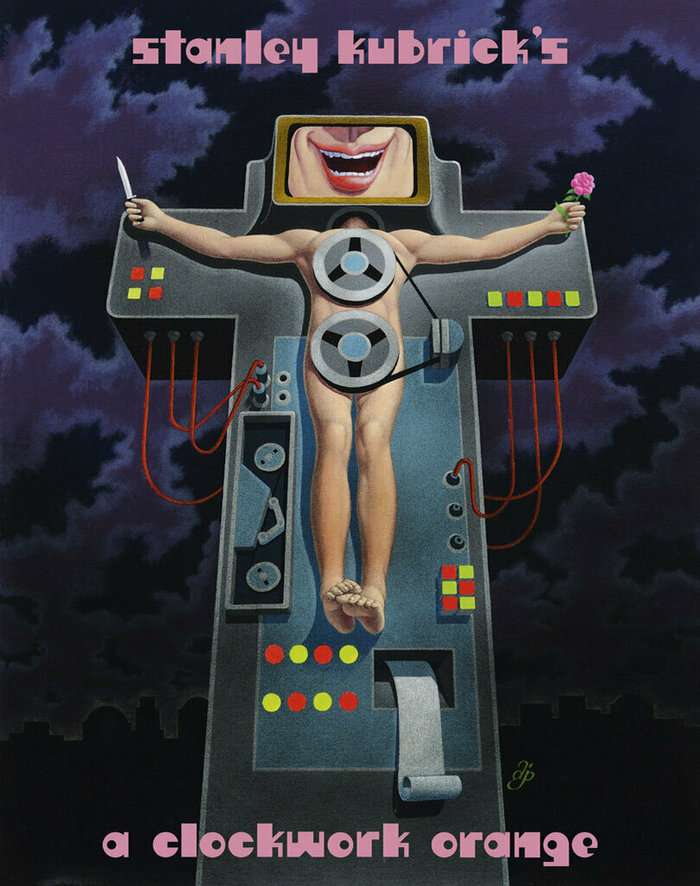
From the New York Times:
Mr. [Bill] Gold spent six months working on black-and-white poster designs before arriving at this illustration, drawn by Ivan Punchatz — but it was rejected in favor of a design by Philip Castle.
The chosen poster for Stanley Kubrick’s film became an icon of pop culture. The title and the director’s name on it is custom lettering drawn by Castle. The naive letterforms on the unused poster design shown here are from a typeface, though. It’s named Stromberg Graphic. To my knowledge, it’s the only published alphabet design by Harvey Stromberg, made for Photo-Lettering and listed in their 1971 catalog.
I wonder whether this Harvey Stromberg is identical with the artist of the same name who pulled a prank on the MoMA around the same time. You can read about it in an article by A.D. Coleman for the New York Times from 1971, and in “A Productive Irritant: Parasitical Inhabitations in Contemporary Art” by Post Brothers and Chris Fitzpatrick, in Fillip 15, Fall 2011.
Formats
- Posters/Flyers (4721)
Topics
- Film/TV (1663)
Designers/Agencies
- Bill Gold (7)
- Don Ivan Punchatz (4)
Tagged with
- movie posters (572)
- unrealized (56)
- A Clockwork Orange (4)
- Stanley Kubrick (6)
- Anthony Burgess (5)
- 1970s (1355)
- all lowercase (760)
- Crucifixion (7)
- crosses (48)
- knives (22)
- flowers (255)
Artwork location
- United States (8298)
- New York City (2329)














2 Comments on “A Clockwork Orange (1971) unused movie poster”
Yes, it was the same artist as the guy who pranked at MOMA. Harvey ‘Hank’ Stromberg was my brother and passed away in 2006
Gary, thanks for your comment and the confirmation, much appreciated! I’m sorry to hear that Hank is no longer around.