
Esquire magazine, September and October/November 2020
Contributed by TYPE.WELTKERN® on Dec 3rd, 2020. Artwork published in
circa September 2020
.
Esquire USA. License: All Rights Reserved.
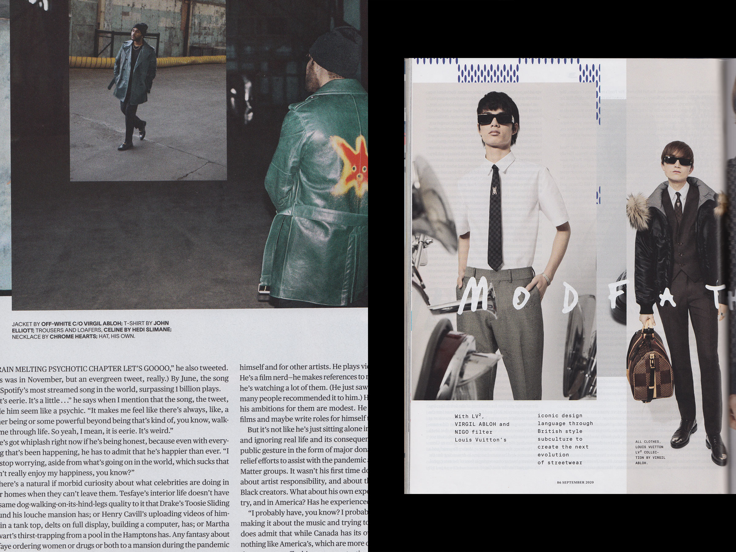
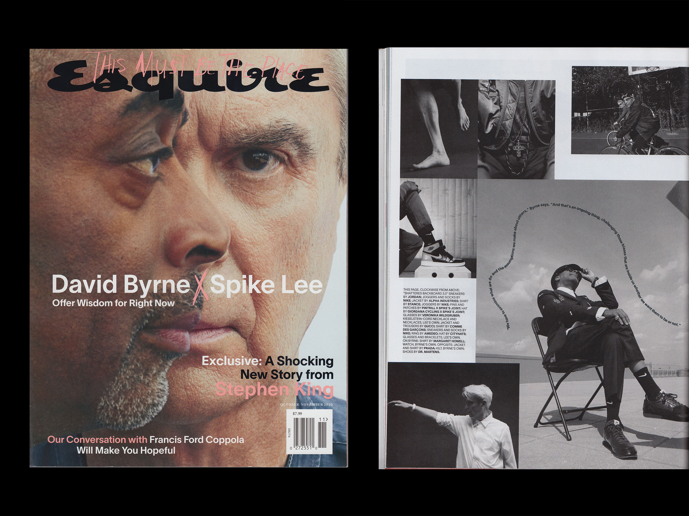
September and October/November issues of the Amercian Esquire magazine, designed in-house. The new design includes the use of the Lausanne Family and TWK Lausanne Mono (by Nizar Kazan) as well as Publico (Commercial Type) for the body text.
The September 2020 issue, with a cover photograph of The Weeknd uses a yet unidentified serif [it’s Hubert Jocham’s Glanz, see comments] scattered around the artist, with italics in the right hand corner.

Esquire USA. License: All Rights Reserved.
Esquire USA. License: All Rights Reserved.
Esquire USA. License: All Rights Reserved.

Esquire USA. License: All Rights Reserved.

Esquire USA. License: All Rights Reserved.


")


")


5 Comments on “Esquire magazine, September and October/November 2020”
I think the serif typeface for the body text is Publico, not Charter.
commercialtype.com/catalog/…
The serif typeface on the cover is Glanz.
www.hubertjocham.de/shop/ty…
BTW, I think Glanz is the retail version of DoubleUSerif, which was used on W Magazine.
(Though Glanz is a little bit different from DoubleUSerif.)
bit.ly/2VzlcQK
You’re spot on, of course! Thank you, Akira.
Looking in Esquire’s CSS code, it is actually Charter, not Publico.
Hi Charles, this post is specifically about the print issues from September and October/November 2020. You are correct that the Esquire website uses Charter BT (see also the dedicated post about the 2019 state). The typeface used in the shown print issues, however, is the similar Publico. See the comparison attached: Publico Text is shown in the middle, with Charter BT at the bottom. The differences are probably most evident in g and the angle of the top serifs in d, l, u.