

A fresh brand relaunch for a new generation
For over 25 years, Paeßens family dentists has been a local institution, offering high-quality dentistry across the German Lower Rhine region. Together, we introduced a simplified brand architecture that helps to provide clarity, consistency and orientation. The design system helps to hone the practice’s profile, making it more tangible via various touchpoints – such as the new website or the spatial design at the new location.
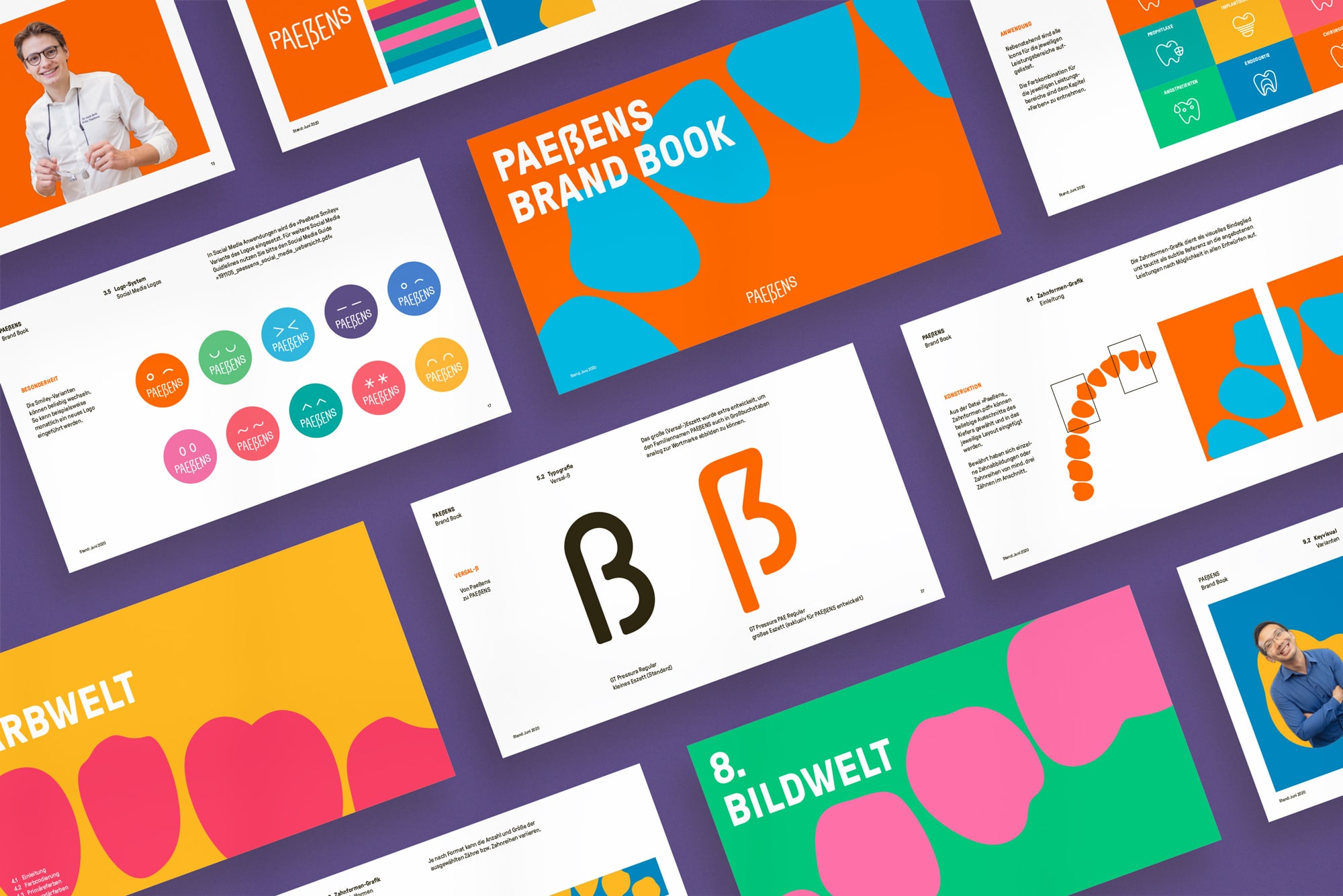
As we chose Grilli Type’s GT Pressura – which had no uppercase ß in it – we reached out to the well-known and probably most friendly Swiss type designers, to create a custom ẞ glyph for our needs. You can imagine what benefit this brings when running a company by the name of Paeßens with a new visual identity which prescribes that all headlines have to be in capital letters!. Happy client, happy end.


")


 and #16 (16 Jan 1919)")


