
“Nur das Originelle wird beachtet!”, Frobenius AG
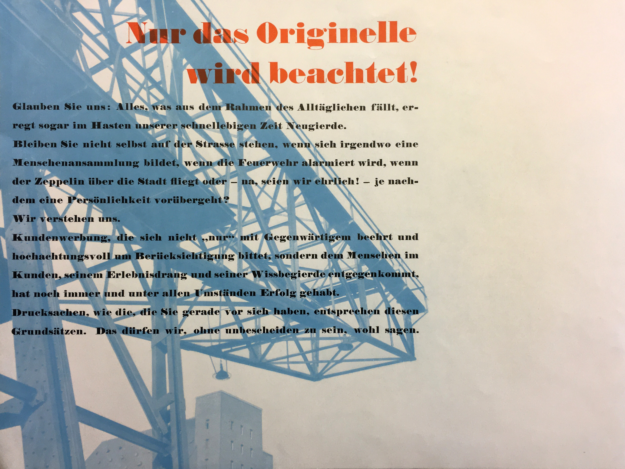
“Only original work finds attention!” Detail from Basel wird Seestadt, issued by Frobenius AG around 1934. The text praises the benefits of “advertising that suits the person in the customer, their urge to experience and thirst for knowledge […] Printed matter such as the one at hand corresponds to these principles”. Frobenius was a printing company active in Basel from 1910 to 1995.
Design by Hermann Eidenbenz (1902–1993), using what looks like a version of Normande (possibly Neue Normande by Haas?) for the text. The headline is distinguished by some cruder design details, most notably in a and g. It’s either another, similar Fat Face, or there were differences between the various sizes. Together with his brothers Reinhold and Willi, Eidenbenz ran a design studio in Basel at the time. The Swiss graphic artist later designed the typefaces Clarendon and Graphique for the Haas foundry.


")


")


1 Comment on ““Nur das Originelle wird beachtet!”, Frobenius AG”
Here’s Fette Normande / Normande grasse as shown in the Alphabete specimen by Haas from ca. 1965.
It looks like both the headline and the text are set in this typeface, which indeed exhibits considerable differences between the sizes. I’d assume that this Fette Normande is identical with Neue Normande shown by Haas before 1926. The specimen shows 5 out of 14 sizes (5–48pt).
Berthold’s Normande is similar and was cut in 12 sizes (6–72pt). It’s difficult to list the differences without having extensive specimens for all sizes. A comparison against a medium-large size from Berthold’s DIN index card shows that Berthold’s Normande is distinguished by horizontally compact glyphs for f and j. The left diagonal in y is continuous, like in the 9pt and 14pt cuts by Haas. These details can be found in the digital versions, too, which appear to be based on a different (larger) size by Berthold.