
Oliver (Chaplin) – Standing Stone album art

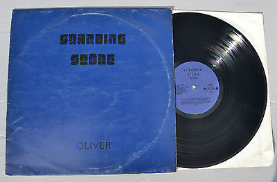
Sleeve for the original release of Standing Stone by Oliver (Chaplin), privately pressed in 1974. The title typeface is named Turtle. Designed by Bob Newman, it was issued by Letraset for dry transfer lettering in 1971, but was continued after only a few years. “Oliver” is in caps from an unidentified generic light gothic.
Apostolos B. Psaltoulis has more info in his review for Standin’ At The Crossroads:
An ultra-rare and expensive privately pressed album by a certain Oliver Chaplin which is an amalgam of folk, blues, progressivism and psychedelia. All the material was written by Oliver. Its highlights include Freezing Cold Like An Iceburg, which sounds very like Captain Beefheart; In Vain, which has been likened to Pink Floyd’s More Soundtrack; Flowers On A Hill, which has a sort of ragtime feel; Cat And The Rat, a length piece of guitar-driven progressivism and the folky Primrose and Orbit Your Factory.
His brother Chris Chaplin had been employed as a BBC Sound Engineer and worked on the BBC’s Hendrix sessions, which explains why the sound quality on the 50 minute album is so good. 250 copies of the album were issued originally in a plain blue cover with black letters. When the covers came back from the printers the shade of blue was so deep the liner notes were almost illegible and an olive green sleeve was substituted. Most copies were given to family and friends but copies were passed to Radio One deejays Brian Matthew and Alan Black. The latter was keen to feature it on his show but was reluctant to do so when it wasn’t available in the shops. After refusing to sign a contract for the album to be distributed through Virgin Records because he considered the record industry corrupt Chaplin returned to his native Wales.


")


