
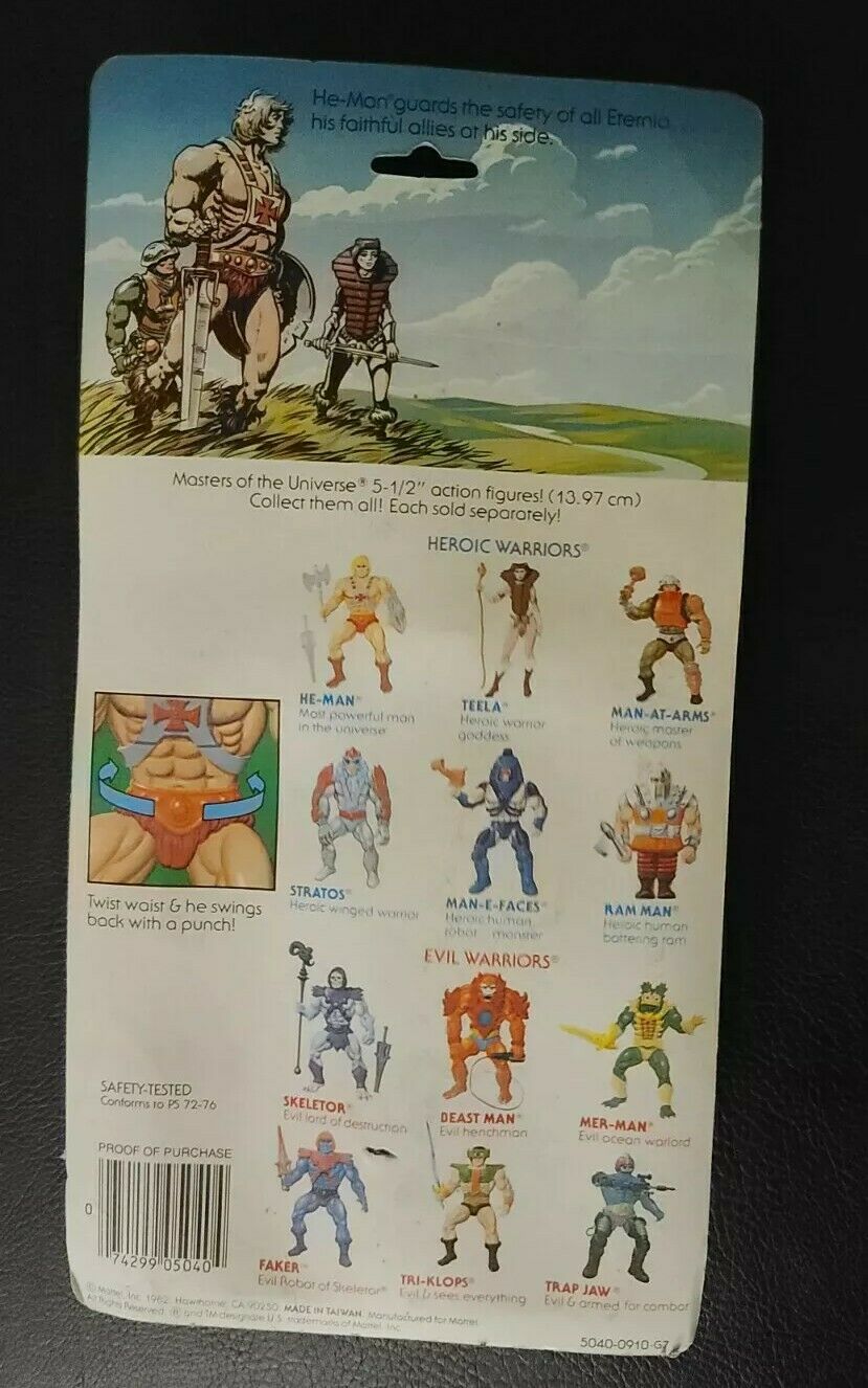
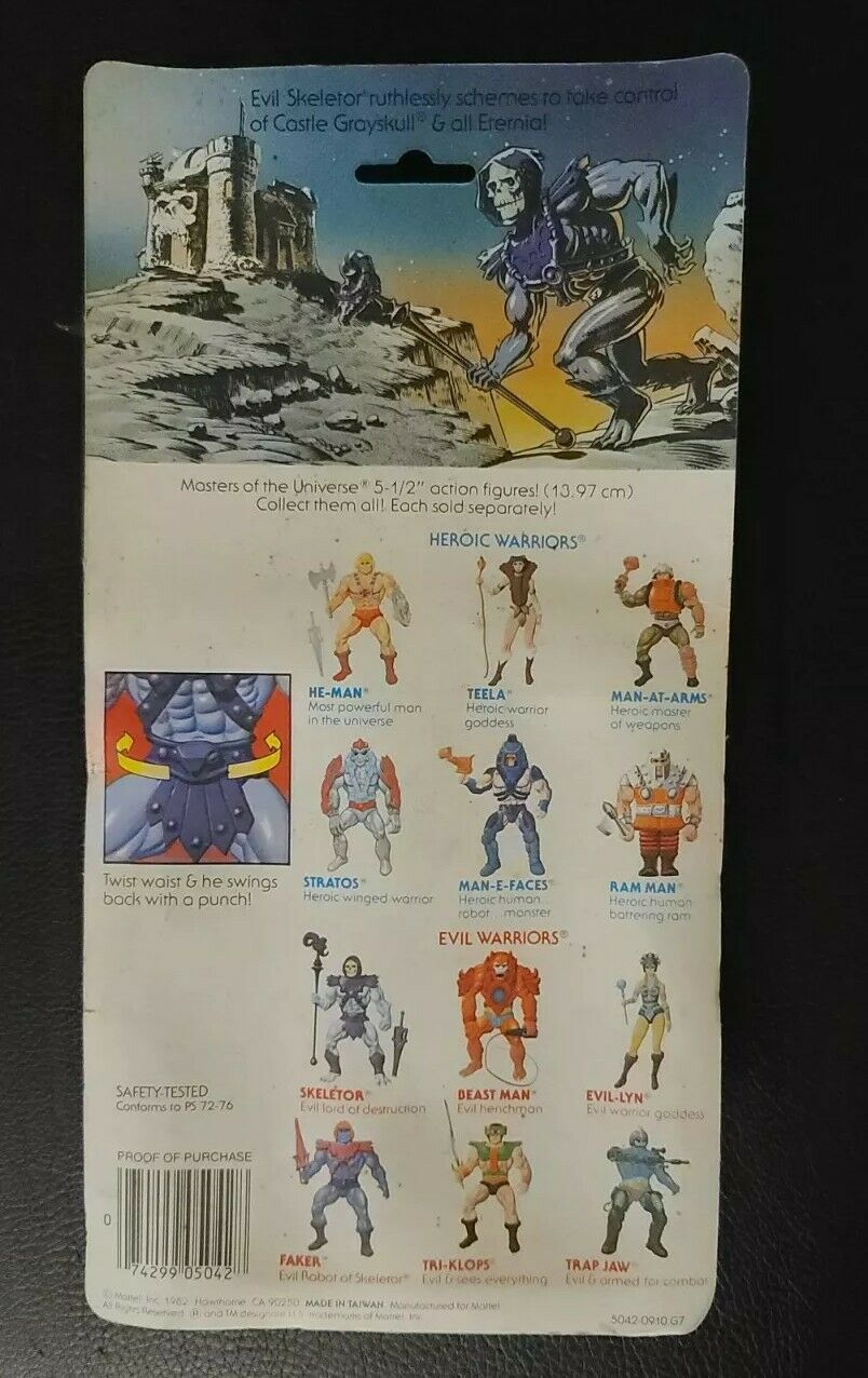
Masters of the Universe action figure packaging
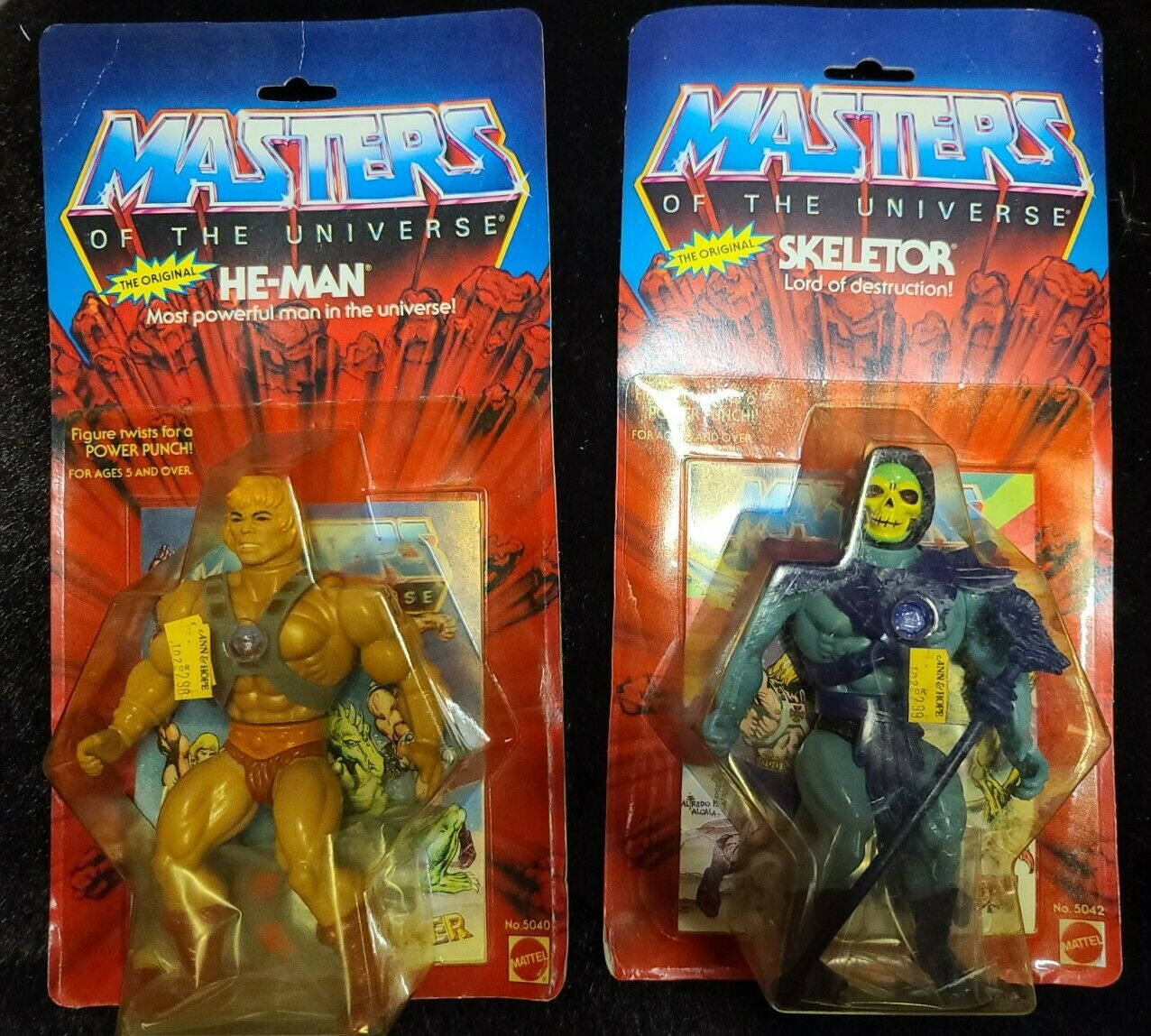
These are the He-Man and Skeletor action figures, released as part of the first Masters of the Universe toy line in 1982 by Mattel.
The “Masters” aspect of the logo is hand drawn, and not part of an established font. “Of the Universe” features loosely spaced caps of the Univers typeface.
The name of each figure, and the sub-header underneath it, which has a different slogan for each different toy character, uses ITC Serif Gothic.
From Vintage Action Figures:
The He Man series grew out of an idea in the early 1980s by Roger Sweet, a designer at Mattel. By 1982 Mattel had brought the toy line to market. Mattel the company then began to make original He Man action figures in 1981 which also spawned later incarnations. There were similarities between He Man and “Conan the Barbarian” which happened to have a movie out during the same time. This similarity resulted in Conan Properties suing Mattel for copyright infringement. Mattel ended up winning the lawsuit and He-Man and The Masters of the Universe (MOTU) became one of their best selling toy lines. By 1983 a cartoon series had even been produced featuring He Man and the other MOTU characters.


")


")


 TV series titles")


